
Recommended
More Related Content
What's hot
What's hot (17)
Similar to Music magazine Contents Page
Similar to Music magazine Contents Page (20)
Recently uploaded
Recently uploaded (20)
Music magazine Contents Page
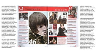
- 1. There are a range of images on the contents pages. On the first, there is a close up shot of a member of Oasis, Liam Gallagher. Additionally on the page there is an on location image of the band Queen performing at a gig. Underneath the image there is text identifying the band and it provides information of the article that features them and which page it’s on. On the second page the images are not all boxed. There are shots of the magazine itself to show readers what they will be reading or what to expect. There is a variety of artists and musicians. In the corners of the images there are large pages numbers so the reader can quickly identify their favourite artists and find their articles. The layout of the cover is quite uniformed. Only one of the shots is not boxed. The shots stay within the centre. The top of the contents page has a header so that the reader is clear about what they are reading. The close up shot of Liam Gallagher is arguably the focus of the contents page as it is the largest images and also just off centre. Text does not support this image most likely as he is an infamous character and well known in the music industry. The contents is separated into sections. On the left there is subheading: “Features”. Underneath there is all of article and stories that are on the cover. The article details are laid out with a subheading which is the title of the article and to the left of this the corresponding page number. There is also a short description of the article underneath to provide context. There is an issue number in a large text at the top of the page. There is also a section which features the regular features in the magazine. The contents page allows uses Q magazine’s house colours of red and white. A majority of the font is in black. Key details such as article details and image captions are in red to distinguish them from information about articles.
- 2. On the contents page there are several images. This Q magazine contents has one page. There is a variety of boxed and unboxed images on the page. The focus of the page is Alex Turner. His close up shot is central on the page therefore drawing attention to him. Also on the image there is a “cover story” in capitals in a black circle, thus making it stand out against the white background and blue of Alex Turner’s shirt. This is so that the reader can easily identify the cover story. There is no text to support the images because Alex Turner is a prominent figure in the music industry and those reading the magazine are most likely fans of his. Otherwise they would be intrigued and can discover who he is. Underneath the image there is text identifying the band and it provides information of the article that features them and which page it’s on. On the second page the images are not all boxed. There are shots of the magazine itself to show readers what they will be reading or what to expect. There is a variety of artists and musicians. In the corners of the images there are large pages numbers so the reader can quickly identify their favourite artists and find their articles. The layout of the contents page is quite uniformed however half of the images are unboxed. The unboxed image is a member of the band Green Day and he is not the focus. The focus of the contents page is the unboxed close up shot of Alex Turner. The page contains on location shots of the bands whereas Turner is a studio shot. There are three sections to categorise different artists and feature in the magazine. There is a section in the top left corner showing the main sell line and another article shown on the cover. Occupying the bottom of the magazine are all of the articles which are in the issue. On the right there is category naming artists which are featured in the Q review section of this issue or which will be featured in future issues. This would entice people to read future issues is an artist they like will be written about. There is a large red banner at the top of the page. This is one of Q’s infamous house colours. The purpose of the page in the issue is made evident by the large, clearly distinguishable font of “CONTENTS”. The title of the page is in black and this is clear to read however the logo of Q magazine still remains the focus of the header. Also included on the contents page is subscription data. Additionally, in the header, “November 2013” tells readers which issue they are reading. This is useful for people looking for a specific issue or for collectors of the magazine. The footer of the contents page also contains the issue date of the magazine and the page number. The contents page uses thick black lines to distinguish between the review section and the articles and also the images which accompany the cover features.
- 3. There are three sections to categorise different artists and feature in the magazine. There is a section in the top left corner showing the main sell line and another article shown on the cover. Occupying the bottom of the magazine are all of the articles which are in the issue. On the right there is category naming artists which are featured in the Q review section of this issue or which will be featured in future issues. This would entice people to read future issues is an artist they like will be written about. There is a large black banner at the top of the page. This is one of NME infamous house colours. The purpose of the page in the issue is made evident by the large, clearly distinguishable font of “CONTENTS”. The title of the page is in black and this is clear to read however the logo of NME still remains the focus of the header. Also included on the contents page is subscription data. Additionally, in the header, “this week” tells readers which issue they are reading. This is useful for people looking for a specific issue or for collectors of the magazine. The footer of the contents page also contains the issue date of the magazine and the page number. The contents page also contains band index which is detailed list of al of the bands which feature in the issue and which pages they can find them on.