
Recommended
More Related Content
What's hot
What's hot (20)
Viewers also liked
Viewers also liked (10)
Similar to Psychological Horror Film Poster Conventions
Similar to Psychological Horror Film Poster Conventions (20)
More from StephanieAlabi
More from StephanieAlabi (20)
Recently uploaded
Recently uploaded (20)
Psychological Horror Film Poster Conventions
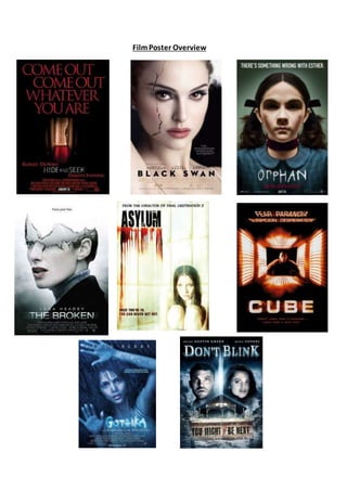
- 2. The eight posters I have chosen have been designed to promote films in the psychological sub-genre successfully. By examining these posters and by comparing them to each other, I have made it possible to determine features that they all share and to establish repeated patterns. All eight posters feature regular film poster conventions. We can easily pick out likely general conventions in seven of the eight posters such as the fact that the title of the film is always the largest and most bold piece of text in the frame, a main image that commands the whole poster and gives a hint to what the narrative may include and a slogan to tie poster together as it also touches on what the plotline may be. As well as this, you can see other repeated patterns such as the fact that most of the main characters shown on these posters are female, which is the character who usually undergoesmiseryoristhevictim.An exampleof thisis in the Asylumposterasthemise- en-scene displays an image of a young female who is huddled on the ground clutching her knees with a frightened/haunted facial expression showing that she has endured some torment. This convention can also be seen in the poster for Gothika where the female protagonist is pressed up against a glass pane with a spooked expression on her face and thewords “not alone” defacingher arm. This offers theidea that the narratives of these films along with many other psychological horror films fixate on a female protagonist whose job is to figure out what is real/true in their lives and what is not/a hallucination. The protagonist is usually female because in horror films, it is conventional for women to be portrayed as innocent and weak and the antagonist is usually a man so it would be harder for the protagonist to overpower them. In five of the eight posters shown, the main image depicts a medium close up or close up shot of the main female protagonist. This shows that the focus of the film will be on them and their mental stability. This is emphasised in two of these, Black Swan and The Broken where the characters are shown with cracks splintered through their faces to appear like glass which suggests that their psychological capacities will be tested and in this case broken. Other similarities include the haunting direct address used in three of the posters which makes it more personal for the audience as they will feel as if they are being directly targeted. The images in these film posters are terrifying and designed to scare the audience to symbolize that they belong to the horror genre. In the poster for Hide and Seek you can clearly see portrayed the eerie looking hallway with a female child at the end with only half her profile showing. This is similar to the poster for The Cube as both use low-key lighting to draw attention to the fact that the characters in the films may not see the antagonist drawing near them when they are preyed on. In all of these posters I have selected, we never see a masked villain or an excess of gore; rather we simply see the
- 3. main protagonists who feature which is common in the psychological horror sub-genre because the antagonist would normally be the psychological capabilities of the main characters. There is a consistent pattern between the usesof colour within these film posters as in Orphan, Gothika and Don’t Blink the colour blue features of varied shades. This could link to the atmosphere being icy and hostile or the conditions being inhospitable such as in Gothika the character is being engulfed in a pale blue hue which she may have to escape from. This would intimidate the audience as it would create an ominous atmosphere that they would find scary. In the case of Black Swan, The Broken and Asylum the majority of the image is the colour white which could indicate that they are indeed innocent or the victims in the situation whereas in Cube and Hide and Seek the colour scheme consists of red and black which could represent that they have more blood and gore in their films. Insix of theeightposters,thetitleof thefilm is positionednearthebottomof theposter beneath the main image which displays how the audienceare first enticed by theimage then presented with thetitle afterwards.In most of them the titleis the largest pieceof text in the frame except from Hide and Seek where the slogan is larger than the title. Each title is shown in uppercase in a simple, bold font that is easily seen. Text effects have been used to make the poster look scarier, such as in the Orphan poster the text is made to be seen as if a child wrote it which ties in with the narrativeof the antagonist being a child. The style of text used for the titles are emphasised to reflect the genre and narrative of the film it is promoting. For example, the title for Cube is written in a large, block font to reflect the name of the film being a cube. Each of the posters feature a tagline that is used to accentuate the narrative of the film. Such as in the Don’t Blink poster the phrase “You might be next” is used which shows the audience that the main focus of the storyline will be the characters figuring out who will be killed next. Plus, in the Asylum poster their strapline “Once you’re in, you can never get out” complements the image of the frightened/mentally unstable female character and signifies that the main character will probably get placed in an asylum and may spend the film attempting to escape. Most of the taglines have in common the fact that they are all direct and refer to the audience personally by saying that the audience will be next or that they cannot hide from the antagonist. The majority of the postersshownhaveplaced their taglinesat the top of theposter, abovethe main image and this effective as the audience can identify the protagonist or antagonist then read the tagline and try to determine what will happen to them within the narrative. Surprisingly, only four of the eight posters introduce institutional information which is positioned at the base of the poster underneath the image. Other text, such as ‘From
- 4. the director of Final Destination 2’ and ‘an extraordinary, intoxicating masterpiece’ are used to pull in audiences. Saying that the film was produced by the creator of another successful horror film makes the audience more inclined to watch the film. Overall, all of these film posters are effective in showcasing the psychological horror sub-genre as they are all simple yet persuasive enough to make the audience want to watch the film. When developing ideas and carrying out my practical work I will refer back to this as it proves how you need an engaging image to draw in the audience first and then to introduce the narrative so my film poster can also be successful.