Call Girls in Dwarka Mor Delhi Contact Us 9654467111
Cover page analysis
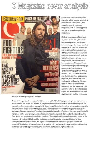
1. Q magazine is a music magazine
featuring all the biggest artists, it is
published by Bauer media, and
they also publish a lot more
magazines such as kerrang, grazia
and lots of other highly popular
magazines.
My first impressions of the front
cover are that is it bright and it is
laid out very clearly with lots of
information yet the image is still at
the centre of it all, still very visible.
Q gives comprehensive coverage
of the current music scene, while
not forgetting the trends of yester
years, from what I can see it is a
magazine for the mature music
lover, not teens. The cover lines
run down the right side of the page
advertising the articles and
contents of the page from “NOELS
RETURN!” to “LUCINDA WILLIAMS”
and there is a skyline page special
of prince, which will attract and
the is also a puff saying “20 page
special” which will also entice
readers to buy the magazine. The
audience talks to its audience as a
friend and the models on the front
cover page are making eye contact
with the readers giving direct address.
The main image is well composed and takes up roughly 70% of the page making it more prominent
and its stands out more. It is related to the genre of the magazine making it an interesting read for
its readers. The masthead is a big capital Q that is emboldened and in white with a red box around it,
which makes it one of the first things you see. The masthead is behind the image and because it’s
such a well known magazine it’s easily recognisable to its readers. The cover lines run down the right
hand side with a large plus symbol next to them, it is all in capital letters and emboldened in white
font with a red box around it making it stand out. The magazines house style seems to consist of the
colours red, white and black and the font seem to be all in capital letters and in bold writing
throughout the magazine cover, the layout seems to be quite formal in layout but still has an
informal friendly feel to it, which makes it attractive to its readers with everything laid out in a none
cluttered way and this gives it an overall premium, professional, high quality look.
2. On the front cover the bands/artists are Noel Gallagher, Kate tempest, jack white, Lucinda Williams,
the foo fighters and prince. This would suggest to me that the magazines target audience would be
aiming towards more mature readers and because they feature male/female artist’s men and
women equally enjoy this magazine. The main cover line is ‘NOEL RETURNS!’ this suggests maybe he
is releasing a new album or maybe going on tour etc. Q Represents social groups and they reach out
to rock fans as well as pop fans and a wide variety of other social groups, to give them a wider social
group. The used the quote from Dave Grohl “I HAD ANOTHER LIFE 25 YEARS AGO. IT WAS TURNED
UPSIDE DOWN.....” this keeps the readers interested as I assume as i assume this was referred to a
time before he became such a successful artist.
The magazines masthead tells me that it is a premium magazine that is of a very high standard.
There is a strapline at the top of the page ‘prince: his full story as it is a special that they don’t always
have and this helps attract readers. They use the colours red, white and black throughout, which
gives it a premium quality glossy look to it. All its fonts are in capitals to make everything stand out
and it has an attractive look to it.
They use a lot of strategies on the cover page, firstly the main image takes up the majority of the
page and the models are making eye contact with its readers and this attracts its audience. They also
use strap lines, puffs and a cover mount all in a very successful bid to attract more readers by having
lots of relevant attractive information on the cover to give the magazine more value for money and
this can encourage more readers if they feel they are getting value for money.