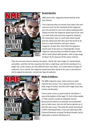
1. Brand Identity
NME wants their magazines brand identity to be
very diverse.
This is because they use various font styles, like serif
and sans serif. For the masthead of the magazine,
you can see that it’s sans serif, which would give the
impression that the magazine would want to be seen
as a more bold and masculine magazine, however,
the coverstory’s font is a serif style, which would
give the impression that they want the brand to be
seen as a more feminine and more mature
magazine. So from this I learn that the magazine
would want to be seen as a mixed gender aimed
magazine, because they use different types of font
which could attract both genders, with an age range
of about 16-25, because of the colour scheme.
They also use very diverse selection of colours, like for the main image, it’s mainly blacks
and whites, and then for the coverlines the font is a light blue, and for the masthead it’s a
bright red, so the colours are very different from each other, so it could attract all types of
audiences. As an overall, the magazine would want their brand to be seen as very diverse
and to appeal to everyone, not just one type of audience.
Mode of Address
The NME magazine cover comes across as quite
colourful but serious. This is because there is a very
wide range of colours, but the main image looks very
serious and dramatic.
It also comes across as quite comical, like where it
says at the bottom of the page “Er, Paris Hilton wades
in” they say this in quite an awkward manner
because Paris Hilton isn’t normally associated with
rock or indie music, but she still had an opinion on it.
Also the way it says “The week the world went black”
it didn’t literally go black, it was just referring to My
Chemical Romance as being The Black Parade, and so
made quite a comical reference to it.
2. Brand Identity
With this contents page, NME wants their magazine
to see very engaged in bands. This is because it has a
whole strip dedicated to an index of bands, which is
on the entire left hand side. Another reason why the
magazine looks very intrigued in bands is because the
main image is a band and the article on that page is
about a band, not a solo artist. So the magazine
would come across as a more band engaged
magazine rather than a solo engaged band.
It’s also got a house style to it, because it goes along
with the same kind of colour scheme as the cover. It
has blacks, whites and then the bright reds again. All
of these colours contrast very well against each
other, so the magazine could come across as a very
colour co-ordinated magazine, which takes great
consideration into what colours it uses for its magazines. Again, the magazine contents
would be aimed at both genders because of the colour scheme, it could use the black to
attract the male audience, and then the red and whites for the female audience because
they’re very modern and bright colours, and could be aimed at an age range of again about
16-25 year olds just because the colours are very modern and work well together, and so it’s
very eye catching, and could attract the younger eyes because it’s not hard to look at.
Mode of Address
The NME contents page comes across as very
organised and well laid out. On the right hand side of
the page you have all of the sub-headings and
descriptions of what you’d find inside of the
magazine, and in the centre of the page you have a
main image of a band and a little article underneath
explaining what happened with the band, and it’s
basically just giving you an insight of what to expect
out of the magazine with the way that it’s wrote the
article. On the left hand side of the page, you have
the band index, which basically just gives you an A-Z
of bands that you’d find inside of the magazine, so
you can look at the index and find what band you
were hoping to find, and it just makes it a lot easier
and quicker to find what you’re looking for.
3. Brand Identity
With this double page
spread the brand identifies
itself as quite laid back and
expressive with the colours
that they use. It comes
across as quite laid back
because of the image it
used. It used an image of
the main band from the
article just lying back on a
bed relaxing. This creates a
laid back feel to the
magazine and so would come across as the magazine identifying itself as quite a laid back
and chilled magazine. The way it uses it’s colours again creates a house style effect, because
it’s used the white, black and bright blue, like it used for the cover of the magazine, and also
includes a little red box with the red NME logo inside of it, also being consistent throughout
the cover, contents page and now the double page spread. It would probably appeal to
more the male target audience, with an age range of about 16-25 year olds, mainly because
of the colours, and in the background of the image you see they have images of semi naked
girls on their wall.
Mode of Address
As I said previously, the NME
magazine comes across as very
laid back and chilled out, and as I
explained this is shown through
the use of the main centre image.
Also the language of the
magazine speaks a lot to the
audience. Like with the band
name “The Teenagers” it’s very
big and bold, and so we look at
that more rather than the rest of the magazine because we can relate to it because the
audience reading the magazine are mainly teenagers or young adults, and so we become
intrigued about what the article is about.
Also they say “Everyone’s talking about…” which would make us want to read this section
because teenagers and young adults are always wanting to stay cool and in trend, and so
we’ll definitely be drawn towards this section as well.