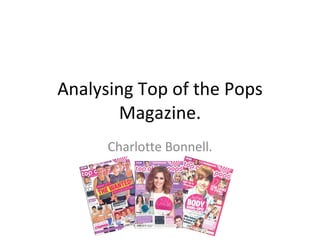
2. The mise en Scene has a dominant image of a well known celebrity who is going to appeal to the target audience. Flasher. This is going to be used to attract young girls into fashion ideas & interests. Header. They have used a persuasive line ‘Win!’ to pull the reader in and their chance of winning something. The masthead matches the theme of a pink and feminine idea. The main coverline uses younger language to relate to the reader. It is also in a pin board style to make it more stylish. The image of a topless celebrity also appeals to the reader. The language and use of ‘PHWOAR!’ gives the impression of his attraction to females. Also, the footer gives the reader the chance to see what other freebies are available. The background of a pink window is idealistic to the reader and gives the more feminine tone. ‘ OMG’ makes it stand out a lot more, and it is also to do with a celebrity in a weird pose, making it seem interesting.
3. Straight away the reader is going to be drawn to the bold masthead on the contents page, this tells them in 3 words what this is about. There is a printed image of the front cover to help the reader know where to find certain articles. Numbers are located pointing to the article. The numbers are bold and easy to read. Girly images of what the reader might be interested in. Famous bands which a lot of the target audience will be interested in. They are all boys which instantly is appealing. ‘ Wins & offers’ will pull the reader in. It is seperated into the rule of thirds and gives it the original magazine layout. The language on the contents page seems quite feminine and articles are located into the girls interests such as boys, shopping and celebrities. Colour co ordinated page. 3 simple colours to make it seem more toned down.
4. One page is image dominated. This makes the reader know straight away who the interview is about. Pull Quote. This is usually an interesting quote which the reader will want to read about. Flasher. This gives a small insight about the band. Coverline. The caption underneath gives the reader a small info box about the band and their interests. Images are used to show what the band do, also adds more interest to the page and attracts the eye. Questions from the interview are highlighted. Set out into columns to look neater, and look more like a magazine. Drop Capital. Colour Co ordinated to look more simple, yet still have the idea of a feminine style, to still appeal to the reader and not look too boring.