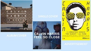
2. .
The name of the artist is in the centre of the album cover,
this allows the artist to be a main focus point.The simple
white font and plain bold lettering is a common feature on
Calvin Harris cover art.This helps to build up a brand and
make a recognisable style for the artist.The simple font
works well to not draw too much attention away from
album art.The simplistic font is accompanied by a simple
picture as well, this builds up a theme for the artwork.The
colour scheme is very neutral again following the
simplistic look the artist is trying to portray.
The blue tone is followed through out the album and single cover, this gives are very calm
and peaceful tone to the art. Again following the message of Calvin Harris. Calvin Harris is
also on the cover of the album this makes his face recognisable with his work. He is also just
sitting on the floor in a very quite looking area which leads you to wonder about his story and
how he got there.This then encourages the viewer to listen to the music too find out more.
ALBUM COVER
3. .
SINGLE COVER
The single cover follows a very
similar style to the album cover.
The tone of the colours are the
same neutral blues.This follows
the theme of Calvin Harris’
work, this again builds up a
style and a brand for the artist.
The font is also the same bold
white this makes it very easy for
the audience to recognise that
this single comes from Calvin
Harris as well.
The title of the song is also
bold in the middle of the
cover which makes it very
noticeable.The art work is
of a man and a horse this
leaves us wondering why
he is on the cover and why
this picture relates to
Calvin Harris’ music.We
assume the title would
relate to a romantic
relationship so this is quite
an unusual picture.
4. .
ADVERTISEMENT
This advertisement doesn’t follow the same theme as the
album and single cover. However, I think it is still
recognisable as Calvin Harris due to its simplicity. The
bright yellow works well for an advertisement because it
draws the viewers attention to the poster. Calvin Harris is
written boldly down both sides of the poster, this works
well because it makes the artists name very noticeable as
well as being a bit unusual or different.The
advertisement is very simple with not much writing but it
has all the information needed if someone was interested
in the artists.The face in the is very bold and intriguing
this again draws the viewers attention straight to the
picture which then has the name of the artist right next
to it.