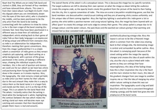
Noah And The Whale are an indie/ folk band and
started in 2006, they are formed of four members
and have released three albums. This cover is
from their latest album 'Last Night On Earth'. From
this digipak advert you are immediately drawn
into the eyes of the main artist, who is situated in
the middle, and has been positioned to be the
only artist from the band to be looking
(connecting) with the audience to show his status
as he is the main singer of the band creating this
intimate feel. Here they have been positioned in a
different way to show their all individual, all
independent artists relating back to their genre of
indie/ folk as their body language is an expression
of being unique and different from everyone else,
as indie is an abbreviation for independent,
therefore meeting their genre conventions. Also,
from this image I gathered that it is a simple
advert a convention of indie genre as they remain
simplistic yet capturing, with black writing on a
white background, with a picture of the group
positioned in the centre, all looking in different
ways, showing the individual aspects of the
members, this is the sort of position and stances
we could use for our advert as we have two artists
and positioning them facing different ways could
draw in the viewers as it creates mystery. Also,
the typography, the style remains simple yet bold,
as indie artist use their names for their albums
due to the vast amount they make this is a way to
notice them as the band name is in a larger font,
and stands out the most, as it is as the top of the
image. This is an advert for the band Noah And
The whale. I instantly notice that the writing is
black while the background is white, highlighting
the contrast between the two which makes the
writing stand out more and become more eye
catching and connotes that their black/white
people there music is real and acoustic.
One of the most important feature in this advert
is the grain effect that is applied giving it that
vintage edge, this is a typical genre convention
for indie music artists as they create this
aesthetically pleasing vintage vibe. Also, the
layout is set out to be like a Polaroid image
which is common from the olden eras relating
back to that vintage vibe, the dominating image
is central and surrounded by white outline. Also,
the advert is conveying youth because of the
street setting within the image the opacity
changes and creates this idea of youth within the
city, also the city is a place linked with indie
genres as they use settings that have
meaningfulness, this idea of the fading shows
how this is their inspiration the city is the heart
and the main relation to their music, this idea of
the gradient changes from one image to another
inspires me as I like the idea of merging my artist
within nature setting to show this was our
inspiration. The typography used is big and bold
black font and this font is consistent throughout
showing synergy and the bold font gives the title
emphasise of the band name.
The overall theme of the advert is of a conceptual nature. This is because the image has no specific narrative.
The target audience are left to develop their own opinion on what the image as about letting the audience
create this enigma code, as the opacity levels create this gradient from the picture of the band to then fading
into the city, this is a genre convention of indie. The mise-en-scene is key within establishing genre, see that the
band members are dressed within smart/casual clothing and they are all wearing shirts creates uniformity and
this unique idea of them coming together. Also, the high key lighting is used within this indie genre a lot to
portray the artist within a positive manner and using natural lighting. Also, the image has been layered with an
affect ‘grain’ to create this vintage and rustic edge to convey their genre. The colour pallet is unique due to its
vintage colours and the water colours, the pale blues and the washed out colours giving it that warming and
relaxed feel as blue connoted truth and pain.

Noah and whale Advert

  • 1.
    Noah And TheWhale are an indie/ folk band and started in 2006, they are formed of four members and have released three albums. This cover is from their latest album 'Last Night On Earth'. From this digipak advert you are immediately drawn into the eyes of the main artist, who is situated in the middle, and has been positioned to be the only artist from the band to be looking (connecting) with the audience to show his status as he is the main singer of the band creating this intimate feel. Here they have been positioned in a different way to show their all individual, all independent artists relating back to their genre of indie/ folk as their body language is an expression of being unique and different from everyone else, as indie is an abbreviation for independent, therefore meeting their genre conventions. Also, from this image I gathered that it is a simple advert a convention of indie genre as they remain simplistic yet capturing, with black writing on a white background, with a picture of the group positioned in the centre, all looking in different ways, showing the individual aspects of the members, this is the sort of position and stances we could use for our advert as we have two artists and positioning them facing different ways could draw in the viewers as it creates mystery. Also, the typography, the style remains simple yet bold, as indie artist use their names for their albums due to the vast amount they make this is a way to notice them as the band name is in a larger font, and stands out the most, as it is as the top of the image. This is an advert for the band Noah And The whale. I instantly notice that the writing is black while the background is white, highlighting the contrast between the two which makes the writing stand out more and become more eye catching and connotes that their black/white people there music is real and acoustic. One of the most important feature in this advert is the grain effect that is applied giving it that vintage edge, this is a typical genre convention for indie music artists as they create this aesthetically pleasing vintage vibe. Also, the layout is set out to be like a Polaroid image which is common from the olden eras relating back to that vintage vibe, the dominating image is central and surrounded by white outline. Also, the advert is conveying youth because of the street setting within the image the opacity changes and creates this idea of youth within the city, also the city is a place linked with indie genres as they use settings that have meaningfulness, this idea of the fading shows how this is their inspiration the city is the heart and the main relation to their music, this idea of the gradient changes from one image to another inspires me as I like the idea of merging my artist within nature setting to show this was our inspiration. The typography used is big and bold black font and this font is consistent throughout showing synergy and the bold font gives the title emphasise of the band name. The overall theme of the advert is of a conceptual nature. This is because the image has no specific narrative. The target audience are left to develop their own opinion on what the image as about letting the audience create this enigma code, as the opacity levels create this gradient from the picture of the band to then fading into the city, this is a genre convention of indie. The mise-en-scene is key within establishing genre, see that the band members are dressed within smart/casual clothing and they are all wearing shirts creates uniformity and this unique idea of them coming together. Also, the high key lighting is used within this indie genre a lot to portray the artist within a positive manner and using natural lighting. Also, the image has been layered with an affect ‘grain’ to create this vintage and rustic edge to convey their genre. The colour pallet is unique due to its vintage colours and the water colours, the pale blues and the washed out colours giving it that warming and relaxed feel as blue connoted truth and pain.