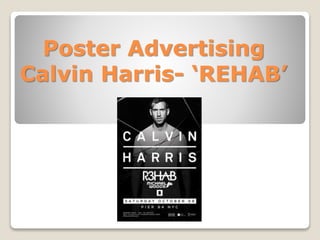
2. Initially, we acknowledge the black and white
theme to Calvin Harris Advert. This is significant
as these colours highly contrast making the
White, simple typography easy to read. One could
argue this is because people who listen to
dance/house music are of the younger generation,
and making a simplistic poster enables audience
to notice the writing. This technique is essential
as the creator wants you read the poster as it
contains all the information of where the concert
is and on what date it is taking place.
The black and white lines going through the advert are significant to
the genre of the advert. They look as though they are electric lasers
which adds to the electronic genre music type. In our music video
advertising poster I will use the electronic/house stereotypes in my
poster, to initiate to the audience the type of music they will be
listening to.
3. Artist Promotion
We notice a common theme within Calvin Harris’ advertising posters,
in which he uses his famous, recognisable face to promote his
concerts and albums. Various artists use this technique as celebrities
like Calvin Harris have a huge fan base who know his look and style.
It is an eye-catching method, especially due to his name being
inserted directly underneath him in big letters. The similarity of his
facial expression in every poster is significant as it is easily
recognisable for people when images are repeated. We wont be
using this method in our poster as we are going for the idea of an
‘average man’ as the protagonist, being James. However we will take
elements of Calvin's techniques in promoting, and use them in our
poster, like the electrical backgrounds and youth dance stereotypes.