1. Block capitals have been used to create a
The same masthead text style on As well as the text the
formal yet creative feel to the cover. Also
the front of their other magazine masthead has kept the
large and smaller text is differentiated
has continued and will go onto be red and white colour
throughout the cover to create attention,
continuous scheme which it has A light has been used to show
for example ‘New White Stripes Movie’
always used more of a positive light on the
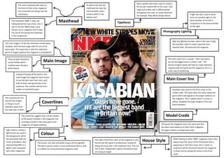
The masthead ‘NME’ is bold, yet
hiding behind the two artists, this is
Masthead Typefaces
band member to the left in
comparison to the band member
due to the fact NME being a very on the right
famous music magazine and to take
the risk of not having the masthead Photography Lighting
in the foreground
High Key lighting has been used in the main image,
The main image is of the two frontment of the band this has been used to create a positive tone
Kasabian, with the lead singer with his arm of his towards both the band and the magazine
band mate. This band links in with the indie/rock
genre of target audience the magazine is intended for
They are both dressed in The main cover line is a quote, “oasis have gone,
casual clothes which Main Image we are the biggest band in Britain now”. This
could be worn during a almost arrogant quote will help to create attention
performance towards both the band and the magazine, this is a
clever way of publishing
Instead of having all the band in the
main image the magazine have chosen
to use the two main front men, with Main Cover line
both of them staring directly at the
audience. This creates interest from
......
readers or potential buyers Kasabian have used on the front cover as the
model credit. The band share the same indie/rock
genre which will appeal to the target audience on
The coverlines do not the magazine. This is helpful when it comes to
obscure the images
or bring to much Coverlines selling alongside the large imagine of the two
band members.
attention away from
the main text or titles
The coverlines suggest only a small number Model Credit
of the bands included in the magazine, but
all being included in the same genre and
subgenres of target audience All around the magazine cover the same text font
has been used aswell as on their other magazine,
Light colours, mainly a this again creates a strong house style
light brown are used in
the background, which
Colour
are associated with the While looking at other ‘NME’ magazine covers they
music of Kasabian, also The brown, red, blue and white colours all tie together.
The style of the front cover of the magazine is very
formal and the layout if professional, instead of
House Style always have the name of the artist/band that is
representing NME as a The block colours create a more professional feel as well being very busy and in the audiences face. This can appearing on the front cover, this is clever so
lighter read compared as a better all round presented magazine cover link in with ‘independent’ genre of audience they audiences will be attracted towards the magazine
with other magazines are trying to target in shops just by seeing the name on the front
cover