1. Double page spread analysis
The Pull quote is kept at the top left hand side of the second
Many Conventions of Double Page Spreads page of this DPS. It is kept here as this will be the first place the
have been kept in this DPS from vibe reader’s eyes go to after seeing the image on the page opposite
magazine; like the Header which is placed side. The Pull Quote is also in bright colours to draw the reader’s
neatly at the top left hand side of the page. attention, mainly in yellow with white to point out key words.
This is placed here as it is the least
important piece of information on the page
but is still on the page to provide the reader A Smaller related image is also
with a sense of familiarity and to keep the shown on the article. This is placed
magazines brand identity. here so the audience will be more
interested in the article, gives the
article more information/visual
detail but is always related to the
whole article itself. This is also a
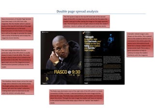
The main image dominates the one good convention to help to
particular side of the DPS which is usually continue to keep the readers
shown in most, if not all, DPSs. This main familiarity with the magazine.
image is clearly shown and is linked to the
actual article in the DPS. This convention is
again kept carry on the magazines brand
identity and to prevent confusion to the
reader.
The Headline clearly shown across the main
image and is relevant to the whole article.
The bright yellow colour on the black
banner will catch the reader’s attention,
making them want to read more to see The Body copy dominates most of the right side of the DPS which is a classic
what the article is actually about. convention of DPSs; to have 1 side dominated by the main image and the
other by the copy. The body copy is placed here so the readers can find out
about the article. Through the main image the readers will have an interest
in the article therefore th4e body copy is there to “satisfy” the reader’s
needs.
2. The Headline clearly shown across the
second page and is relevant to the whole
article. The bright yellow colour on the black
banner will catch the reader’s attention,
making them want to read more to see
what the article is actually about.
The main image dominates the one
particular side of the DPS which is
usually shown in most, if not all, DPSs.
This main image is clearly shown and Many Conventions of Double Page
is linked to the actual article in the Spreads have been kept in this DPS
DPS. This convention is again kept from vibe magazine; like the Header
carry on the magazines brand identity which is placed neatly at the right top
and to prevent confusion to the hand side of the page. This is placed
reader. here as it is the least important piece
of information on the page but is still
on the page to provide the reader with
a sense of familiarity and to keep the
magazines brand identity.
The Body copy dominates most of the right side of the DPS which is a classic
convention of DPSs; to have 1 side dominated by the main image and the
other by the copy. The body copy is placed here so the readers can find out
about the article. Through the main image the readers will have an interest
in the article therefore th4e body copy is there to “satisfy” the reader’s
needs.