SlideShare a Scribd company logo
1 of 3
The Main Image takes up the whole page which                         The Font and italics used on ‘lady’
makes it the main focus of the double page spread.                    shows sophistication and makes
The lack of colour makes it look professional and an                   the article more appealing. The
all round high quality photograph. The chains round                  ‘GAGA’ is in capitals to emphasise
her neck and her hands strategically placed over her                               her name.
breast
portrays
her as a                                                                                         The Text is
rebellious                                                                                    split up into 3
character,                                                                                          separate
interesting                                                                                     columns, in
the reader.                                                                                   the style of a
                                                                                                 newspaper
The layout                                                                                       article. The
is very                                                                                         paragraphs
basic                                                                                                 are not
dedicating                                                                                       specifically
one page                                                                                      recognizable
entirely on                                                                                        giving the
an image                                                                                          reader the
of the star                                                                                      impression
and the                                                                                        that there is
other page                                                                                   a lot of text on
on the text.                                                                                        the page
           Drop cap is used at the start of            The ‘L’ is the only colour on the          which may
           different sections to split the text up     page, it is very eye catching as it      put them off
           and make it more eye catching,              is positioned on top of all of the          reading it.
           this is a typical convention of a           writing and immediately draws the
           double page spread.                         reader in.
the Main Image is positioned mainly on the left page          A Stand first is used in a larger font at the
however covers both pages in the double page spread          start of the article to give a brief lowdown on
which is unusual as many magazines have the picture         what the article is about. The use of the colour
taking up all of one page and have the other page filled    blue on ‘Florence Welch’ draws the reader in
with text. It is an Image of Florence and she is             and automatically tells you who the article is
positioned on a                                                                    about.
table covered by
the American flag.
You can see her
whole body
which is a typical
convention of a                                                                                 There is not
double page                                                                                   a lot of room
spread.                                                                                                for text
                                                                                                 because of
                                                                                                     the main
                                                                                               image being
                                                                                               so large and
                                                                                                 spread out.
                                                                                                    The Drop
                                                                                                 cap is used
                                                                                              at the start of
                                                                                                   the text to
                                                                                                split the text
                                                                                              up and make
                                                                                                 it more eye
                There is very little colour used on the double page spread and                      catching.
                the vast majority of the spread is black and grey. Using these dark
                colours helps to make the red (on the flag and her hair) look
                brighter so that it stands out more.
The Main Image is positioned on the left hand side          The stand first at the top of the page in pink is
and although it isn’t very large, it takes up the whole        the opening of the article. It is a quote from
page as there is a lot of white space around it. The         Alexander Burke herself which may entice the
image of Alexander Burke has a good effect, as it          audience and make them interested in what she
catches the                                                                                         has to say
readers                                                                                                   after
attention                                                                                             winning
automatically                                                                                    the X-Factor.
because of
her sexy
body language                                                                                          Mainly all
and seductive                                                                                         of the text
pose. The                                                                                                 is black
hand on hip                                                                                                 and in
creates a                                                                                                     neat
sense of                                                                                                columns,
attitude and                                                                                            there are
her eye                                                                                                   no drop
contact                                                                                                    caps to
with the                                                                                                  split the
audience                                                                                                   text up
creates a                                                                                             which may
direct mode                                                                                                put the
of address.                                                                                            audience
                                                                                                      off reading
                                                                                                                  it.
                                                          The only colour on the article is pink.
The layout is very basic dedicating one                   This is used to reflect the gender of the
page entirely on an image of the star and                 model and also to attract a female
the other page on the text.                               audience to read the article.

More Related Content

What's hot

Film magazine research
Film magazine research Film magazine research
Film magazine research Lucypankhurst
 
Analysis of 3 music magazines
Analysis of 3 music magazinesAnalysis of 3 music magazines
Analysis of 3 music magazinesrayJMA
 
Double page spread
Double page spreadDouble page spread
Double page spreadjamunakumar
 
Double page spread research indie
Double page spread research indieDouble page spread research indie
Double page spread research indieRayrayy
 
Contents page research
Contents page researchContents page research
Contents page researchtwinklez
 
Mojo magazine
Mojo magazineMojo magazine
Mojo magazinekewlerb
 
Josh robinson double page spread analysis 1
Josh robinson double page spread analysis 1Josh robinson double page spread analysis 1
Josh robinson double page spread analysis 1Joshrob
 
MAGAZINE RESEARCH - DOUBLE SPREAD PAGE
MAGAZINE RESEARCH - DOUBLE SPREAD PAGEMAGAZINE RESEARCH - DOUBLE SPREAD PAGE
MAGAZINE RESEARCH - DOUBLE SPREAD PAGEGiulia Malacrida
 
Analysis of Professional Double Page Spreads
Analysis of Professional Double Page SpreadsAnalysis of Professional Double Page Spreads
Analysis of Professional Double Page SpreadsLauren6789
 
Double page media
Double page mediaDouble page media
Double page mediaemilyshep
 
Kerrang double page spread
Kerrang double page spreadKerrang double page spread
Kerrang double page spreadJodene Chisholm
 

What's hot (17)

Film magazine research
Film magazine research Film magazine research
Film magazine research
 
Analysis of 3 music magazines
Analysis of 3 music magazinesAnalysis of 3 music magazines
Analysis of 3 music magazines
 
Product research
Product researchProduct research
Product research
 
Product research
Product researchProduct research
Product research
 
Question 1
Question 1Question 1
Question 1
 
Double page spread
Double page spreadDouble page spread
Double page spread
 
Double page spread research indie
Double page spread research indieDouble page spread research indie
Double page spread research indie
 
Magazine analysis
Magazine analysisMagazine analysis
Magazine analysis
 
Contents page research
Contents page researchContents page research
Contents page research
 
Mojo magazine
Mojo magazineMojo magazine
Mojo magazine
 
Media 14
Media 14Media 14
Media 14
 
Josh robinson double page spread analysis 1
Josh robinson double page spread analysis 1Josh robinson double page spread analysis 1
Josh robinson double page spread analysis 1
 
MAGAZINE RESEARCH - DOUBLE SPREAD PAGE
MAGAZINE RESEARCH - DOUBLE SPREAD PAGEMAGAZINE RESEARCH - DOUBLE SPREAD PAGE
MAGAZINE RESEARCH - DOUBLE SPREAD PAGE
 
Analysis of Professional Double Page Spreads
Analysis of Professional Double Page SpreadsAnalysis of Professional Double Page Spreads
Analysis of Professional Double Page Spreads
 
Front cover anylsis
Front cover anylsisFront cover anylsis
Front cover anylsis
 
Double page media
Double page mediaDouble page media
Double page media
 
Kerrang double page spread
Kerrang double page spreadKerrang double page spread
Kerrang double page spread
 

Viewers also liked

2nd game melissa fdz v
2nd game melissa fdz v2nd game melissa fdz v
2nd game melissa fdz va1840
 
Blender manual
Blender manualBlender manual
Blender manualougoug
 
семинар тарасенко и.а.
семинар тарасенко и.а.семинар тарасенко и.а.
семинар тарасенко и.а.Adenski
 
Анастасия Горбунова «Мобильная аудитория Рунета»
Анастасия Горбунова «Мобильная аудитория Рунета»Анастасия Горбунова «Мобильная аудитория Рунета»
Анастасия Горбунова «Мобильная аудитория Рунета»SpyLOG
 
McKesson - Business Process Redesign
McKesson - Business Process RedesignMcKesson - Business Process Redesign
McKesson - Business Process RedesignBhavik Doshi
 
What i love
What i loveWhat i love
What i lovea1840
 
Gaming through the decades
Gaming through the decadesGaming through the decades
Gaming through the decadesJordanshortman
 
The Rise & The Fall of Abercrombie and Fitch
The Rise & The Fall of Abercrombie and FitchThe Rise & The Fall of Abercrombie and Fitch
The Rise & The Fall of Abercrombie and FitchBhavik Doshi
 
Сергей Кедров «Медиаплан своими руками»
Сергей Кедров «Медиаплан своими руками»Сергей Кедров «Медиаплан своими руками»
Сергей Кедров «Медиаплан своими руками»SpyLOG
 
Visual hammer - Nail your Brand
Visual hammer - Nail your BrandVisual hammer - Nail your Brand
Visual hammer - Nail your BrandBhavik Doshi
 
Indian Healthcare - Transitional Shift Towards Sustainable & Mobile Care
Indian Healthcare - Transitional Shift Towards Sustainable & Mobile Care Indian Healthcare - Transitional Shift Towards Sustainable & Mobile Care
Indian Healthcare - Transitional Shift Towards Sustainable & Mobile Care Bhavik Doshi
 

Viewers also liked (16)

Stem 3.0
Stem 3.0Stem 3.0
Stem 3.0
 
2nd game melissa fdz v
2nd game melissa fdz v2nd game melissa fdz v
2nd game melissa fdz v
 
Blender manual
Blender manualBlender manual
Blender manual
 
семинар тарасенко и.а.
семинар тарасенко и.а.семинар тарасенко и.а.
семинар тарасенко и.а.
 
Анастасия Горбунова «Мобильная аудитория Рунета»
Анастасия Горбунова «Мобильная аудитория Рунета»Анастасия Горбунова «Мобильная аудитория Рунета»
Анастасия Горбунова «Мобильная аудитория Рунета»
 
Front covers
Front coversFront covers
Front covers
 
Shopping
ShoppingShopping
Shopping
 
Leydy henao
Leydy henaoLeydy henao
Leydy henao
 
McKesson - Business Process Redesign
McKesson - Business Process RedesignMcKesson - Business Process Redesign
McKesson - Business Process Redesign
 
Leydy henao
Leydy henaoLeydy henao
Leydy henao
 
What i love
What i loveWhat i love
What i love
 
Gaming through the decades
Gaming through the decadesGaming through the decades
Gaming through the decades
 
The Rise & The Fall of Abercrombie and Fitch
The Rise & The Fall of Abercrombie and FitchThe Rise & The Fall of Abercrombie and Fitch
The Rise & The Fall of Abercrombie and Fitch
 
Сергей Кедров «Медиаплан своими руками»
Сергей Кедров «Медиаплан своими руками»Сергей Кедров «Медиаплан своими руками»
Сергей Кедров «Медиаплан своими руками»
 
Visual hammer - Nail your Brand
Visual hammer - Nail your BrandVisual hammer - Nail your Brand
Visual hammer - Nail your Brand
 
Indian Healthcare - Transitional Shift Towards Sustainable & Mobile Care
Indian Healthcare - Transitional Shift Towards Sustainable & Mobile Care Indian Healthcare - Transitional Shift Towards Sustainable & Mobile Care
Indian Healthcare - Transitional Shift Towards Sustainable & Mobile Care
 

Similar to Double page spread deconstructions

Music magzine research
Music magzine researchMusic magzine research
Music magzine researchluketanner
 
Anaylsis of double page spreads
Anaylsis of double page spreadsAnaylsis of double page spreads
Anaylsis of double page spreadsLandellr2
 
Analyses of front, contents and double page spreads
Analyses of front, contents and double page spreadsAnalyses of front, contents and double page spreads
Analyses of front, contents and double page spreadsRana Karim
 
Double page spread
Double page spreadDouble page spread
Double page spreadelliotpack1
 
Double page spread research
Double page spread researchDouble page spread research
Double page spread researcholiviaolives
 
Double page spread nm and lg
Double page spread   nm and lgDouble page spread   nm and lg
Double page spread nm and lgAlixKelly
 
Analysing double page spread 1+2
Analysing double page spread 1+2Analysing double page spread 1+2
Analysing double page spread 1+2asmediac12
 
NME front cover analysis
NME front cover analysisNME front cover analysis
NME front cover analysisLaraMedia
 
inner pages research
inner pages researchinner pages research
inner pages researchjessheap
 
Contents page and double page spread analysis
Contents page and double page spread analysisContents page and double page spread analysis
Contents page and double page spread analysisAmeenqaderi
 
Mock up and research changed
Mock up and research changedMock up and research changed
Mock up and research changedChezInspireMe
 
Double page spread
Double page spreadDouble page spread
Double page spreadjamunakumar
 
Dizzee rascal double page spread analysis
Dizzee rascal double page spread analysisDizzee rascal double page spread analysis
Dizzee rascal double page spread analysisJackGlennon
 
Dizzee rascal double page spread analysis
Dizzee rascal double page spread analysisDizzee rascal double page spread analysis
Dizzee rascal double page spread analysisJackGlennon
 
Final analysis
Final analysisFinal analysis
Final analysisluketanner
 
Analysing double page spread 1+2
Analysing double page spread 1+2Analysing double page spread 1+2
Analysing double page spread 1+2asmediac12
 

Similar to Double page spread deconstructions (20)

Media
MediaMedia
Media
 
Music magzine research
Music magzine researchMusic magzine research
Music magzine research
 
Anaylsis of double page spreads
Anaylsis of double page spreadsAnaylsis of double page spreads
Anaylsis of double page spreads
 
Product research
Product researchProduct research
Product research
 
Product research
Product researchProduct research
Product research
 
Analyses of front, contents and double page spreads
Analyses of front, contents and double page spreadsAnalyses of front, contents and double page spreads
Analyses of front, contents and double page spreads
 
Double page spread
Double page spreadDouble page spread
Double page spread
 
Double page spread research
Double page spread researchDouble page spread research
Double page spread research
 
Double page spread nm and lg
Double page spread   nm and lgDouble page spread   nm and lg
Double page spread nm and lg
 
Analysing double page spread 1+2
Analysing double page spread 1+2Analysing double page spread 1+2
Analysing double page spread 1+2
 
Double page 1
Double page 1Double page 1
Double page 1
 
NME front cover analysis
NME front cover analysisNME front cover analysis
NME front cover analysis
 
inner pages research
inner pages researchinner pages research
inner pages research
 
Contents page and double page spread analysis
Contents page and double page spread analysisContents page and double page spread analysis
Contents page and double page spread analysis
 
Mock up and research changed
Mock up and research changedMock up and research changed
Mock up and research changed
 
Double page spread
Double page spreadDouble page spread
Double page spread
 
Dizzee rascal double page spread analysis
Dizzee rascal double page spread analysisDizzee rascal double page spread analysis
Dizzee rascal double page spread analysis
 
Dizzee rascal double page spread analysis
Dizzee rascal double page spread analysisDizzee rascal double page spread analysis
Dizzee rascal double page spread analysis
 
Final analysis
Final analysisFinal analysis
Final analysis
 
Analysing double page spread 1+2
Analysing double page spread 1+2Analysing double page spread 1+2
Analysing double page spread 1+2
 

Double page spread deconstructions

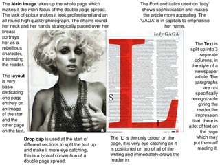
  • 1. The Main Image takes up the whole page which The Font and italics used on ‘lady’ makes it the main focus of the double page spread. shows sophistication and makes The lack of colour makes it look professional and an the article more appealing. The all round high quality photograph. The chains round ‘GAGA’ is in capitals to emphasise her neck and her hands strategically placed over her her name. breast portrays her as a The Text is rebellious split up into 3 character, separate interesting columns, in the reader. the style of a newspaper The layout article. The is very paragraphs basic are not dedicating specifically one page recognizable entirely on giving the an image reader the of the star impression and the that there is other page a lot of text on on the text. the page Drop cap is used at the start of The ‘L’ is the only colour on the which may different sections to split the text up page, it is very eye catching as it put them off and make it more eye catching, is positioned on top of all of the reading it. this is a typical convention of a writing and immediately draws the double page spread. reader in.
  • 2. the Main Image is positioned mainly on the left page A Stand first is used in a larger font at the however covers both pages in the double page spread start of the article to give a brief lowdown on which is unusual as many magazines have the picture what the article is about. The use of the colour taking up all of one page and have the other page filled blue on ‘Florence Welch’ draws the reader in with text. It is an Image of Florence and she is and automatically tells you who the article is positioned on a about. table covered by the American flag. You can see her whole body which is a typical convention of a There is not double page a lot of room spread. for text because of the main image being so large and spread out. The Drop cap is used at the start of the text to split the text up and make it more eye There is very little colour used on the double page spread and catching. the vast majority of the spread is black and grey. Using these dark colours helps to make the red (on the flag and her hair) look brighter so that it stands out more.
  • 3. The Main Image is positioned on the left hand side The stand first at the top of the page in pink is and although it isn’t very large, it takes up the whole the opening of the article. It is a quote from page as there is a lot of white space around it. The Alexander Burke herself which may entice the image of Alexander Burke has a good effect, as it audience and make them interested in what she catches the has to say readers after attention winning automatically the X-Factor. because of her sexy body language Mainly all and seductive of the text pose. The is black hand on hip and in creates a neat sense of columns, attitude and there are her eye no drop contact caps to with the split the audience text up creates a which may direct mode put the of address. audience off reading it. The only colour on the article is pink. The layout is very basic dedicating one This is used to reflect the gender of the page entirely on an image of the star and model and also to attract a female the other page on the text. audience to read the article.