
Recommended
More Related Content
What's hot
What's hot (20)
Viewers also liked
Viewers also liked (17)
Similar to Greyscale cover star facial expression conveys film character insight
Similar to Greyscale cover star facial expression conveys film character insight (20)
More from uzzthekid
More from uzzthekid (13)
Greyscale cover star facial expression conveys film character insight
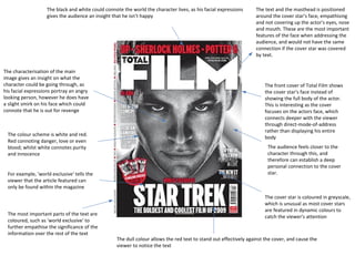
- 1. The black and white could connote the world the character lives, as his facial expressions gives the audience an insight that he isn’t happy The characterisation of the main image gives an insight on what the character could be going through, as his facial expressions portray an angry looking person, however he does have a slight smirk on his face which could connote that he is out for revenge The colour scheme is white and red. Red connoting danger, love or even blood; whilst white connotes purity and innocence For example, 'world exclusive' tells the viewer that the article featured can only be found within the magazine The most important parts of the text are coloured, such as 'world exclusive' to further empathise the significance of the information over the rest of the text The text and the masthead is positioned around the cover star's face, empathising and not covering up the actor's eyes, nose and mouth. These are the most important features of the face when addressing the audience, and would not have the same connection if the cover star was covered by text. The front cover of Total Film shows the cover star's face instead of showing the full body of the actor. This is interesting as the cover focuses on the actors face, which connects deeper with the viewer through direct-mode-of-address rather than displaying his entire body The audience feels closer to the character through this, and therefore can establish a deep personal connection to the cover star. The cover star is coloured in greyscale, which is unusual as most cover stars are featured in dynamic colours to catch the viewer's attention The dull colour allows the red text to stand out effectively against the cover, and cause the viewer to notice the text
- 2. The cover star is coloured in greyscale, which is unusual as most cover stars are featured in dynamic colours to catch the viewer's attention. The dull colour allows the red text to stand out effectively against the cover, and cause the viewer to notice the text. The most important parts of the text are coloured, such as 'world exclusive' to further empathise the significance of the information over the rest of the text. For example, 'world exclusive' tells the viewer that the article featured can only be found within the magazine. This magazine front cover uses two colours, red and white, as the previous example does, however it is altered slightly. The featured film 'Star Trek' is not coloured red, and instead is the second largest text on the page. The text 'world exclusive' is coloured red symbolise that it is more important than the film itself; the magazine is the first in the world to review the film, which is used as the selling point as consumers would buy the issue for its exclusivity, and not just for the featured film. Along the masthead, the front cover lists three other films that will be featured within the magazine. The text is also coloured red to indicate its importance and appeal to the audience The text is the third biggest on the page, surpassed only by the 'Star Trek' and 'Total Film' texts, which indicates that the magazine's name is the most important feature of the front cover, followed by the feature article of 'Star Trek', and then by the other three featured articles based on another set of popular upcoming films. It may also be stating a public opinion, based on reviews that other people have wrote about the film The bottom of the front cover says 'the boldest and coolest film of 2009', with the word 'coolest' underlined. This suggests that the magazine thinks that the Star Trek film is popular and well recieved, perhaps hinting that the article within the issue will convince the reader to see the film.
- 3. The title of the magazine is in two different colours. Total being in black to link in with the character and film in white to link in with the film title The masthead isn’t positioned over the masthead in this edition of Total Film, instead its positioned around the actors face, this could inform the audience that the actor isn’t well known yet, even though the magazine is well known The main image covers up the main image, and is a close up of the actor. This was done to give the audience a point of view on the actors facial expression and also to give them an insight on what the actor may be thinking in his head The main image looks like it was taken in a photo shoot, it looks more like an actors headshot photo The Unique Selling point (USP) is the name of the film star Trek, as it’s a well known film, and have been published throughout the years so the audience knows the film very well, which will guarantee to draw in potential buyers, as many people know the Star Trek franchise The clothing isn’t really clear in the main image, however the audience can see that the actor is wearing a black t-shirt. The colour black could connote darkness in the actor’s life. The background seemed to be edited, as it looks blurred out, this could give the audience an insight on what could be happening around the actor’s life, and also what could be happening to him. It’s almost like the editor of Total Film doesn’t want to give away too much of what’s going on in the background so that it remains ambiguous
Editor's Notes
- {}