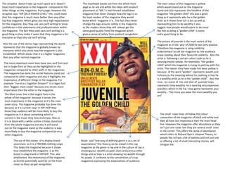
1. The main colour of this magazine is yellow
which would stand out on the magazine
stand and also represents the headline of the
magazine “the golden child” this was a good
thing as it represents why he is the golden
child as it shows how rich is but as well as
representing him to be wealthy it also
suggest how people would aspire to be more
like him as being a “golden child” is iconic
and a good thing to be.
The masthead stands out from the whole front
page as its red and white this helps with product
placement as “XXL” is well known established
magazine that never changes how the logo is so
for loyal readers of the magazine they would
know which magazine it is . The fact they never
change the logo ensures safety in the magazine
as the readers know they will always get the
same good quality from the magazine which
gives a sense of safety from product recognition.
The picture of juvenile is the main centre of the
magazine as in the year of 2000 he was very popular.
Therefore the magazine is using celebrity
endorsement to sell the magazine as the audience
enjoy reading about their favourite celebrity. Also the
artist is following a certain colour code as he is
wearing mostly yellow. He resembles “the golden
child” which the magazine is trying to portray with this
artist. The reason they have made him wear yellow is
because of the word “golden” represents wealth and
richness so the meaning behind his clothing is that he
is a wealthy artist as he is the “golden child”. Also the
mise –en-scene of the mid shot of juvenile helps
represents how wealthy he is wearing very expensive
jewellery which in the hip –hop game represents your
wealthy - “the more you wear the more wealthy you
are”
The small cover lines all follow the colour
convention of the magazine of black and white and
they all have less importance then the main head
line. However the magazine offer abundance as they
isn't just one cover line they are several small ones
in the corner. This offers the sense of abundance
which refers to Richard Dyer’s Utopian Theory, as
people like to have a lot of options and not just one
so offering a lot of small interesting stories will
intrigue the.
The strapline doesn’t take up much space as it doesn’t
have much Importance in the magazine compared to the
other things on the magazines front page. However the
strapline says “HIP ON A HIGHER LEVEL” this could state
that this magazine is much more better then any other
hip-hop magazine. Which gives you very high expectations
for the magazine. Also they use sans serif writing to show
confidence in the statements and professionalism within
the magazine. The fact they used sans serif writing is a
good thing as they make it seem that they magazine is for
everyone as they also use serif writing.
Also the use of the stereo logo representing the world
represents that the magazine is globally known by
everyone which also show how the magazine is also
established. Which shows that it is a higher magazines
then any other normal magazine
The more important cover lines have sans serif font and
are in larger font so they can be highlighted in the
magazines compared to other puffs in the magazines.
The magazine has done this so the features stand out
compared to other magazine and also it highlights the
importance of different things in the magazine. For
example “run-d.m.c together forever?” is in lager font
then “biggies mom cooks” because one serves more
importance then the other in the magazine.
The Main cover line is the largest font in the
whole of the magazine because it serves the
most importance in the magazine as it’s the main
cover story. The magazine probably has done this
because as it is current news in HIP-HOP they
know they audience will be more likely to buy this
magazine as it is about something which is
current in the music they love and enjoy. Also as
it is in black with a white outline it helps stand out
from the whole magazine and also it will stand
out on the magazine stand so the audience is way
more likely to buy the magazine compared to an y
other magazine.
Neale said “one way of defining genre is as a set of
expectations” this theory can be stated in this rap
magazine as the genre is rap and in the culture of rap is
showing your wealth via gold silver and various other
things and as they is a artist showing his wealth through
his jewels it conforms to the conventions of a rap
magazines expressing the expectations of audience.
The use of this stamp is to display brand
awareness as it is a YMCMB clothing range .
This helps the magazine because it shows
how established the magazine is as the
brand is a big brand in HIPHOP. This also
emphasises the importance of the magazine
as brands potentially want be on the front
cover so they can get recognition.
2. “one way of defining is as a set of expectations” – (Neale 1980)
Steven Neale said “one way of defining is as a set of expectations” this could be applied to this
magazine as because this magazine is a Hip-Hop/Rap magazine and the common conventions of
rap and hip-hop which is displaying your wealth through your image of yourself which could be
what you wear or what you have. For example French Montana is wearing several chains. So this
part of the magazine conforms to the genre theory as it is conforming to the common
expectations of a hip hop magazine. However it also subverts from the expectations because he
has his hands together as he is about to pray. So it wouldn’t conform to the general expectation of
a hip hop star or a hip hop magazine.
“genre are instances of repetition and difference” – Steven Neale we can see how this statement
can relate to this music magazine because this magazine conforms to its typical genre but also
subverts to its genre to stand out above from the other hip hop magazines we can see examples of
this by how French Montana is dressed to fit the part of a typical rapper with the hats chains and
clothing.
How ever he also subverts the typical conventions of this magazine as he comes of positioned as
he praying which subverts from the common conventions of a rap artist who prefers to portray a
thug type figure instead of one who is praying with both of his hands together.
3. This conforms to the male gaze theory as
she is shown to be showing of her assets
in the magazine and the male gaze theory
suggest that media is shown to please
men's eyes which this magazine is doing
by showing Nicki minaj skin instead of her
wearing clothes she comes looking
sexual.
This subverts from the feminine mystique
theory as it doesn‘t suggest or show
feminism of women not only being looked
at as a piece of meat but also being
recognised as a equal. That‘s why this
picture of Nicki minaj on the magazine
subverts the theory of feminine mystique as
she is shown to be barely wearing much
clothes and isn‘t portrayed as a housewife
or someone who works at the same level of
men. However as this is a 21st century
magazine she could conform to the
feminine mystique theory as her artist
portrays this and she is comfortable to
portray herself like this.