

Recommended
More Related Content
What's hot
What's hot (20)
Viewers also liked
Viewers also liked (20)
Similar to Teen now christine
Similar to Teen now christine (20)
Recently uploaded
Recently uploaded (20)
Teen now christine
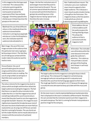
- 1. In this magazine the shot type used is mid shot. This is because the institution wants to grab the attention of the audience and mainly wants to look at the expression of their face and body language. I think they opted for this shot because it shows how close the groups on the cover are. The colour scheme for the magazine has stuck to colours which are bright and therefore attract the target audience to reading the magazine. The fact that there is no specific colour connotes to the reader that this is in fact the magazine has a bit of everything inside and the use of neutral colours means that they don't want to aim the magazine to one gender but both. However, this magazine cover slightly leans towards the females because most of the cover has stories that females are more likely to read and the use of using a lot of Pink can connote that this is aiming for females. The use of pink can tell the reader that the stories may be about love or romance with the connection of each band members. Non-Traditional Cover mount- The institution uses a non-traditional cover mount to appeal to their target audience. This is because a cover mount usually includes having a free gift on the front cover. This magazine shows us the free posters inside which are a form of advertising as well as grabbing the audience to read. Masthead-the use of two different colours in the masthead allows the audience to know that the institution is aiming at young people and also as it is the first thing that is seen, the institution want the audience to be attracted to it. Main Image- the use of this main image connotes to the audience that this particular main story is going to be focusing on Union J. The fact they are all making eye contact with the reader makes the audience want to read on more. Personification- the use of personification gives the sense of enigma and therefore makes the readers want to carry on reading. The use of using numbers as well gives it that little more surprise to the audience. Slogan- the fact the institution uses a 3 word slogan means that they want to keep it short and to the point. The use of summer special allows the audience to connect with and think that there is going to be something more in the magazine due to it being ‘special’ and therefore the sales increase. Direct address-the use of direct address with the audience gives the feeling of being unique. This allows the audience to feel a connection with the magazine itself. Alliteration- The institution uses alliteration within the cover because it tries and grabs the audience’s attention. This is done as many will take a second glimpse of the heading and if drawn in will most likely buy it. The target audience for this magazine is aiming for those in the D and C group. This is because this magazine is aimed at young teenage girls who are not working and still in education and therefore the use of non formal language appeals to them more. The rough age that this is aiming for is 11-17 because this age group is usually the ones who want to keep up to date with the music and gossip. On the cover music is mainly represented because nearly every story that is displayed on the cover is related to a different band. Therefore, this can connote that the institution wants to aim their magazine to one particular group. The fact it is aiming for female it also produces a positive image for the company.