Python Notes for mca i year students osmania university.docx
Masthead One
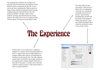
1. The colour option for this
mast head is a deep red and I
believe this is an appropriate
colour due to its connotation
of strength, power and also
passion – passion being
something that will link with
the context of the magazine
further down the line. I have
used Adobe Photoshop CS6 to
create this masthead by using
a satin, colour overlay.
The masthead font symbolises the nostalgia rock
genre that will be intertwined in the magazine as Jimi
Hendrix will be an inspiration for this task. As you
can see the font is connoting the 1960s era due to its
hippy writing; furthermore representing the meaning
of appreciating old, American Rock as this time
period was Hendrix’s heydays. I believe these
symbolic meanings and representations are strong
points as this certain font is easy to recognise its links
with the aspects of American rock during the 1960s.
I believe there is not a need to have a significant
emphasis on a specific font for the target audience as
there is a range of fans, from an older audience to a
younger audience that I believe will understand my
intentions for choosing this font. The older audience
would maybe be enticed by the nostalgic elements of
the magazine and a younger audience whom have a
clear lure for this genre - a modern twist to this font
could be an option to attract a wider niche market of
teens (a younger audience).