
Recommended
More Related Content
What's hot
What's hot (16)
Viewers also liked
Viewers also liked (16)
Similar to Front cover analysis
Similar to Front cover analysis (20)
Recently uploaded
Recently uploaded (20)
Front cover analysis
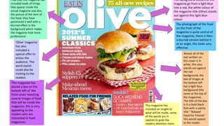
- 1. The background colours of the magazine go from a light blue into a red, the white colour of the magazine title (Olive) stands out against this light blue colour. The photograph of the food on the front of the magazine is quite central of the magazine, there is then a blurred version behind it at an angle, this looks very effective. Almost all of the text written on this cover is in white, this also stands out against the red background, the box of images at the bottom left has a light blue background (the same as the top of the magazine). The title of the box is in a bold black font with a catchy title “ Relaxed Food For Friends” this would appeal to the reader. This magazine has included an insight to what will be inside, some of the words are in capitals to grab the readers attention more. This magazine has placed a box on the bottom left of the front cover revealing several images of food that will be inside the magazine, this is very appealing to the readers who are interested in food magazines. ‘Olive’ magazine has also included a special offer to entice the audience. The word stylish could also be inviting to the readers I like that this magazine has included loads of things that appear inside the actual magazine and also the picture of the item of the food, they have positioned it well with a blurred effect in the background which makes the magazine look more professional