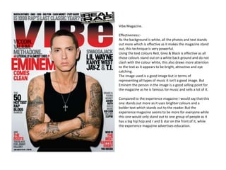
1. Vibe Magazine.
Effectiveness:-
As the background is white, all the photos and text stands
out more which is effective as it makes the magazine stand
out, this technique is very powerful.
Using the text colours Red, Grey & Black is effective as all
those colours stand out on a white back ground and do not
clash with the colour white, this also draws more attention
to the text as it appears to be bright, attractive and eye
catching.
The image used is a good image but in terms of
representing all types of music it isn’t a good image. But
Eminem the person in the image is a good selling point for
the magazine as he is famous for music and sells a lot of it.
Compared to the experience magazine I would say that this
one stands out more as it uses brighter colours and a
bolder text which stands out to the reader. But the
experience magazine seems to be more for everyone while
this one would only stand out to one group of people as it
has a big hip hop and r and b star on the front of it, while
the experience magazine advertises education.
2. THEXPERIENCE MAGAZINE
The background is quite effective as it doesn’t collide or
clash with any other the other colour on the magazine.
The images are effective as they are pictures of students
and relate to the magazine subject and purpose but at
the same time I don’t think it very effective as it is only
one picture and doesn’t really sell the magazine or give
an in depth idea of what the magazine is about..
The logo and writing are quite effect as they stand out.
Compared to the Vibe magazine this one seems to stand
out to more than one audience unlike the vibe magazine.
The colours on this cover done stand out as much as the
colours on the vibe magazine but they stand enough to
draw the reader’s attention and for us to read. The
pictures are also different to the vibe magazine as the
vibe magazines picture is only of one person while this
picture has 3 people one of which is a different race
which could draw more people attention as it shows it is
a magazine for all types of people and races.
3. The Vibe Magazine Contents
This contents page is quite effective as the theme and colour scheme
don’t seem to clash. The word “Contents” is bright and stands out to
the reader. The information on the contents is positioned quite well as
it is discrete but is a bright colour that attracts the eye to it. The picture
is also positioned well as it positioned in the middle at the bottom and
all the text fits around the picture nicely. The picture seems to also
relate to the subject of the magazine and seems to also give a nice
vision about what the magazine will be about and hold inside. Also the
“V” for vibe magazine is positioned nicely and stands out to the reader
and almost gives it a trademark as on most of their magazines there
are “V” like this one on the contents page. The clothes and style of
clothing the person in the picture is wearing also gives a great insight
as he is wearing a baseball cap backwards, expensive gold and silver
chains, ring s, a pendant and no top along with tattoos on his body.
This gives the image of gangsta rap or gangsta / afro Caribbean related
subjects.
Overall this contents page is good and effective as it is simple but
effective and shows a lot by saying little.
This magazine is a completely different style compared to the city
magazine below as they have no similarities but they both stand out a
lot and have good colour schemes and give the reader a wealthy insight
into what is in the magazine.
4. Magazine Contents
This magazine content page is very good and stands out quite a
lot even though a dark dull colour is the background. The
pictures used in the magazine are very bright and stand out and
the photography is very good. This magazine contents page has
been put together very well. It uses white writing on a black
background which is a great mix as there opposite colours that
stand out great on one another. The title “contents” is also
white and is bigger than the rest of the writing which gives it
presence on the page. The subtitle “features” is also bigger than
the rest of the writing but is a brown which reduces the amount
it stands out but it also gives this title presence. The pictures
chosen give an insight and idea of what the magazine will be
about as the pictures all show either the city or people so this
gives an idea of the magazine regarding community and land.
This magazine is set in a typical conventional way as it is vertical
but the theme and colour scheme of this magazine is done and
chosen very well.
Overall this is a greatly designed magazine which stands out a
lot to the user.
Compared the vibe magazine above this magazine seems to
have a completely different style of attracting readers. But both
magazines are effective and would both draw readers in.
5. Magazine Contents
This magazine seems to have a basic but effective them as the
background is white then the main image is big on the page.
This takes after the normal conventional type of magazine as
it is vertical but this still makes this contents stand out. The
main image of the magazine is taken and illustrated very well
but the image doesn’t really give an insight of what the
magazine will be about. The title content stands out as it is a
completely different colour to the rest of the writing on the
magazine so it has presence, it is also a different font to the
rest of the magazine and having a range of fonts on a
magazine stands out and gives the magazine complexity.
Under the title features which is also a different font and
colour to the rest of the writing there are some main titles of
the pages in the magazine. These titles also stand out as there
bold and then in thinner writing underneath give you a
greater insight into what them pages will be about. Other
images incorporated in this magazine are quite effective as
well as it shows images of what the page holds following by
the page number.
Overall this is an effective quite simple magazine that will
attract readers.
Compared to the vibe magazine below this magazine is set up
a bit more correctly as it gives more of an insight into what
the magazine holds inside.
6. Vibe Magazine Contents 2
This contents page portrays the traditional conventional type of
magazine as it is vertical. You can tell this magazine is a “vibe”
magazine as it has the traditional “V” at the top half of the contents
page. The writing is effective and stands out as it is a bright white
colour which stands out the background which is black around
where the word content is located. The rest of the contents
information also stands out as it is black writing on white
background; it also stands out because it is a different font to the
rest of the magazine. The picture used is effective and shows who
the magazine is aimed at as it is a woman being quite revealing and
seductive but the picture doesn’t really give an insight into what the
magazine will be about.
Overall I think this magazine contents page is quite good in the way
it is set up but the pictures could be set a bit more different and
effectively as it could give more of an insight into what the
magazine is about.
Compared to the magazine above this magazine has more presence
as it is simple and effective.