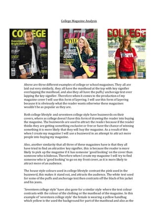
1. College Magazine Analysis
Above are three different examples of college or school magazines. They all are
laid out very similarly, they all have the masthead at the top with key signifier
overlapping the masthead, and also they all have the puffs/ anchorage text over
lapping the key signifier. Therefore when it comes to the production of my
magazine cover I will use this form of layering. I will use this form of layering
because it is obviously what the reader wants otherwise these magazines
wouldn’t be as popular as they are.
Both college lifestyle and seventeen college style have buzzwords on their
covers, where as college doesn’t have this form of drawing the reader into buying
the magazine. The buzzwords are used to attract the reader because if the reader
thinks they are getting something exclusive or free or have the chance of winning
something it is more likely that they will buy the magazine. As a result of this
when I create my magazine I will use a buzzword in an attempt to attract more
people into buying my magazine.
Also, another similarity that all three of these magazines have is that they all
have tried to find an attractive key signifier, this is because the reader is more
likely to pick up the magazine if it has someone ‘good looking’ on the cover than
someone who is hideous. Therefore when I create my magazine I will try to find
someone who is ‘good looking’ to go on my front cover, as it is more likely to
attract more of an audience.
The house style colours used in college lifestyle contrast the pink used in the
buzzword, this makes it stand out, and attracts the audience. The white text used
for some of the puffs and anchorage text then contrasts off the black of his jacket
and his jeans.
‘Seventeen college style’ have also gone for a similar style where the text colour
contrasts with the colour of the clothing or the masthead of the magazine. In this
example of ‘seventeen college style’ the female is wearing a yellow handbag
which yellow is the used the background for part of the masthead and also as the
2. text colour for a puff and the ‘win’ in the buzzword. The fact that this magazine
has done this makes it look more like a fashion magazine, which for the age
group it is targeted at (teenagers to early 20’s) is more likely to be popular as
people of that age are going to be interested in the best or latest fashion.
The college magazine uses the colour from the female’s top as the colour of the
masthead and the denim colour of her shorts for the puffs/ anchorage text; these
colours form the house style for the magazine. This shows that there is a link
between the person who is at college and possibly the content which is shown
within the magazine, this is what the reader of this magazine is going to want –
information and stories from the inside of the college to see what college life is
like.
Therefore when it comes to the production of my magazine I will link the colours
of the key signifier and the house style of the magazine. Also, there are four main
text colours on each of the three magazine covers which link with the key
signifier, so I will also try to use four main text colours these colours must link
with the key signifier.
ContentsPage
Here is an example of a contents page,
which was made by another student,
the use of the lined paper background
like you’d find in an exercise book
means that it can be identified easily as
a school or college magazine. This is
something I would consider doing
when I create my magazine.
The house style for this contents page
is very plain and simple, white, grey,
blue and black these are also some of
the colours used on the lined paper.