❤️Amritsar Escort Service☎️9815674956☎️ Call Girl service in Amritsar☎️ Amrit...
Alicia keys cove
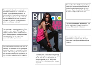
1. The masthead is placed in the centre and
behind the artists head. The masthead can be
covered as it is a well-established brand, so
seeing only half is recognisable to the audience.
There is bold white text that is filled with color
and the large texts fills the page so it appears
striking to the audience , the white text with
colour is a well known trademark.
The date price and bar code are a usual
convention of a magazine cover, the buyer
would need to see this to see the price of the
magazine.
The main image is situated in the centre of the
magazine. It takes up a lot of the page. The
celebrity is in direct address with the audience
which allows the audience to engage more with
the magazine and feel like they’re being
welcomed into the magazine more.
The main cover line is the name of the artist on
the cover. The font is bold and the colour is the
same colour as is on the artists top. This allows
a theme to flow through the cover which allows
it to all connect together. This would attract the
fans of the artist to want to read the magazine.
The rule of thirds is continued throughout this
magazine cover, you can clearly see three grids,
the left hand side is full of coverlines, the
centre is the image and the right is more
coverlines. This makes the cover look neat and
organised.
The coverlines show that the magazine features
other artists, this enables the magazine to be
targeted to a wider audience than just Alicia
Keys fans. They’re also bold which allows them
to stand out and catch the readers eye.
The colour scheme is grey, white and pink. This
all fits together and links with the clothing /
makeup of the celebrity on the cover.