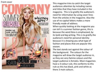
1. This magazine tries to catch the target
audiences attention by including names
and titles that they have included in the
magazine. This is to gratify the audience’s
need for information by using cover lines
from the articles in the magazine. Also the
use of no capital letters makes a more
friendly mode of address.
When quickly looking at the magazine you
can tell it a summer fashion genre, this is
because the word Ibiza is emphasized, by
its bold and big writing. This is to gratify the
audience’s need for personal identity
because it is showing you what type of
fashion and places that are popular this
season.
The text stands out against the colour of
the background. The colours for the
magazine will draw the target audience in,
as they are very famine colours and the
target audience is females. Most magazines
have a 3-colour rule, this conforms to this
rule as this has black, pink and white as
there 3 main colours.
Front cover
2. Front cover
This magazine has large cover lines
which stand out, giving details about
what the magazine contents. This gives
the target audience a incentive to buy
the magazine. Also these cover lines
gratify the audience’s need for
entertainment, by including these is an
enigma and the only way the audience
will find out about the cover lines is if
they buy the magazine.
This front cover also includes celebrity
endorsement, this will attracted
audiences who like that particular
celebrity. This enhances the audience’s
need for personal identify as
celebrities draw many of the target
audience in.
The masthead for this front cover is
clear and unique for the magazine, this
is so that the target audience
associates the font to that specific
magazine.