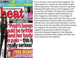
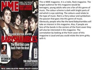
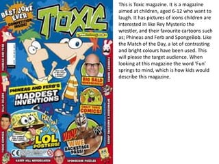
1. This is the cover of an issue of Heat magazine. The
target audience is women of near enough all ages
who are gossip fans. The colour scheme is quite eye
catching with bright colours on the magazine such
as; red, blue and yellow. This draws the customers
eye towards this magazine before looking at any
other magazine on the shelves. It has images of
famous celebrity's each week upon the cover, so the
buyer would want to find out about the celebrity if
they like them, this week Victoria Beckham is on the
front cover so her fans would be interested in buying
this magazine. The semiotics in the name heat
suggest hot gossip about celebrity. The genre
convention of gossip magazines is that all gossip
magazines all cluttered with images, and most may
have a quote from the celebrity.
2. This is NME magazine. It is a Indie, Rock magazine. The
target audience for this magazine would be
teenagers, young adults who are a fan of this genre of
music. The colour scheme is dark with bright parts of
red which is eye catching. The colours used relate to
the type of music. Red is a fiery colour and symbolises
the passion that goes into this genre of music.
Obviously, people who like the band Babyshambles will
take an interest in this magazine. Also, if people are
fans of the bands in the corners of the front cover they
will also be interested in this magazine. The
connotation by looking at the front cover of this
magazine is Loud and you could relate the term gritty
with it.
3. This magazine is aimed at kids aged 6-
14 and most probably aimed at
boys, who are interested in football.
However, some girls who like football
will find this magazine a good magazine
for them. There is no set colour scheme
for this magazine, as there are a lot of
different colours appearing on the
magazine, because of the football shirts
the player are using. On the other
hand, as it is a Match of the Day
magazine it has the font in black with
the yellow background, which is the
typical Match of the Day colour scheme.
It has a bit of red font colours on the
magazine as well as the black and
yellow. It has many players from
different clubs on the cover. This is good
because, it will catch the eye of the
supporters who support the club which
feature on the front of the magazine. It
would be bad if just Wayne Rooney was
on the front, as it won’t appeal to
Manchester City fans, luckily though
Tevez represents Manchester City.
4. This is a Fishing magazine and unlike the
Match of the Day magazine, it has more
of a set colour scheme. The only colours
that are really being used on this
magazine are blue, orange and a white
font. The colour blue has the
connotation of water and sea. It is a
colour that relates to fishing. The colour
orange is used as it contrasts with blue
and it stands out on the magazine. These
two colours are good colours to use. The
target audience for this magazine are
obviously going to be people who are
interested in fishing, but the person on
the front cover is a man aged around 40-
50 so it would appeal to this age of
people more than it will appeal to
teenagers or other age generations.
5. This is the gossip magazine called ‘OK!’. Like
the heat magazine, it uses some bright
colours that are very eye catching, red has
been used here to get the attention of
people interested in Cheryl Cole, or Steven
and Alex Gerrard. The magazine is aimed at
women, and maybe some men who are
interested in gossip, and want to know
every detail about each and every celebrity.
The red used symbolises hot news or hot
gossip. I prefer the Heat magazine’s colour
scheme to this magazines because, Heat
magazine has a white background which
makes the red font stand out more.
Also, the blue used in Heat contrasts with
the red, the red and purple used in this
magazine do contrast but not as much as
the red and blue used in Heat.
6. This is Toxic magazine. It is a magazine
aimed at children, aged 6-12 who want to
laugh. It has pictures of icons children are
interested in like Rey Mysterio the
wrestler, and their favourite cartoons such
as; Phineas and Ferb and SpongeBob. Like
the Match of the Day, a lot of contrasting
and bright colours have been used. This
will please the target audience. When
looking at this magazine the word ‘Fun’
springs to mind, which is how kids would
describe this magazine.