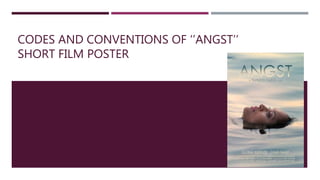
2. IMAGE
The focus of the poster is on an actress who is most likely the
protagonist.
Image is in medium close up which is a common convention for short
film posters.
The background (water) could be used as metaphor for the deeper
meaning of the film.
The thoughtful expression on the actress’ face suggests the topic is
more suited for an older audience.
Her facial expression also causes the audience to wonder why she’s
like that (creates hermeneutic/proeretic code).
3. TEXT
The title is made large and bold to be obvious and eye catching to the
audience.
The title ‘Angst’ creates hermeneutic code which would attract a wide
audience that isn’t specifically meant to be targeted.
The name of the director is just underneath the title of the short film
to emphasise his importance.
Just above the credits, the names of the two main actors are displayed
in a white, thin font to contrast the background so that they are visible
but not too obvious to the audience.
At the bottom of the poster there are names of the production team,
the font used is much smaller as its not the most relevant information
that the audience needs to receive.
4. COLOURS
The colours used are very simple and light which is a common
convention for these types of short films.
Blue has connotations of freedom and is associated with
relaxation, which clashes/contrasts with the film’s title and the
actress’ facial expression; this confuses the audience and
creates further hermeneutic code (Barthes).