Model Call Girl in Bikash Puri Delhi reach out to us at 🔝9953056974🔝
Poster point analysis
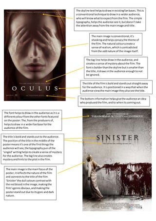
1. The skyline text helps to draw in existing fan bases. This is
a conventional technique to draw in a wider audience,
who will know what to expect from the film. The simple
typography, helps the audience see it, but doesn’t take
the attention away from the main image and title.
The main image is conventional, it’s
shocking and helps convey the theme of
the film. The natural colours create a
sense of realism, which is contradicted
from the odd nature of the image itself.
The tag line helps draw in the audience, and
creates a sense of mystery about the film. The
font is bolder than the skyline but is smaller than
the title, it draws in the audience enough to not
be ignored.
The title of the film is bold and stands out straight away
for the audience. It is positioned in a way that when the
audience view the main image they also see the title.
The bottom information helps give the audience an idea
who produced the film, and to when its coming out.
The font helps to draw in the audience as it is a
different colour from the other fonts featured
on the poster. The, from the producers of,
helps to draw in a wider fan base for the
audience of the film.
The title is bold and stands out to the audience.
The position of the title in the middle of the
poster means it’s one of the first things the
audience will see, the typography pun of the
‘singed’ writing helps to create a sense of mystery
for the audience. The tag line also creates
mystery and hints to the plot in the film.
The main image is the main focus of the
poster, it reflects the nature of the film
and connects to the title of the film
‘Sinister’ the dull colours contrast with
the red blood in the image, making the
film’s genre obvious, and making the
poster stand out due to its gore and dark
nature.