Ancillary task film review analysis - Pirates Of The Caribbean
Ancillary task movie poster analysis - The Dark Knight Rises
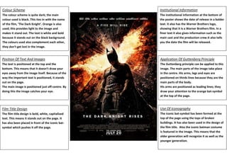
1. Colour Scheme
Institutional Information
The colour scheme is quite dark; the main
colour used is black. This ties in with the name
of the film, ‘The Dark Knight’. Orange is also
used; this provides light to the image and
makes it stand out. The text is white and bold
because it stands out on the black background.
The colours used also complement each other,
they don’t get lost in the image.
The institutional information at the bottom of
the poster shows the date of release in a bolder
text. It also has the Warner Brothers logo,
showing that it is a Warner Brothers film. In a
finer text it also gives information such as the
main cast and the production crew.It also tells
you the date the film will be released.
Position Of Text And Images
Application Of Guttenberg Principle
The text is positioned at the top and the
bottom. This means that it doesn’t draw your
eyes away from the image itself. Because of the
way the important text is positioned, it stands
out on the page.
The main image is positioned just off-centre. By
doing this the image catches your eye.
The Guttenberg principle can be applied to this
image. The main parts of the image take place
in the centre. His arms, legs and eyes are
positioned on thirds lines because they are the
main parts of the body.
His arms are positioned as leading lines; they
draw your attention to the orange bat-symbol
at the top of the page.
Film Title Design
Use Of Iconography
The film title design is bold, white, capitalized
text. This means it stands out on the page. It
has also been placed in front of the iconic batsymbol which pushes it off the page.
The iconic bat-symbol has been formed at the
top of the page using the tops of broken
buildings. It has also been used in the design of
the film title. Also the iconic batman costume
is featured in the image. This means that the
older generation will recognize it as well as the
younger generation.