2. Film Title
The title of the film looks quite
rustic and old as some of the letters
are slightly faded and patchy. This
could indicate to the audience the
time in which the film was set. The
colour of the text is a red which
stands out effectively against the
light blue and white background.
3. Actors
The actors names are displayed in a
different colour to the title of the film
and in a bolder font. This could indicate
the importance of their involvement.
Towards the top of the film poster, the
colours get darker and so a white text is
used to stand out.
The actor’s names are placed at the top
of the poster. This is usually the first
thing that the audience reads and so
they will be informed straight away as to
who the protagonists are and whether
the film is for them or not.
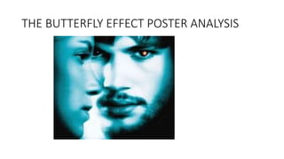
4. Main image
The colour of the image has be edited a lot
to produce a low saturation and a blue hue.
This look gives a sense of a distorted version
of reality and fits in with the sci-fi/thriller
convention. The male protagonist’s face is
very desaturated and washed out. This
could indicate that he has no of love or
compassion, he looks almost ghost like. The
female protagonist is seen to be as close to
the camera as the male protagonist, but her
head is turned side on to the audience. It
looks as if she is either deep in thought or
staring at something off screen. This adds a
sense of mystery to the story. Both of the
main characters have blank expressions on
their face which leaves an uncertainty with
the audience as to why they have become
this way and what their role is in the film.
The male protagonist makes a direct eye
contact with the audience creating a
tension and sense of intimidation. However,
this eye contact still adds a connection and
will encourage the audience to watch the
film.
The hint of red in the male protagonists eye
stands out significantly against the blue and
white colours that dominate the poster. As
well as this, it could also indicate to the
audience that he has supernatural powers.
5. Tagline or slogan
This tagline is effective as it keeps the
audience guessing. This creates an
enigma and will encourage the
audience to watch the film.
The tagline is also good as the spacing
between the tagline enables the reader
to pause in between giving a more
dramatic effect.
6. Cast and crew
Due to the posters image being so
huge, the billing block has been put
around the perimeter of the poster to
avoid it covering the protagonists
faces.
The actors and anyone who was
involved in the production of the film
will appear in the billing block. The
billing block is a legal requirement and
gives the audience information about
who is in it and they can therefore
make a judgement about whether or
not they want to see the film.