
Recommended
More Related Content
What's hot
What's hot (20)
Viewers also liked
Similar to Posters Analysis
Similar to Posters Analysis (20)
Recently uploaded
Recently uploaded (20)
Posters Analysis
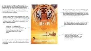
- 1. Suraj Sharma is the main star of the film, yet he was very unknown during the advertisement of the movie. His star power is not large, therefore naming him on the poster is unimportant. The close up shot of the tiger is impressive and almost surreal, informing the viewer of a magical atmosphere in the film. The tiger is golden along with the background, creating a sense of warmth and also introducing the theme of religion. The beauty of the image shows that the film has advanced cinematography and wins over the audience by the impressive nature. The film title is in a bold white font, standing out against the darker golden part of the image. The font is made of straight lines and is simple, ensuring to not take all focus away from the stunning image behind. Instead of having the actor’s name listed clearly on the poster, the director is listed. This is due to the director’s popularity and reputation in the industry: he is an obvious success. Winning the ‘Academy Awards’ is a highly respected achievement, informing the viewers that the director is taken seriously and the film is going to be of high standard. As in most film posters, the crew and institution is listed in a thin font, easily readable but not overly noticeable to make sure the focus does not leave the most important visuals and information on the poster. Once again, due to being an unknown actor, the protagonist is not needed to be seen clearly as advertisement on the poster. This image also hints at the isolation in the story. This slogan is centred on the page, making it noticeable. The font is once again easily read, but smaller and letters are slightly shadowed to blend into the background and avoid distraction from the main title. The simple repetition of “believe” sticks in the readers mind and the positive against negative intrigues without telling anything of the story. In this sentence, the theme of surrealism is once again introduced.
- 2. This poster is digitalised, initiating the futuristic and surreal atmosphere of the film. Cool tones suggest digitalisation whilst also creating an unapproachable appearance, hinting that the world behind the heroes is dangerous or in danger. The actors each have warm tones, contrasting against the cold background and gaining an appearance of trust and safety. Gold tones are shown in skin, proving the power of the characters. By creating the idea of power, the likeability of the characters is enhanced and perks the interest of the audience. The contrast of oranges against blues makes the image more noticeable, again attracting viewers. Robert Downey Jr. is shown larger than the rest of the cast, being the one with the largest star power. The actor is known for starring in successful action films, informing the viewer that the film is going to be of that genre and will probably a high standard. Chris Hemsworth is also extremely well known, also landing a place in the foreground to attract viewers. The cast is named in an easily understandable font and all capitals to ensure the stars can be identified and convince fans of their acting to watch the film. Each star is well known to other genres of film as well as action with large followings, meaning that stating the cast will ensure viewers interested in other genres. The release date is in a stark white font (the same as the title’s font to stand out) against a black background to make sure it is easily identified. The placement of the centre of the poster also ensures that it will not be missed. The film title is centred and stands out against the background clearly. The slight gradient on the text creates a metallic and once again futuristic appearance. The motif of red and white appears continuously through the poster, advertising the brand ‘Marvel’ and attracting their strong following. Information of the cast and crew is presented in a blue font which could easily disappear into the background. This is done to avoid taking the attention away from the main focuses: the title, the brand, the stars and the special effects
- 3. The background of the image is white, keeping the main focus on the star of the film. Dark eye makeup mimics the eyes of a swan, fitting with the title of the film and storyline. Her skin is painted and airbrushed white, once again mimicking a swan whilst allowing the dark eyes lips and contours of her face to stand out more and appear more impressive and demon-like. Red eyes match lips to create the sense of danger and inform the genre of the film. The red tones are continued throughout the poster and is used on font to resemble blood and gore. The only parts of the photo used that is focused are her eyes, ensuring that they are the most dynamic and shocking as possible. The crown matches the silver and black tones of the eyes with sharp ridges which appear slightly like knifes, hinting at danger. The font is narrow and sharp, indicating horror alongside the deep black contrasting with the white background. In capitals, it is clearly understood and centred to capture the viewers attention. The cast and crew are listed less obviously in this poster than the previous. I believe that this is to keep the focus on that star: Natalie Portman. The font is in a blood red, continuing the theme of horror. Being an unspecific release date, it is not needed to be seen clearly, the font rounded and deep red with a slight transparency to blend into the image beneath. The main stars are listed in a wide spread font, creating more of an impact and attracting more attention to their names. Each star is very well known- hence being listed on the poster (to attract fans and others who are familiar with their previous work). The awards are mirrored on each side of the centred image, balancing one another and in a dark font matching the dark shades of the eye makeup. This makes the font noticeable and the awards more impressive, allowing viewers whom are interested in the industry to be attracted for the film itself and not the star power.