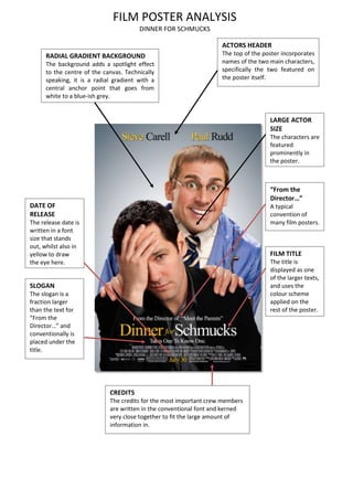
1. FILM POSTER ANALYSIS
DINNER FOR SCHMUCKS
ACTORS HEADER
The top of the poster incorporates
names of the two main characters,
specifically the two featured on
the poster itself.
RADIAL GRADIENT BACKGROUND
The background adds a spotlight effect
to the centre of the canvas. Technically
speaking, it is a radial gradient with a
central anchor point that goes from
white to a blue-ish grey.
LARGE ACTOR
SIZE
The characters are
featured
prominently in
the poster.
“From the
Director…”
A typical
convention of
many film posters.
FILM TITLE
The title is
displayed as one
of the larger texts,
and uses the
colour scheme
applied on the
rest of the poster.
CREDITS
The credits for the most important crew members
are written in the conventional font and kerned
very close together to fit the large amount of
information in.
DATE OF
RELEASE
The release date is
written in a font
size that stands
out, whilst also in
yellow to draw
the eye here.
SLOGAN
The slogan is a
fraction larger
than the text for
“From the
Director…” and
conventionally is
placed under the
title.