1. Question 4: Who would be the audience for your media product?
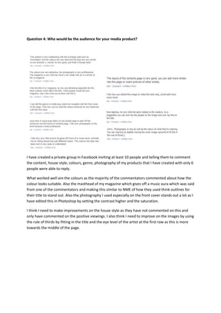
I have created a private group in Facebook inviting at least 10 people and telling them to comment
the content, house style, colours, genre, photography of my products that I have created with only 6
people were able to reply.
What worked well are the colours as the majority of the commentators commented about how the
colour looks suitable. Also the masthead of my magazine which gives off a music aura which was said
from one of the commentators and making this similar to NME of how they used think outlines for
their title to stand out. Also the photography I used especially on the front cover stands out a lot as I
have edited this in Photoshop by setting the contrast higher and the saturation.
I think I need to make improvements on the house style as they have not commented on this and
only have commented on the positive viewings. I also think I need to improve on the images by using
the rule of thirds by fitting in the title and the eye level of the artist at the first row as this is more
towards the middle of the page.
2. Question 5: How did you attract/address your audience?
With the contents page, I added an extra feature of the number issue ‘213’ and I made this black and
bigger than the fonts beside as this is where the audiences will focus on if they had missed out any
previous issue.
The image I took are a boy band which would attract female teenagers or above. One of the
commentators said it looks professional which I edited in Photoshop using colour balance and
saturation for this to become the right standard of a magazine. I also used fix tools for the skin in
order to make the image of the boys look better than they really are in reality which goes the same
for actual music magazines.
House style for the cover lines I used ‘generation humiliation’ as this is an issue and it rhymes well in
order for the readers to be easily notified what it’s about. I also used alliteration on ‘Bringing back’
the reason for this is the use ‘b’ makes them want to say it physically and this would be kept in their
minds.
Design and layout is similar to Q the magazine which is said to be eye-attracting. The colours I used
are suitable for the target audiences which the colour red stands out. For my contents page, I
wanted to include other artists but they are less important than the main issue of the magazine. For
the double page, I made the font plain black because the black colour stands out more in contrast
with the plain white colour background.
Using the Guttenberg principle with the primary optical area this includes the masthead and the
bands eye contacting towards the readers. The title ‘encore’ creates a good atmosphere which is
quite similar to the rolling stones masthead where the outline is black to define this and to be easily
recognised from the readers.