

Recommended
More Related Content
What's hot
What's hot (19)
Similar to Production diary FMP
Similar to Production diary FMP (20)
More from Daniel Thompson
More from Daniel Thompson (20)
Recently uploaded
Recently uploaded (20)
Production diary FMP
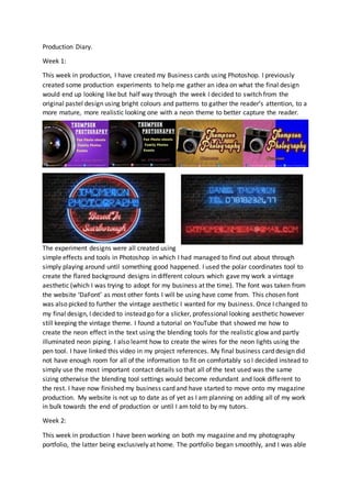
- 1. Production Diary. Week 1: This week in production, I have created my Business cards using Photoshop. I previously created some production experiments to help me gather an idea on what the final design would end up looking like but half way through the week I decided to switch from the original pastel design using bright colours and patterns to gather the reader’s attention, to a more mature, more realistic looking one with a neon theme to better capture the reader. The experiment designs were all created using simple effects and tools in Photoshop in which I had managed to find out about through simply playing around until something good happened. I used the polar coordinates tool to create the flared background designs in different colours which gave my work a vintage aesthetic (which I was trying to adopt for my business at the time). The font was taken from the website ‘DaFont’ as most other fonts I will be using have come from. This chosen font was also picked to further the vintage aesthetic I wanted for my business. Once I changed to my final design, I decided to instead go for a slicker, professional looking aesthetic however still keeping the vintage theme. I found a tutorial on YouTube that showed me how to create the neon effect in the text using the blending tools for the realistic glow and partly illuminated neon piping. I also learnt how to create the wires for the neon lights using the pen tool. I have linked this video in my project references. My final business card design did not have enough room for all of the information to fit on comfortably so I decided instead to simply use the most important contact details so that all of the text used was the same sizing otherwise the blending tool settings would become redundant and look different to the rest. I have now finished my business card and have started to move onto my magazine production. My website is not up to date as of yet as I am planning on adding all of my work in bulk towards the end of production or until I am told to by my tutors. Week 2: This week in production I have been working on both my magazine and my photography portfolio, the latter being exclusively at home. The portfolio began smoothly, and I was able
- 2. to go out in my own time after college and on my days off to take long walks around Scarborough and capture photos of the nature and landscapes nearby. The problems arose later during the week when my all my planned friends were unable to turn up to my photoshoot for various personal and work-related issues. Although slowing down my work a load, I was still able to work around this and instead decided to fully focus on nature shots as I could easily access them. Once I got the photos, I used Photoshop to manipulate and add effects to them to further resemble what I saw on my travels. I used many tools ranging from adding noise to black & white, colour range and vignettes to contrast and even blur. These effects were used to add a specific style to each individual photo but to also show off what I could do with editing in Photoshop. My magazine production has been a lot more complicated for me so far as I have been creating a whole new colour scheme, layout design and all the content for a product that is supposed to be created by a different company to my own. For the magazine experiment, I decided to attempt to create a more faded, worn looking design. I followed a tutorial I found online that showed me how to add scratches and wear and create a vintage filter to give the cover a great starting aesthetic to build from. At this point, I need to take what I have learnt from this magazine design and add the necessary elements to my final cover. This may include any filters, fonts and colour schemes used. Week 3: Production this week has been solely based upon my final magazine design. I have been creating the cover for my magazine and have decided to change it to a clearer, bolder design in which the reader can quickly and easily distinguish the subject, motive and brand of the magazine. I have changed the colour scheme to a much more mature and professional looking palette featuring more vibrant, eye catching colours to attract more readers and pull them in, actual photography of my own in the background to show off my own skills using and editing camera work and also more relevant fonts to the changes that have been made. I decided to take this modern turn to further differentiate the product from my planned website and business card designs as they already donned the vintage aesthetic. No extra YouTube tutorials were used in the creation of the cover as I had learnt all I needed to know in my design experiments. I may look for more however for the planned photography guide further into the magazine design later. Week 4: This week, I began following my planned layout for my inside and contents page using Photoshop. I used one of my photos from my portfolio for the background of the inside page as the colour palette blended well with the original design of the page planned in my planning PowerPoint. I edited the photo, adding more contrast and slightly decreasing the
- 3. brightness of it to further follow the darker theme. To avoid the content looking like a filler, I added a website link to the bottom of the page to suggest it was an advert for a photography business. My contents page took direct inspiration from a magazine I found while creating a mood board for magazine layouts during the research phase, featuring a sectioned off design using lines and dotted lines to differentiate between different pages and subjects. I decided to keep the background of this page plain white as to not distract the reader from the content on the page such as the page numbers and images.