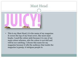
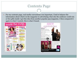
1. I N W H A T W A Y D O E S Y O U R M E D I A P R O D U C T
U S E , D E V E L O P O R C H A L L E N G E F O R M S A N D
C O N V E N T I O N S O F R E A L M E D I A P R O D U C T S ?
Evaluation Question 1
2. Mast Head
• This is my Mast Head, it is the name of my magazine.
It covers the top of my front cover, like most mast
heads, I used the colour pink because it is one of my
main colour schemes, also the colour is not dull and
will be eye-catching. I choose this name for my
magazine because it tells the audience that inside the
magazine is gossip, it intrigues people in.
3. Fonts
On my front cover, contents page and also double page spread, I
have kept my fonts either the same or similar all the way through, I
decided to do this because it is easy to read for the ages I am aiming
for, even the little details like the date and issue number is kept
simple. Even though my mast head and main headline is larger
than the rest of the writing, the font it still kept simple and bold.
Making sure the font is either the same or very similar throughout
my magazine, will keep the design the same and keep it
professional.
4. Contents Page
For my contents page, real media conventions was important, I had to balance the
information about what's in the magazine to advertising what else the audience could win
or free gifts inside I got this idea from another popular pop magazine, I then compared it
again to what I wanted, this is what I found;
5. Double Page Spread
When I was making my double page spread, I looked at the conventions of other pop
magazines, this gave me an idea on the layout I was going to aim for, this is the example I
looked at compared to my own double page spread;
6. Sub Headlime
A sub headline is another convention of a real media product,
here I made sure the audience would know what it inside the
magazine as the main article, still sticking to my colour scheme,
by doing this will attract the audience because I have also
added a buzz word “exclusive” so people know this is the only
place to find the information advertised.
7. I tried to keep some conventions the same, using the space provided in the
right way and getting in the information I needed, also the pictures I have
decided to use portray happiness and fun.
I researched the conventions of a media product, I looked at various pop music
magazines and picked out ways I could make my product similar, sometimes
using the same conventions that they have, I done this because including the
various conventions would attract my target audience just like the magazines
bought world wide.