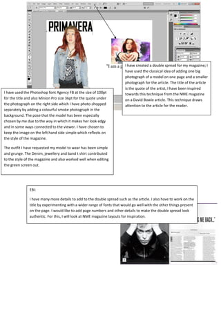
1. I have created a double spread for my magazine; I
have used the classical idea of adding one big
photograph of a model on one page and a smaller
photograph for the article. The title of the article
is the quote of the artist; I have been inspired
towards this technique from the NME magazine
on a David Bowie article. This technique draws
attention to the article for the reader.
I have used the Photoshop font Agency FB at the size of 100pt
for the title and also Minion Pro size 36pt for the quote under
the photograph on the right side which I have photo-shopped
separately by adding a colourful smoke photograph in the
background. The pose that the model has been especially
chosen by me due to the way in which it makes her look edgy
and in some ways connected to the viewer. I have chosen to
keep the image on the left hand side simple which reflects on
the style of the magazine.
The outfit I have requested my model to wear has been simple
and grunge. The Denim, jewellery and band t shirt contributed
to the style of the magazine and also worked well when editing
the green screen out.
EBI:
I have many more details to add to the double spread such as the article. I also have to work on the
title by experimenting with a wider range of fonts that would go well with the other things present
on the page. I would like to add page numbers and other details to make the double spread look
authentic. For this, I will look at NME magazine layouts for inspiration.