
Recommended
More Related Content
What's hot
What's hot (20)
Viewers also liked
Viewers also liked (15)
Similar to Question 7
Similar to Question 7 (20)
Recently uploaded
Recently uploaded (20)
Question 7
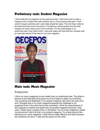
- 1. Preliminary task: Student Magazine I didn't really like my magazine for the preliminary task. I didn't know how to make a magazine and I couldn't work with publisher yet so I did everything with paint. There weren't enough coverlines and I used really simple font types. The only thing I really do like about this front cover is the picture. The lighting in almost perfect and the white background made it easy to put in the coverlines. For the contentspage in my preliminary task I only made a draft. I was quite happy with that draft and I actually used an improved version of that idea for my music magazine. Main task: Music Magazine Frontcover: I think my music magazine is much better than my preliminary task. The photo is framed on the right side which gave me a lot of space to place my coverlines. The coverlines and Masthead in my student magazine were all in the same font and I changed that in my music magazine because the masthead is not supposed to be in the same font as the coverlines. I think the colourscheme of this magazine is clearer and better than my student magazine because I only used 1 bright colour instead of the 2 I did before. For my music magazine I edited my picture and I didn't do that in my student magazine. I'm mostly proud of the framing of my music magazine, I think that it's really effective and clear because the coverlines are all on 1 side and the picture on the other.
- 2. Contentspage: If I look at my complete magazine I think I'm most proud of my contents page. It's looks like the layout of a real magazine with the right spacing of the pictures and the text. I used the draft I had for my preliminary task and improved it. I didn't use as much pictures as I planned in my draft and I put a few more articles on my contentspage. I also decided to put the logo of my magazine on my contentspage and I also added the issuenumber. I didn't have any pictures on my draft and I'm really happy with the pictures I made for this frontpage. I especially like the right top picture. I like her expression in the picture it's like she looks at you and the angle the picture is made in makes that feeling even stronger.
- 3. Double Page Spread: For our preliminary task we didn't have to make a double page spread and for a first attempt I think I did quite a good job. The picture is really effective I think, it shows that's she is not a fancy famous but just a normal girl that's why we didn't use a lot of make up. Next time I would probably try to add a quote in or maybe even make the article bigger so I could add in more pictures and more information.
- 4. What did I learn from this coursework? I learned that making a magazine involves a lot more than I thought it did. You have to think about the pictures, the information and the way you want to present this to your audience. I think this coursework helped me a lot to understand an audiene and also how to make good pictures and how to manipulate them in a good way.