
Recommended
More Related Content
What's hot
What's hot (20)
Viewers also liked
Viewers also liked (14)
Similar to Double page spread
Similar to Double page spread (20)
More from Jasmine Changnai
More from Jasmine Changnai (6)
Recently uploaded
Recently uploaded (20)
Double page spread
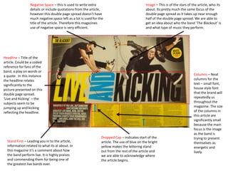
- 1. Columns – Neat columns for the text – small font, house style font that the brand will repeatedly us throughout the magazine. The size of the columns in this article are significantly small because the main focus is the image as the band is trying to present themselves as energetic and lively. Headline – Title of the article. Could be a coded reference for fans of the band, a play on words or a quote. In this instance the headline relates significantly to the picture presented on this double page spread. ‘Live and Kicking’ – the subjects seem to be jumping up and kicking reflecting the headline. Dropped Cap – indicates start of the article. The use of blue on the bright yellow makes the lettering stand out from the rest of the article and we are able to acknowledge where the article begins. Stand First – Leading you in to the article, information related to what its al about. In this magazine it’s a comment about how the band perform live. It is highly praises and commending them for being one of the greatest live bands ever. Image – This is of the stars of the article, who its about. Its pretty much the same focus of the double page spread as it takes up near enough half of the double page spread. We are able to get an idea about who the band ‘The Blackout’ is and what type of music they perform. Negative Space – this is used to write extra details or include quotations from the article, however this double page spread doesn’t have much negative space left as a lot is used for the title of the article. Therefore this magazines use of negative space is very efficient.
- 2. Image – This is of the stars of the article, who its about. Its pretty much the same focus of the double page spread as it takes up near enough half of the double page spread. This image makes Jay Z look mysterious and interesting. The colours add to his look and make him seem like he is a at a concert. It also connotes 2 sides of the story. Columns – Neat columns for the text – small font, house style font that the brand will repeatedly us throughout the magazine. The main focus is the image, Jay Z is presenting himself as a very open guy and he wants to inform people about his music. Pull out quote - A quote from the article that breaks up the text and leads the reader through the article. In this instance, this is used more to interest the reader, rather than break up text. Dropped Cap – indicates start of the article. The use of black font on a white background, makes the ‘H’ stand out. As it is halfway through the article, it makes it seem as though this is an important aspect of the article. Headline – Title of the article. Could be a coded reference for fans of the artist, a play on words or a quote. In this instance the headline relates to the type of person Jay Z is. He is a predominant artist in the rap world and is an influence on many.
- 3. Columns – Neat columns for the text – small font, house style font that the brand will repeatedly us throughout the magazine. The columns are very spread out all over the page and this could be because Nicki wants to present herself as a very alternative person who carries a lot of different characteristics like confidence, originality and beauty. Headline – Title of the article. Could be a coded reference for fans of the band, a play on words or a quote. In this instance the headline relates significantly to the contents of the article, and what Nicki Minaj is actually all about. ‘The Gospel according to Nicki Minaj’ is a religious reference and suggests Nicki is in fact a religious person. Image – This is of the stars of the article, who its about. Its pretty much the same focus of the double page spread as it takes up near enough half of the double page spread. From the image we can understand better Nicki’s character and how she presents herself, for example we can assume she is a very confident person because she us wearing very bright and colourful patterns. As well as this, her ring says icon on it so we can assume she views herself as an icon. Dropped Cap – indicates start of the article. This article is very pink which could be an indication of what Nicki is like and her preferred colours. Therefore, the use of a pink capital letter better emphasises her love for pink and her overall character. Stand First – Leading you in to the article, information related to what its all about. In this magazine it’s a reference to the religious side of Nicki and how she’s a Day- Glo Queen. In addition references to the commandments in the bible is mentioned. Pull out quote - A quote from the article that breaks up the text and leads the reader through the article. This article catches the eye of the reader because there is a use of colloquial language, ‘sexual’, this therefore catches the readers eyes because they become more interested in the contents.