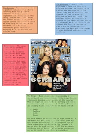
1. The Masthead – Like all the
magazines I have analysed, this
magazine follows the convention of
placing the masthead behind the
image. They are so successful and
capable of this because their
magazine is very well known. The
masthead colour matches certain
accents on the page, which brings it
all together as it follows a colour
scheme. The font is the same as
always and is recognisable to
everyone. The date and issue number
is also included underneath the
masthead.
The Banner – This banner includes
a picture potentially to show a
friendly face and gain more
interest or maybe to just
emphasise the importance of this
story. Either way it challenges
the normal conventions of just a
worded banner and therefore could
be something we consider in our
magazine. It also asks a
rhetorical question which is
engaging with the audience and
anchors them.
The Image – This image is not necessarily a
conventional horror movie image. This image depicts
4 innocent looking girls smiling at the camera.
When we begin to look at their clothing and poses
we can understand a bit more about them. They are
all wearing black, connotations of black include:
- Death
- Mystery
- Evil
- Power
For this reason we get an idea of what these girls
represent and why they are in the film. They are
most likely victims and very mysterious. One of
these characters could even be the ‘scream’. A
medium shot is used and nearly all the actresses’
shoulders are on display, potentially attracting
men as it could be considered provocative.
Cover Lines – The cover
lines act as another
anchor, trying to
persuade the audience
they need to know more
about what’s on the
inside of the magazine.
This magazine has used
famous names like ‘Will
Smith’ in an effort to
target even more people.
The font is bright and
stand out from the other
parts of the magazine,
clearly indicating they
are not related, yet
still follows the colour
scheme to show
sophistication and
professionalism.