
Recommended
More Related Content
What's hot
What's hot (20)
Viewers also liked
Viewers also liked (20)
Similar to Lily Allen's candid interview
Similar to Lily Allen's candid interview (20)
Lily Allen's candid interview
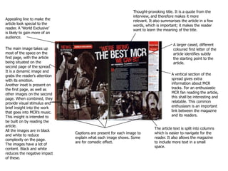
- 1. Thought-provoking title. It is a quote from the interview, and therefore makes it more relevant. It also summarises the article in a few words, which is important; it makes the reader want to learn the meaning of the title. Thought-provoking title. It is a quote from the interview, and therefore makes it more relevant. It also summarises the article in a few words, which is important; it makes the reader want to learn the meaning of the title. Appealing line to make the article look special to the reader. A ‘World Exclusive’ is likely to gain more of an audience. Appealing line to make the article look special to the reader. A ‘World Exclusive’ is likely to gain more of an audience. A larger cased, different coloured first letter of the article identifies subtly the starting point to the article. A larger cased, different coloured first letter of the article identifies subtly the starting point to the article. The main image takes up most of the space on the first page, with the article being situated on the second page of the spread.It is a dynamic image and grabs the reader’s attention with its emotion. Another inset is present on the first page, as well as other images on the second page. When combined, they provide visual stimulus and brief insight into the work that goes into MCR’s music. This insight is intended to be built on by reading the article. All the images are in black and white to reduce complexity on the page. The images have a lot of content. Black and white reduces the negative impact of these. The main image takes up most of the space on the first page, with the article being situated on the second page of the spread.It is a dynamic image and grabs the reader’s attention with its emotion. Another inset is present on the first page, as well as other images on the second page. When combined, they provide visual stimulus and brief insight into the work that goes into MCR’s music. This insight is intended to be built on by reading the article. All the images are in black and white to reduce complexity on the page. The images have a lot of content. Black and white reduces the negative impact of these. A vertical section of the spread gives extra information about MCR tracks. For an enthusiastic MCR fan reading the article, this shall be interesting and relatable. This common enthusiasm is an important link between the magazine and its readers. A vertical section of the spread gives extra information about MCR tracks. For an enthusiastic MCR fan reading the article, this shall be interesting and relatable. This common enthusiasm is an important link between the magazine and its readers. The article text is split into columns which is easier to navigate for the reader. It also allows the magazine to include more text in a small space. The article text is split into columns which is easier to navigate for the reader. It also allows the magazine to include more text in a small space. Captions are present for each image to explain what each image shows. Some are for comedic effect. Captions are present for each image to explain what each image shows. Some are for comedic effect.
- 2. Small effects like this add to the overall stylishness of the spread. By continuing the colour scheme, it fits. The arrows are also there to provide a starting point for a reader of the text. The use of subtle effects like these, and other things such as captions, shouldn’t be underestimated. Naturally, the first thing to grab the reader’s attention is the image. The image provokes thought in the way all the Black Eyed Peas, apart from Will.I.Am, are faded. This suggests the article is centred around him. The image is effect in that it makes all model’s included be depicted as a group, whilst still being able to single out a particular one to forecast the content of the article. The costumes used are also unique, which reflects the group’s style. Whilst doing this, it helps maintain a set colour scheme of silver and gold. This is effective as it uses the uniqueness of the image to let it stand out, whilst still blending healthily with the rest of the page. This article takes the form of an interview with the artist Will.I.Am, as identified by the image and introductory paragraph. Questions and answers are differentiated by bold font. As can be seen, the answers length vary from question to question. Interview format is good because it breaks up information in the text into topic-related areas due to the questions asked. It means the reader can locate sections they are particularly interested in, and read them. From experience, many double page spreads have quotes which stand out, and give a summary of the nature of the text. In some cases, it is in the title; in this one it is set apart from the rest of the interview. Unlike previous analysed spreads, this page’s title is not a quote from the interview. Instead, it is a thought-provoking rhetorical question, and doesn’t take up a lot of space, leaving more for the article on the other page. It follows the colour scheme, and fits neatly on the page. It is followed by an bold introductory paragraph which is there to set the tone of the article. This introduction, as shown in my analysis, has no limit on how much space it takes up, or indeed how long it is. Its purpose is to set up the reader for reading the article; its size shouldn’t affect this.
- 3. Again, the title is a quote from the article. After looking at the image and taking it in, the readers attention shifts to the title. It takes up a lot of space, and spans both pages of the spread, showing there is no limit on the sizes or allocation of features of a double page spread. They have to concentrate on the title, due to the strange, unique style of font, which supports the readers attention - if the reader has to concentrate on something, they are more likely to take in the information given. It also bold, which further reflects Lily Allen’s personality, as described in the title itself. Due to the fact it takes up the majority of the spread, the image of Lily Allen attracts the reader’s attention instantly. This is reinforced by the white, plain background - there is nothing to distract the reader unnecessarily. The image is simple, yet engaging. This is due to the eye contact given to the camera by Lily Allen, and the minimalistic accessories, props, and costume. Lily Allen’s costume is chosen so that the article is more about her personality than her body or looks; she is less objectified. The vibrant shirt reflects Lily Allen’s personality (as briefly described in the title), and also fits in with the colour scheme. An introductory sentence is present. This line follows the style of the article title with the words ‘Lily Allen’. The purpose of this line is to summarise and introduce the article in a fashion which makes the reader want to read more. This is achieved through appropriate choice of words (‘Lily Allen is a tabloid-baiting breath of fresh air.’) The reader’s immediate reaction is to question why Lily Allen is this ‘breath of fresh air’, and therefore will read more so the article can explain its point. Once again, like the MCR spread, starts with a large capital letter to identify the starting point to the text. The text is laid out in columns to fit more text on the page, and it also breaks up the text so it is easier to read for the audience.