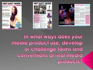
2. Masthead
•The font I have used for my masthead is the ‘Harabara’ font. I found
this on DaFont, a website where you can find a large variety of fonts
suitable for different genres. I chose this particular font because it is
sans serif, yet also clear and stylish.
• According to my research, a sans serif font is most suitable for a Pop
magazine as there are informal and fun connotations with the
genre, instead of educational and high register.
•The other magazines that I have researched have a similar style of
masthead. The fonts have a similar curvature and clear, casual layout.
This informal and youthful energy in the masthead remains throughout
the magazine.
3. •My masthead is very similar to existing Pop magazine mastheads. I added
colouring to the letter ‘O’ in my masthead. The pale pink and baby blue
would immediately connote that the magazine was aimed towards girls, and
it would also show that it was a Pop magazine because of the vibrant, yet
youthful colours. This is similar to ‘Billboard’ magazine’s masthead.
‘Not Just Noise’ is an effective name of the magazine
as it includes alliteration which makes it more memorable. The phrase could
also be referring to how an older person may think Pop music is just noise, but
the magazine is taking the perspective of the younger generation (therefore
connoting that the magazine is aimed towards a younger age group). This is
different to most Pop magazines, which usually have one word mastheads.
But magazines such as ‘We Love Pop’ have the same amount of syllables.
• The black font stands out on the white background, thus capturing the
attention of the reader.
4. •After researching existing Pop magazines such as ‘Billboard’ and ‘We
Love Pop’, I found that images are a crucial part in Pop magazines as
the image to text ratio is largely taken up by images.
• Therefore, I took a lot of photos for my magazine as
they would be a large proportion of my magazine
contents. Other magazines used photos of stereotypically
attractive teenagers (celebrities) who have a mainstream
fashion sense. They were also mostly smiling, looking
happy in light, airy spaces.
•Therefore, my photos are taken of people from ages 16- 23 as this is my
target audience. They are wearing mainstream, light clothes to connote
the Pop genre.
5. • I decided that my magazine would be sold for £2. This is because
according to my research, a cheap price would be most suitable for a
younger target market. My target audience are girls from the age of 16
to 23 years old. Therefore, £2 would be a suitable price as they would be
likely to have that amount of loose change in their pocket.
•I created the barcode on Dafont. I placed it in the bottom right hand
corner of the magazine. This is because the existing Pop magazines I
have seen also place their barcodes in the bottom right hand corners.
This way, it is less obtrusive but it is still visible.
6. The coverlines are written in
an informal, fun manner.
However, it does not seem
suited to a younger, more
child-like audience as the
language used is not
colloquial. The language is
not patronising.
The central image shows a
stereotypical teenage girl
wearing fashionable clothes
with bright, vibrant colours.
This indicates that the
magazine is veered towards
a mainstream
audience, not a niche
audience.
Plain white background seems
bright and happy, also allows
more vibrant colours to be added
over the top. Similar to magazine
such as ‘Pop’ which have plain
backgrounds so they can have a
more eye-catching central image.
The puff in the bottom right hand
corner captures attention due to
the colour, but does not detract
from the main image.
The splash is informal and energetic.
This connotes that the genre is Pop.
It is positioned to the side of the
cover, resembling ‘Billboard’
magazine’s layout of the splash.
7. oThe Pop contents pages I researched were
mostly taken up by images. Therefore, I used
minimalistic text and instead used images to
entice the reader in.
oExisting Pop contents pages have coloured
boxes to show the ‘feature’ articles in the
magazine. Therefore, I decided to replicate
this idea in my own magazine. The pink box
also makes the page more aesthetically
attractive and eye-catching for the reader.
oThe Pop double-page spreads I
researched had a large image taking up
the majority of one of the pages, with text
overlapping it, and the article on the
opposite page. Therefore, I did a similar
design, using 3 columns for the article.
oThe same colour scheme of pink and baby
blue remains throughout the
magazine, from the cover to the
contents, to the double page spread. This
shows it is the house style of the
magazine, and shows continuity.
8. • The house style of my magazine is the colour
scheme of baby blue, white and candy pink.
•These colours connote the Pop genre as they
are light and fun colours, and also quite
feminine.
•The mise-en-scene of my pictures are
happiness and bubbliness. I wanted my models
to smile and look happy in the photos to exude
energy.
•My photos also show self-pride as the
teenagers in the photos are well preened and
are clothed in fashionable clothing. This is the
stereotype of the target reader.
9. My research of existing Pop magazines has allowed me to create
my own Pop magazine which includes the conventions and
features of a typical Pop magazine.
My magazine was aimed towards a mainstream audience which
meant that I did not challenge many conventions of Pop
magazines.
My magazine cover, contents page and double-page spread
connotes the Pop genre to the reader.