1. Target Audience and Genre
Mixmag is aimed at a target audience of
around 20 – 35 years old, the genre of
the magazine is dance, and club-style
music.
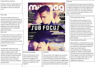
Main Image
On the main image is Sub Focus, an
electronic music creator from England. He
looks preoccupied on this picture, and has
his head down suggesting that he doesn’t
sing, but creates music, like a DJ. The
background of the smoke-strobe light
image displays how he is an electronic
dance music creator.
Model credit
The model credit on this cover is a indicator as
to who the model is, introducing Sub Focus, as
a main point on the cover. Also as the model
credit has a black background with white
writing suggesting how he stands out, possibly
alluding to the genre of dance.
Masthead
The masthead follows the typical house style of Mixmag,
in using the white colour writing, it makes the letters stand
out against the background. The title also suggests how it
is a electronica magazine, as ‘mix’ is often referred to in
house music, as a set for a DJ. The double circled dot on
the “I” is almost like a strobe light,for example in a club,
again comparing to the genre.
The Gutenberg Design Principle
The masthead is placed covering part of the
primary optical area. From the primary optical
area there is many side cover lines, which most
readers will see as they look over the axis of
orientation. The main coverline is placed perfectly
inbetween the primary optical area and the
terminal area, therefore placing it in the centre
showing it’s importance compared to all the
others. The terminal area is perfect for keeping
the barcode, and any other extras included in the
magazine as they are not as significant to the
other coverlines.
Colours/Typefaces/House style
Mixmag follows a contemporary house style
of a translucent background (no background)
and a white title, contrasting with the main
image. Also the white colour is
stereotypically unisex, showing how this
magazine isn’t aimed at a specific gender.
The coverlines also are always along the side
of the magazine, via the axis of orientation, in
every issue. And the model credit is mostly
always in the middle of the cover, to
emphasise its importance.
Banners/Flashes/badges
There are many banners on the
side to advertise the exclusive
content in the magazine. The
flashes are in white text, showing
how they are significant to the
magazine.
Lead Article
The lead article “Bass music’s new
superstar steps into the ring” gives the
reader an insight to what’s in the
magazine. Also the play on words “steps
into the ring” gives us a sense of how its
hard to break into the industry. The
readers receive a hint on how they
should be aware of his music, therefore
they look inside.
Coverlines
The coverlines on this magazine are crucial into
the marketing of the magazine, they also all
mention something or someone that alludes to
the genre of music presented here, suggesting the
genre. Also if people see a coverline of an area of
music/person they’re interested in, they will buy
it.
2. Target Audience and Genre
Vibe magazine is mainly heavily focused on the
Rap/RnB genre of music, the target audience I would
say is slightly older as obviously there is usually
taboo language said in rap songs. Also the style is
quite sleek and modern, with maturity, showing how
it is aimed at an older audience maybe 18-30 year
olds.
Main Image
On the main image is Alicia Keys, an RnB artist
from Manhattan, NYC. Alicia is using direct
address to the camera and is fashioning some
black lipstick which could allude to her dark side,
possibly conforming to RnB stereotypes. Her
outfit of a high collar leather jacket is similar to
that of Elvis along with the quiff in her hair.
Showing her significance.
Model credit
“Alicia Keys” is the model credit on here, The model
credit also is in a larger font than other text showing
how it’s a main credit of the magazine, in this issue. It
acts as an introduction to the person on the front of
the magazines, allowing people to familiarise
themselves with her so they know who she is if they
buy it.
Lead Article
The lead article “first REAL interview” suggests
how this interview is completely exclusive to
Vibe and is Alicia’s first time in opening up. This
would be useful for marketing purposes as the
readers feel a stronger connection to the
magazine as it suggests that all new
information will be revealed.
Masthead
The masthead of this cover is the signature house
style of Vibe, the same font is used and there is a
signature style of really large capacity of the letters.
Vibe always uses bright colours but in this case
The Gutenberg Design Principle
The masthead is placed directly in the primary
optical area, suggesting the significance of the title
to the contents of the magazine. From the primary
optical area there is the axis of orientation where
coverlines and a flash are placed, as people will
mostly look at these when they first see the
magazine. The barcode is placed in the terminal
area, as people will not usually look there, right
away.
Colours/Typefaces/House style
Vibe follows a house style of bright colours
and side coverlines, the main artist is always in
the centre of the page usually with a blank
coloured background. The magazine always
looks sleek and sophisticated, displaying the
older genre.
Banners/Flashes/badges
This issue contains one flash advertising how it
is the 2nd annual global issue, making the
readers feel a part of something when they
purchaseit. There are no banners as this could
make the magazine seem more immature.
Coverlines
There is five coverlines on the front cover of the
magazinewhich markets the content of the magazine adding
more reason to buy it. The coverlines are all red or black
which stands out against the grey background.
3. Target Audience and genre
Q magazine is a magazine aimed at 18s and
over due to its sleek style, there is no specific
genre to Q ultimately making it unique and a
stand out amongst others.
Main Image
On the main image is Lana Del Rey, slightly
tilting her head to the side. The genre of Lana
Del Rey’s genre (dream pop) is made clear in
the image as Lana looks in a dream like state,
but with a darker edge with the blood dripping
from her temple.
Model credit
“Lana Del Rey” is useful in showing who Lana is
to those who may not be familiar to her. The
black bold text across Lana’s face in a tear drop
style place, in comparison to her pale skin, also
helps to emphasise her name being somewhat
significant.
Lead Article
The lead article “Everybody’s mad for Lana Del
Rey so what’s so bloody good?” gives a hint of
how Lana is an upcoming artist who is enjoying
a big fuss around her. The readers receive a
hint on how they should be aware of her music
and read the interview inside.
Masthead
The masthead of this cover is the signature house style of
Q, the red background and the white perfectly contrast
together to make the magazine stand out. With the title of
the magazine being “Q” it is evidently a modern magazine
and could possibly allude to a que in a shop or possibly a
cue to begin playing music.
The Gutenberg Design Principle
The masthead is placed directly in the primary
optical area, suggesting the significance of the title
to the contents of the magazine.From the primary
optical area most would look diagonally downwards
towards the terminal area, which is where the lead
article is placed. The terminal area is perfect for
keeping the barcode.
Colours/Typefaces/House style
Q follows a very similar house style of a red
masthead background with a white title. Also
red is a colour which could be aimed at both
sexes. Also the slogan at the base of the title is
a house style which is included in every issue
of Q therefore people know it’s Q without just
looking at the masthead.
Coverlines
There is only one cover line, as the reader has previously
purchased this magazine as it is subscriber edition only. The
coverline is placed onto Lana’s face, as a tear drop shape.
Banners/Flashes/badges
This is a subscribers edition therefore the
readers would have already purchased this
previously meaning there is no need for extra
marketing techniques such as badges , flashes
or banners.