This document analyzes the content page of a magazine. It summarizes that the target audience is people aged 15-22 who are into rock/indie rock music, as evidenced by the bands and artists featured like Arctic Monkeys. The primary optical area drawing the eye is the large red box highlighting what's inside the magazine. Imagery of bands like Arctic Monkeys and Lily Allen reflect the genre focus. The house style uses red, white, and black colors in a cluttered informal layout to appeal to male readers.
Beyond the EU: DORA and NIS 2 Directive's Global Impact
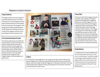
Magazine content analysis2
1. Magazine Content Analysis
House Style
The house style of thismagazine would
be white,red, andblack.The right is
significantthroughoutthe magazine
because oneveryQ magazine it’sred.
Thishouse style of thiscontentpage is
upbeatandcoloursfull because of the
colourstheyhave usedonthe page
numbersandthe coloursin the images.
The imagesaren’tdark theyare bright
and theyhave coloursto theminthe
background.Thisrepresentswhattype
of magazine thisisbecause itshowsthe
musicbandsinside are upbeatandpop
but if the bandswere dark androck
theywouldn’tbe muchcoloursonthe
bag it wouldbe mainlyblackandwhite
Target Audience
The target audience forthismagazine
wouldbe people whoare intorockor
indie pop,etc.Itwouldappeal tothose
typesof people because of the people
whoare featuringinthe magazine. The
target age wouldbe people between
18-30 because forthe advertsthatare
inside of the magazine andthismusic
wouldappeal tothose people more
The GuttenbergDesignPrinciple
The primaryoptical area wouldbe the
top leftcorner.Inthat cornerthere isa
picture of RickyGervais and that’s
where itstarts to saythe pagesand
the content. The strong fallowareais
the top rightcorner,in that corner
there isreviews thatQhave made on
bandsand artists.Thismay make
people buythe magazine if the
magazine givesrecommendations of
goodartists
Imagery
On the bottomof the page there isan image of LillyAllenwhichreflectswhat
type of magazine thisisbecause LillyAllenmakes Indie Pop musicsothat’sthe
type of musicthat maybe inside the magazine orothergenreslike that.Thismay
make people bythe magazine if theysee thattype of musicwill be inthe there
so theymaywant to buyit more.
DesignBalance
The balance of thiscontentpage would
be informal because the textisn’tlaid
out ina certainway it’sjustbeenplaced
on the page randomlyandthe colorful
page numbersaren’tall the same size.
It wouldalsobe informal because the
coloursare brightand theydon’tlook
professional
2. Magazine Content Page Analysis
Target Audience
The target audience of thismagazine wouldbe
people whoare intoo Rockor Indie Rockbecause
that’sthe type of bandsand artiststhat are inthe
magazine.The targetage wouldbe people
betweenthe agesof 15-22 because it’sadvertising
clothesthatyoungerpeople wouldwearand
festivalstheywouldgotoo.
The GuttenbergDesignPrinciple
The strong fallowareaiswhere the big redbox is
where itistalkingaboutwhat’sinthe magazine.
Thismay have beenputthere because itcatches
people’sattentionsandshowsthemwhat’sinside
whichmay make people wanttobuythe
magazine.The primaryoptical areaisthe top left
corner. In the primaryoptical area itis talking
aboutthe mainpointsof the magazine andwhat
pagesthere on.Thiswouldhave beenplacedthere
so people canfindoutwhat’sinthe magazine
before theybuyit.
Imagery
On the contentpage there isan image of Artic monkeysonthe leftside which
reflectswhattype of genre of magazine thatisbecause ArticMonkeyare a rock
bandand the magazine wouldhave theminthere because itwill appealto
people wholike rockmagazinesandrockbands.Alsothe magazine maybe
targetingmenbecause of the colourstheyhave usedwhichiswhite blackand
redbecause theyare masculine coloursandtheywill appeal tomen.
House Style
The house style of thismagazine wouldbe
redwhite andblack.The layoutof this
magazine isclutteredandit’snot
organized.Thisshowsthatmenreadthis
magazine because it’snotsmartlike other
magazinesare.
DesignBalance (informal orformal)
The designbalance wouldbe formal
because the box are placedina specific
place and theyall fittogetherinstraight
lines.It’salsoinformal becausethe page
doesn’thave symmetry,textisjustplaced
anywhere onthe page.
3. Evaluation
These two magazines have a lot of similarities and differences. One of the similarities between them is that the main colours on both
of the content pages is red, this may have been used because they stand out on the page and it is very eye catching. Another
similarity is that they have a lot of images on the content page of who is featured in the magazine which shows which type of music
magazines they are and who the audience may like to see. Finally the both target the same people who are into the same type of
music which is rock/Indie rock.