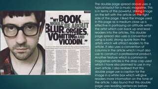
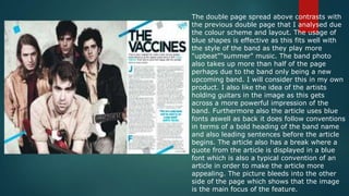
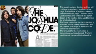
Analysis of a
Double Page
Spread
The double page spread above uses a
typical layout for a music magazine. This
is in terms of the powerful, striking image
on the left with the article on the right
side of the page. I liked the image used
in this page as a medium close up is
effective in portraying an attitude within
the artist which can back up and lead
readers into the articles. This double
page spread also uses a convention of
using a bold, strong quote from the
artists which will attract readers to the
article. It also uses a convention of
columns in the article which I must also
use to construct a professional product.
Another feature which is common in
magazines articles is the drop cap used
which I have also planned to use in my
own article. I also realised that this
double page use a caption for the
image in a white box which will give
readers more information on the tone of
the article. I also found that this double
page uses leading sentences before
The double page spread above contrasts with
the previous double page that I analysed due
the colour scheme and layout. The usage of
blue shapes is effective as this fits well with
the style of the band as they play more
"upbeat""summer" music. The band photo
also takes up more than half of the page
perhaps due to the band only being a new
upcoming band. I will consider this in my own
product. I also like the idea of the artists
holding guitars in the image as this gets
across a more powerful impression of the
band. Furthermore also the article uses blue
fonts aswell as back it does follow conventions
in terms of a bold heading of the band name
and also leading sentences before the article
begins. The article also has a break where a
quote from the article is displayed in a blue
font which is also a typical convention of an
article in order to make the article more
appealing. The picture bleeds into the other
side of the page which shows that the image
is the main focus of the feature.
The main text is very appealing and unusual.
This is because the text is text you would
normally use in a ransom note. This is
appealing because it is unusual but also
because it is big and bulky which automatically
catches your eye. The double page spread
follows a colour scheme which is black, white
and a bit of red. This is appealing to the
audience because it has a professional look
and doesn't make the magazine look messy it
makes it look neat and tidy. The layout of the
double page spread is really good. This is
because it is very neat and tidy and nothing is
crammed together. The layout is also good
because there isn't too much text which may
put off certain readers as the target audience
relates to the younger generation. The headline
and the smaller text are placed well and the
main image is also placed well because it
doesn't overlap over any of the text and is big
which makes it appealing but not messy.
The spread contains 3 columns of text with
one large image taking up all of the first
page. The headline is large and takes up
half of the second page. The main colours
used are black and white with the stylish
design of the headline being used to make
the article stand out.
The image used show the band standing in
a relaxed stance making eye contact with
the camera. The image is well lit and we
can clearly see the band.
The font used for the main article is
conventional and easy to read. The font
used is small compared to the headline.

Analysis of professional dps

  • 1.
  • 2.
    The double pagespread above uses a typical layout for a music magazine. This is in terms of the powerful, striking image on the left with the article on the right side of the page. I liked the image used in this page as a medium close up is effective in portraying an attitude within the artist which can back up and lead readers into the articles. This double page spread also uses a convention of using a bold, strong quote from the artists which will attract readers to the article. It also uses a convention of columns in the article which I must also use to construct a professional product. Another feature which is common in magazines articles is the drop cap used which I have also planned to use in my own article. I also realised that this double page use a caption for the image in a white box which will give readers more information on the tone of the article. I also found that this double page uses leading sentences before
  • 3.
    The double pagespread above contrasts with the previous double page that I analysed due the colour scheme and layout. The usage of blue shapes is effective as this fits well with the style of the band as they play more "upbeat""summer" music. The band photo also takes up more than half of the page perhaps due to the band only being a new upcoming band. I will consider this in my own product. I also like the idea of the artists holding guitars in the image as this gets across a more powerful impression of the band. Furthermore also the article uses blue fonts aswell as back it does follow conventions in terms of a bold heading of the band name and also leading sentences before the article begins. The article also has a break where a quote from the article is displayed in a blue font which is also a typical convention of an article in order to make the article more appealing. The picture bleeds into the other side of the page which shows that the image is the main focus of the feature.
  • 4.
    The main textis very appealing and unusual. This is because the text is text you would normally use in a ransom note. This is appealing because it is unusual but also because it is big and bulky which automatically catches your eye. The double page spread follows a colour scheme which is black, white and a bit of red. This is appealing to the audience because it has a professional look and doesn't make the magazine look messy it makes it look neat and tidy. The layout of the double page spread is really good. This is because it is very neat and tidy and nothing is crammed together. The layout is also good because there isn't too much text which may put off certain readers as the target audience relates to the younger generation. The headline and the smaller text are placed well and the main image is also placed well because it doesn't overlap over any of the text and is big which makes it appealing but not messy.
  • 5.
    The spread contains3 columns of text with one large image taking up all of the first page. The headline is large and takes up half of the second page. The main colours used are black and white with the stylish design of the headline being used to make the article stand out. The image used show the band standing in a relaxed stance making eye contact with the camera. The image is well lit and we can clearly see the band. The font used for the main article is conventional and easy to read. The font used is small compared to the headline.