
Recommended
More Related Content
What's hot
What's hot (20)
Recently uploaded
Recently uploaded (20)
Contents page
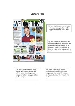
- 1. Contents Page The font used for the titles and sub titles are corresponding which suggest a consistent house style. The pictures around the centre are other stories that are included in the magazine however they are not as important as the centre picture so it is on the edges of the page as well as smaller. The page uses a consistent house style as well as using a variety of colours which suits the genre of magazine well as it is supposed to be loud and bright. The image in the centre is main headline/story that features in the magazine as they probably have an exclusive with the artist who is in the centre.