Welcome to TechSoup New Member Orientation and Q&A (May 2024).pdfTechSoup
In this webinar you will learn how your organization can access TechSoup's wide variety of product discount and donation programs. From hardware to software, we'll give you a tour of the tools available to help your nonprofit with productivity, collaboration, financial management, donor tracking, security, and more.
Unit 8 - Information and Communication Technology (Paper I).pdfThiyagu K
This slides describes the basic concepts of ICT, basics of Email, Emerging Technology and Digital Initiatives in Education. This presentations aligns with the UGC Paper I syllabus.
How to Split Bills in the Odoo 17 POS ModuleCeline George
Bills have a main role in point of sale procedure. It will help to track sales, handling payments and giving receipts to customers. Bill splitting also has an important role in POS. For example, If some friends come together for dinner and if they want to divide the bill then it is possible by POS bill splitting. This slide will show how to split bills in odoo 17 POS.
The French Revolution, which began in 1789, was a period of radical social and political upheaval in France. It marked the decline of absolute monarchies, the rise of secular and democratic republics, and the eventual rise of Napoleon Bonaparte. This revolutionary period is crucial in understanding the transition from feudalism to modernity in Europe.
For more information, visit-www.vavaclasses.com
We all have good and bad thoughts from time to time and situation to situation. We are bombarded daily with spiraling thoughts(both negative and positive) creating all-consuming feel , making us difficult to manage with associated suffering. Good thoughts are like our Mob Signal (Positive thought) amidst noise(negative thought) in the atmosphere. Negative thoughts like noise outweigh positive thoughts. These thoughts often create unwanted confusion, trouble, stress and frustration in our mind as well as chaos in our physical world. Negative thoughts are also known as “distorted thinking”.
Operation “Blue Star” is the only event in the history of Independent India where the state went into war with its own people. Even after about 40 years it is not clear if it was culmination of states anger over people of the region, a political game of power or start of dictatorial chapter in the democratic setup.
The people of Punjab felt alienated from main stream due to denial of their just demands during a long democratic struggle since independence. As it happen all over the word, it led to militant struggle with great loss of lives of military, police and civilian personnel. Killing of Indira Gandhi and massacre of innocent Sikhs in Delhi and other India cities was also associated with this movement.
Ethnobotany and Ethnopharmacology:
Ethnobotany in herbal drug evaluation,
Impact of Ethnobotany in traditional medicine,
New development in herbals,
Bio-prospecting tools for drug discovery,
Role of Ethnopharmacology in drug evaluation,
Reverse Pharmacology.
1. ThomasGrainger
Magazine Analysis
Front Cover
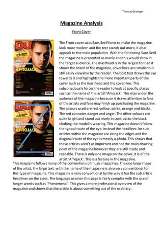
The Front cover uses Sans Serif fonts to make the magazine
look moremodern and the text stands out more, it also
appeals to the male population. With the fontbeing Sans Serif
the magazineis presented as manly and this would show in
the target audience. The masthead is in the largestfont ad it
shows thebrand of the magazine, cover lines are smaller but
still easily viewable by the reader. The bold text draws the eye
towards it and highlights the more important parts of the
cover such as the masthead and the cover line. This
subconsciously forces thereader to look at specific places
such as the name of the artist‘Afrojack’. This may widen the
audience of the magazinebecause it draws attention to fans
of the artists and fans may finish up purchasing the magazine.
The colours used are red, yellow, white, orange and blacks.
The red connotes danger and anger. The other colours are
quite brightand stand out nicely in contrastto the black
clothing the model is wearing. This magazinedoesn’tfollow
the typical route of the eye, instead the headlines for sub
articles within the magazineare along the edges and the
diagonal route of the eye is mostly a photo. This shows that
these articles aren’t as important and not the main drawing
point of the magazinehowever they are still inside and
readable. There is only one image on the cover, it is of the
artist ‘Afrojack’. This is a feature in the magazine.
This magazinefollows many of the conventions of music magazines. The one large image
of the artist, the large text, with the name of the magazine is also very conventional for
this type of magazine. This magazineis very conventional by the way it has the sub article
headlines on the sides. The language used on this page is fairly complex with the use of
longer words such as ‘Phenomenal’. This gives a more professionaloverview of the
magazine and shows that the article is about something out of the ordinary.
2. ThomasGrainger
Contents Page
The contents page is very uniform and colourful. There are
many bright colours used such as pink, yellow, blue, and
purple. These colours make the page more welcoming and
happier as they are bright, not dull. The fonts used are all
Sans-Serif meaning they are more modern and blocky which
fits with the genre of music the magazine is based on as well
as making it to appeal to teenagers and young adults. There
are quite a few images on this page, each of them relate to an
article or page within the magazine. The useof these images
makes effective useof creating visualideas of whatthe
articles are about but they also advertisethe article to readers
and may even show the reader something that they wasn’t
initially interested in. the shot types vary from closeups of people and technology to
further away shots wherewe can see everything from the knees upwards. The
language used is quite simple on this page, there are someaggressivewords used such
as ‘Bloodbath’. Mostof the words could be said to appeal to a more masculine
audience as they do not have the stereotypical feminine feel. The layout of this page is
very uniform, with the contents of each page in two columns down the left side and
with a column of photos down the right hand side. This layout is very well organised
and it isn’tcluttered so it gives the magazinea moreprofessionaland appealing look.
This magazinefollows some of the conventions for a contents page as mostof the
content on them need to be similar. With the page numbers
and the text set into columns, this follows the design
for the majority of magazines however the difference
with this page is with the pictures, the positioning of
these set this magazine apartfrom another.
3. ThomasGrainger
Double Page Spread
This page uses fonts which have a slight serif on them for the headline, however the majority
of the fonts are Sans-Serif. The layoutof this page is very clean and uses a large picture on
the left hand side of the double page spread with the headline in the top rightcorner so it is
the firstthing that is seen. Along with the picture and the headline there is a small paragraph
explaining a little bit about the article, giving someinformation to the reader to interest them
enough to read the full article without revealing too much so you still need to read the article
to understand fully whatit is about. On the right hand side, the majority of the page is taken
up by the single article and it is set into two columns which break up the text to make it
easier to read. Along with the main article there is a smaller article separated by a vertical
Line making the two articles clearly
separated. The colours used for the
background photo are very dark,
mysterious colours with a silhouette of
what appears to be a city skyline
behind the text. The text has been put
into the contrasting colour of white to
make the article easy to read. There is
only one image on this page, it fills up
the entire page with the majority of it
being a dark background. Thereis a
large photo of the music artist
however on the left page. This fills up
the majority of the page making it the main feature to go along with the article. The costume
worn by the artist is very casual and stylish, it may portray his casual, laid back personality.
The shot type on this page is full body, it isn’t focused on any particular area of the body but
instead shows himas a whole. The language used is very professionaland ‘well-spoken’ with
many words to make up the article. This magazine page is fairly conventional with a large
heading being the firstthing you see when you open the page, followed by the image of the
artist.