
Recommended
More Related Content
What's hot
What's hot (18)
Viewers also liked
Viewers also liked (8)
Similar to Magazine Cover Research
Similar to Magazine Cover Research (20)
Recently uploaded
Recently uploaded (20)
Magazine Cover Research
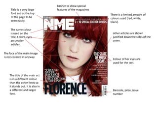
- 1. Title is a very large font and at the top of the page to be seen easily. There is a limited amount of colours used (red, white, black). The face of the main image is not covered in anyway. The title of the main act is in a different colour than the other fonts so it stands out. It is also in a different and larger font. other articles are shown justified down the sides of the cover. Banner to show special features of the magazines Colour of her eyes are used for the text. Barcode, price, issue number The same colour is used on the title, t-shirt, eyes an smaller articles.
- 2. Banner, to show other articles The titles is in a large font Main image of the band to attract fans. smaller images of other bands in different articles. Free gifts to attract the audience Green is used many times on the cover to relate to the name of the band. there are only 4 colours used on the cover (white, red, black, green.) Main article has a very large font so it is clearly visible. Barcode, price, issue number. The main image contains a lot of black, so white is used on the font to contrast it. Font of the title is used to look broken so it seems onomatopoeic Other articles are shown to hook the audience
- 3. Title is the largest, it is placed behind the main image because it is a well-known brand which is easily recognisable. limited colours are used, they are linked to the main image as red is also used in the image. Exclusive content is used to make the audience feel like they need this magazine, that it is different. The main image is not covered by any text. The second largest font is the name of the article which is linked to the main image There are other articles shown, they are justified down the sides of the cover so it doesn’t cover the face.. Tagline is used for the main article to give extra detail. Barcode, price and issue number.
- 4. Title is the largest font on the cover to attract attention. Red is picked out in the image to draw attention. It also links the image to the title. text is justified around the image so it doesn’t obscure the image. Banner states that it is the biggest music magazine, to attract fans of music magazines Only a few colours are used between the image and the text to link them, and to also make the cover less complicated. Image is desaturated so attention is drawn to the more colourful parts of the cover e.g. important text, lips, title. Barcode, price and issue number. The image is seen as sexual to attract a male audience to the magazine, but it is also used to attract women who want to be like this person.
- 5. A limited colour palette is used to link the text and image together. Blue is used for the colour of the title of the magazine, it is also used on the image to connect them. A banner is used to show important information above the title Other articles or ‘hooks’ are used to give information about the magazine and to attract the audience. The image covers the title of the magazine to make him seem like he is coming out of the page. The most important pieces of text are in a larger, different font to draw attention to them. The background is plain so no attention is taken away from the main image.
- 6. The main image takes up most of the cover to draw attention to it. The article relating to the main image is placed centrally so the audience can see that they are linked. This magazine has a more formal layout, this shows that it has a more serious tone. The banner is used to show other articles in the magazine. A plain background is used so that no attention is taken from the main image. Smaller images are used to show the other articles. A border is used to make the cover seem more formal. There is a limited number of colours used : red, white and grey.