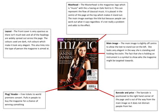
1. Layout - The Front cover is very spacious as
there isn’t much text and all of the headings
are widely spread out across the page. The
colours used are dark, rich colours which
make it look very elegant. This also links into
the type of person the magazine is aimed at.
Masthead – The Masterhead is the magazines logo which
is “music” with the u having an italic font to it. This can
represent the flow of classical music. It is placed in the
centre of the page at the top which makes it stand out.
The main image overlaps the title but because people can
work out what it says regardless it’s not really a problem
and adds to the effect.
Main image – The main image is slightly off centre
to allow the text to stand out on the left. She
looks very elegant in the way she is standing and
holding the violin. The fact that she is holding an
instrument is a symbol to show who the magazine
might be targeted towards.
Barcode and price – The barcode is
positioned to the right hand corner of
the page and is out of the way from the
main image so it does not distract
people from her.
Plug/ Header – Free tickets to world
premiere concert. Pulls in people to
buy the magazine for a chance of
winning something
2. Pictures – The images used in this
magazines front cover are all quite
close up on the person they are
focusing on. The spiral designs at
the sides create a very majestic
view and represents how free
flowing classical music is.
Layout – The layout is very structured and
organised. There are a few pictures that vary in size
which doesn’t make it look too crowded. Each
section is neatly separated so it easy to find what
you are looking for as all of the text is in black and
the sub headings are noticeably larger which
segregates it clearly.
Colour scheme – There aren’t a lot of different
colours so it doesn’t look messy. The main colour
scheme has been kept to dark colours however
the spiral images at the side of both pages help
to make it more interesting.
3. Feature headline- the feature headline tells the viewer what
the article will be about. In this case it is about choirs and
just underneath this headline there is a further brief
explanation about what they will find out in the article.
Layout – There is a lot of text and the language is very formal and
sophisticated. This shows that the magazine/article is aimed at an audience
with a well educated background. There are only 2 images on the double page
one taking up the majority of the page so even though there are only few all of
the space is well filled. The feature headline is positioned to the right of the
main image so you can see the children’s faces clearly. It has also been put in a
large font so it stands out.
Main Image- The main image takes up the
majority of the page so it draws people in. The
image is also very relevant to the topic in the
article so as soon as people see the picture they
will know it is about the younger generation
joining choirs.