
Recommended
More Related Content
What's hot
What's hot (20)
Viewers also liked
Similar to Photography planning
Similar to Photography planning (20)
More from EmilyPlenty
More from EmilyPlenty (20)
Recently uploaded
Recently uploaded (20)
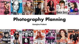
Photography planning
- 2. COVER PAGE The main image for my cover page is going to be a female character. I have chosen a female over male character because I feel like pop music reflects girls more than boys. She will be wearing modern day clothing that is fashionable in the present day. This is important because then the reader can see what the fashionable thing is to wear and make them want to look like the character. The clothing is going to consist of ripped jeans to give the character more of an edgy look. It will also consist of jewellery to make the character look more classy and professional. I am aiming for the clothing to look like what a normal teenager would wear so that they can relate to the magazine more. It will also reflect the target audience I am aiming for. The characters will be pulling a straight face instead of smiling and will be using direct address towards the camera. This will look like it is inviting the audience to read the magazine. The character will be shot as a medium shot so that the audience can see what the character is wearing as well as her face. Most magazine covers use a studio shot, therefore I am going to do the same so that it looks more like a professional magazine. This will also allow me to change the background colour to whatever I want to. It will be useful to be able to change the background colour so that I can make the character stand out more against my chosen background. My cover page is also going to consist of sub-images that will be positioned to the side of the main character. These sub images will consist of other pop music CD’s that will be relevant to the sub headings above them to advertise what will be inside the magazine. By including other images it doesn’t make the main focus of the cover page on the main character but on what is inside the magazine. As shown on the left on the ‘Top of the Pops’ magazine sub- images have been used to advertise what is inside. It looks good and it takes the focus of the cover off Jessie J. I think that including other artists CD’s is a good idea for the cover page because it is advertising pop songs which will hopefully give the magazine a good reputation. By getting people drawn in by the front cover will persuade people to look inside the magazine.
- 3. CONTENTS PAGE For the main image for the contents page I am going to use a shot taken outside in a natural setting. Personally, I think this is a good option because it will give the image naturalistic lighting and make the character look like he/she is in their everyday life style. One of these ideas is the character being in front of a brick wall. I think this would give the page an interesting look and it will also make the character look more edgy looking and cool. The character is going to be in a medium-long shot. I have chosen this type of shot because the audience will be able to see the background, the characters face and what the character is wearing which is important. The male will be dressed in cool, casual modern clothing to reflect the clothing of teenagers in the 21st century. This will also look better when the character is placed in front of the brick wall background because it will make them look more cool. The clothing will also be bright colours so that it will stand out against the brick wall background. This will make the image look vibrant and eye catching to the audience. I am going to position the character similarly to the man on the left stood in front of the wall. For the contents age I am going to use a male character because the main image on the cover page will be a female. I want there to be a varied gender in my magazine so I am going to alternate between male and females. The layout of the contents page will be similar to the one shown on the left of another music magazine. Most of the page will consist of the character, then the actual contents will be placed at the side of the character. Above the contents will be the title ‘Contents’ to represent what the page is. This will be in bold writing, as shown on the left hand side. I am going to make sure that the image of the character and the brick wall background is behind the text so that the reader can see the brick wall background behind the writing. I think this will look better than stopping the image half way across the page. The main image will be the only image on the contents because I do not think that using sub-images is necessary for this particular page. If my contents page was to be a double page, I will place the character on the left hand side of the double page and carry on the brick wall background onto the right hand side. This would link the text on the right hand side to the image on the right.
- 4. DOUBLE PAGE SPREAD For my double page spread I am going to use a medium-close up shot of a character. I think this will look good because you will be able to see the persons face up close of who the double page spread will be about. As shown on the left, my picture will be similar to how the girl looks. Also as shown on the left, my double page spread is going to have my character placed on one of the two pages, and the article on the other side. I think this looks effective because it makes it clear to the audience that the article is about the person on the other side of the page. This will therefore avoid confusion for the reader. I am going to include a sub image on the same side of the page that the text is written on. I am choosing to do this to give the reader more of an idea about the article, even if the sub image is another picture of the same person. My background for the double page spread will be a solid colour because I am going to use a studio shot. I think this is a good idea because then the audience can pay more attention to the character and the article rather than the background. By using a solid colour for the background will also make the article stand out more by giving more attention to the text. One of my chosen main colours for Muse Mag is red so this is a possible colour for the background of my double page spread. However, the colour is going to depend on what the character looks like and what they are wearing. This is because I don’t want them to clash with the background if they have red hair/clothing. Studio shots are also useful because it means I can manipulate the lighting to change how the characters look. Similarly to the other costumes on other pages, my character will be wearing modern, cool clothing to represent the style of teenagers today. Even though the image will be a medium close up shot it is still important that the character is wearing nice clothes that match the magazines style. An example of the type of clothing I am aiming for is the girl on the double page spread on the left. I am not going to include any props in this image due to the image being a medium close up shot. The picture on the top left hand side has edited spot lights into the picture. I might do a similar type of thing because by adding spot lights around the edge it attracts the audiences attention due to the brightness. It could also represent that the article will important for the reader to read so by making it stand out it will persuade them to read it more. By editing in spot lights it will also make the solid background colour as bright because not as much attention will be given to it with something else added onto the page.