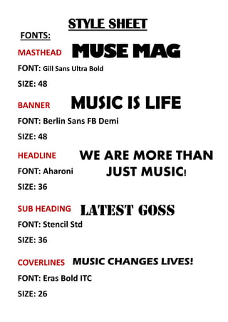
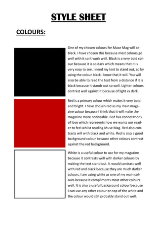
STYLE SHEET
FONTS:
MASTHEAD
FONT: Gill Sans Ultra Bold
SIZE: 48
SUB HEADING
FONT: Stencil Std
SIZE: 36
COVERLINES
FONT: Eras Bold ITC
SIZE: 26
HEADLINE
FONT: Aharoni
SIZE: 36
BANNER
FONT: Berlin Sans FB Demi
SIZE: 48
MUSE MAG
MUSIC IS LIFE
WE ARE MORE THAN
JUST MUSIC!
MUSIC CHANGES LIVES!
STYLE SHEET
COLOURS:
One of my chosen colours for Muse Mag will be
black. I have chosen this because most colours go
well with it so it work well. Black is a very bold col-
our because it is so dark which means that it is
very easy to see. I need my text to stand out, so by
using the colour black I know that it will. You will
also be able to read the text from a distance if it is
black because it stands out so well. Lighter colours
contrast well against it because of light vs dark.
Red is a primary colour which makes it very bold
and bright. I have chosen red as my main maga-
zine colour because I think that it will make the
magazine more noticeable. Red has connotations
of love which represents how we wants our read-
er to feel whilst reading Muse Mag. Red also con-
trasts will with black and white. Red is also a good
background colour because other colours contrast
against the red background.
White is a useful colour to use for my magazine
because it contrasts well with darker colours by
making the text stand out. It would contrast well
with red and black because they are much darker
colours. I am using white as one of my main col-
ours because it compliments most other colours
well. It is also a useful background colour because
I can use any other colour on top of the white and
the colour would still probably stand out well.

Style sheet for magazine

  • 1.
    STYLE SHEET FONTS: MASTHEAD FONT: GillSans Ultra Bold SIZE: 48 SUB HEADING FONT: Stencil Std SIZE: 36 COVERLINES FONT: Eras Bold ITC SIZE: 26 HEADLINE FONT: Aharoni SIZE: 36 BANNER FONT: Berlin Sans FB Demi SIZE: 48 MUSE MAG MUSIC IS LIFE WE ARE MORE THAN JUST MUSIC! MUSIC CHANGES LIVES!
  • 2.
    STYLE SHEET COLOURS: One ofmy chosen colours for Muse Mag will be black. I have chosen this because most colours go well with it so it work well. Black is a very bold col- our because it is so dark which means that it is very easy to see. I need my text to stand out, so by using the colour black I know that it will. You will also be able to read the text from a distance if it is black because it stands out so well. Lighter colours contrast well against it because of light vs dark. Red is a primary colour which makes it very bold and bright. I have chosen red as my main maga- zine colour because I think that it will make the magazine more noticeable. Red has connotations of love which represents how we wants our read- er to feel whilst reading Muse Mag. Red also con- trasts will with black and white. Red is also a good background colour because other colours contrast against the red background. White is a useful colour to use for my magazine because it contrasts well with darker colours by making the text stand out. It would contrast well with red and black because they are much darker colours. I am using white as one of my main col- ours because it compliments most other colours well. It is also a useful background colour because I can use any other colour on top of the white and the colour would still probably stand out well.