SlideShare a Scribd company logo
1 of 9
My music magazine uses thirds and ‘Z’ eye movement to guide the eye of the reader. On my front
cover, I have placed my header bar right at the top with the word ‘win’ in capital letters. This will
catch the eye of the reader and cause the reader to continue to read the rest of the header bar
which has competition prizes stated so will make the reader want to see inside the magazine and
buy the magazine. Below my header bar I have placed my masthead, which will be the next thing
that is seen by the reader. In front of my Masthead is the head of the model in my main image on
my front cover and on either side of them are the cover lines. The cover lines on the right side will
contain the artists name so that readers know exactly who I am talking about and are able to put a
name to a face. This is how I have used thirds. I used ‘Z’ eye movement by placing my masthead
across the top of the page, reader’s eyes will then move along it and go across to the first cover line,
they will the go across the face of the main image and to the next cover line, this will continue until
they meet the footer bar at the bottom of the page.
I tried to use this convention but, found it hard to
make the image cover the masthead because my
image was not big enough so I decided to have the
masthead over the model’s head a little bit.
I decided to also use a medium close-up
shot of my model on my front cover, like in
this real magazine.
In this
magazine the
artists name is
at the bottom-
right of the
page.
I challenged this convention by
placing the artists name next to the
model and instead put a puff. This
was because I wanted did not have
a puff at first so when trying to
place it this was the best place that
it looked.
This magazine has 5
cover lines and 2 of
them are on the
side that the artist
is facing
I used this convention by
also having 2 cover lines on
the side that the model in
the main image is facing, but
I only have 4 cover lines
surrounding the model so in
this way I have challenged
this convention.
I have challenged this convention because in my magazine I have added a header
and footer bar because my page was overcrowded with cover lines. Plus this is a
normal convention for a pop magazine which the magazine I was used did not do.
This magazine did not use a
header and footer bar
After
Before
I added a footer bar onto my front
cover so that I could put more
things on the page because it was
becoming too crowded at the top.
I have changed my main image from being behind the
masthead to being in front of the main image as much as I
can. This is because this is something that established Pop
magazines do, such as Billboard magazine, so I have decided
to uphold this convention, also because it looks better.
I have moved my cover lines further
down the page so that it could look
clearer because it looked too
clustered. I also changed the font to
Serif and Sans Serif fonts because
these are the fonts that are usually
used in established magazines, so
this is another convention I have
upheld.
I have added a puff to my front
page because the page looked plain
and I needed something to draw the
attention of my audience. I have
also used it because it is another
convention of magazines especially
Pop magazines, such as
Top of the Pops.
In my Contents page I have used ‘Z’ Eye movement in the sense that I have places aspect of my
content page in certain places. What I did was that I placed the title at the top so that it is seen first,
but I also placed my contents, by placing my editor’s note right below it so that it is seen right after
the title because it is what is most likely to not be read on my contents page so I put it somewhere
that it would be seen before other things. Below that is the ‘Features’ subheading which I have
placed here so that it is seen after the editor’s note. I have placed the image of the front cover and
the ‘News’subheading on the right side of the page so that they are seen after the contents. Lastly I
have placed the three images for competitions at the bottom to ensure that they are seen last so
that readers remember them.
From looking at other magazines, I
decided to use three images in
boxes, in a row, on my contents
page because this is something that
magazines such as, We Love This
and Billboard do.
I decided to put an editor’s
note on my contents page
because from looking at other
Pop magazines such as, we
love Pop; this is something
that they have done. In We
Love Pop they have also
placed it in the
With my contents I have split
them into categories such as
Features and News. This is
because from looking at
established Pop magazines, I
can see that this is something
that they have done because it
makes things easier for readers
to find what they are looking
for specifically.
AfterBefore
I have changed the position of my
editor’s notefrom below the front
over image to the top left side of
the page so that it is seen more due
to the ‘Z’ eye movement technique.
I have moved the position of the contents on the
page and removed the ‘Quizzes & Competitions’
subheading. This is so that I could put my editor’s
note in the top left side of the page. Also because
after looking closely at established magazines, I
realised that they don’t have a lot of contents
listed on their contents page, t they don’t have a
lot of competitions in their magazines and in their
magazines there are not a lot of articles due to the
amount of advertisement in their magazines,
meaning that their magazines are not actually that
long or full, so all the articles and competitions on
my contents page were not needed.
I have added shapes with page numbers on the image of
my front cover which is on my contents page. This was so
that I would not have to put them on the Features or
News subheadings due to the fact that there was too
much on them. I have also added a Facebook and Twitter
address so that readers can follow my magazine on these
sites for publicity.
As well as having ‘Bubble Pop’ at
the top of my contents page, I have
also put the word ‘contents’ at the
top but below the masthead. This is
so that people know which page it is
but can also still see the masthead.
For my Double-page spread I have also used thirds to arrange my page and make it look clear, neat
and easy to read. On the left page my article is split into three sections, each section is headed with
a question which is in a different colour font than the rest of the text on my page. This is so that
readers can look at each section and decide which one they want to read first, this gives the readers
freedom because there is not specific order to read the article. I also have also used the ‘Z’ eye
movement technique again. I used it by placing the header quote at the top left corner of the page in
large text and in a different font. I have then placed my questions right beneath the quote. On the
right page I have placed the tour dates at the edge of the page so that it is seen after the article is
read as to not distract from the article. I have then placed a footer bar at the bottom of the page
with information on how to get tickets to the tour so that it is seen after the tour dates are seen. I
have then placed the website for the magazine at the bottom right corner of the page so that it is
the last thing that is seen.
I have used pull quotes on my
double page because this is
something that is used by most
magazines because it makes things
easier for the reader to read the
article and makes it look more
interesting. I have also placed them
in a bubble shape to coincide with
the name of the magazine
I have used this colour scheme because these are colours
that go with my genre of pop. I have used the pinkish-red
colour, taken from the colour of the model’s lipstick, to
highlight things such as the questions, and I have used it
for the quotation marks on the pull quotes to highlight the
pull quotes because it is a bright colours so stands out
against other colours well. I have used the light blue colour
for most of the text on the page because it is a basic colour
so does not really stand out. Lastly I have used the light
pink colour for the backgrounds of things like the footer
bar and the tour dates because it made a good base colour
In my magazine females are represented,on my front cover I have an image of a female and in the
image the model is wearing make-up which represents teenage girls because a stereotype for
teenage girls is that they care a lot about make -up and the way they looks, shaving the model wear
make-up upholds this stereotype. My model also has a fun and flirtatious face on which would draw
the attention of males due to the male gaze. On my contents page I have another image of a female
wearing headphones, in this image the model is wearing less make-up so looks more natural, this
challenges the stereotype of females in media, which says that to be attractive they have to wear
make-up to draw in the male gaze. The model is also fully covered in clothing which also challenges
the stereotype of females because there is no part of her body that is exposed apart from her
neck.On my double-page spread I have an image of a female smiling and having fun, this model is
the same model used on my front cover so she is wearing the same clothes and make- up.
The type of media institution that would distribute my music magazine would be an independent
institution. Because my magazine is new and I am an independent magazine, I would not have a lot
of money to pay a conglomerate institution to distribute it for me. This is where digital distribution
comes in handy because as an independent magazine with not a lot of money, an easy and cheap
way for me to distribute my magazine would be through the internet. If I were to put my magazine
on the internet for distribution it would cost less if nothing to do, which is convenient for more as an
independent magazine with a low amount of money because I would not have to pay for it. It would
also allow my magazine to reach global heights because the internet is all over the world, people in
different countries can also have access to my magazine. The Internet has things like social media
sites, which could come in handy for me as I could distribute my magazine on them for free, and
reach a wide audience. Social media is also useful for me because my target audience is young
people such as teenagers, and teenagers are always on social media and make up the vast majority
of social media users. I could also use the social media sites for advertisement and set up a website
for my magazine where readers could subscribe to my magazine, which would make money for me.
The audience for my music magazine is a mass audience because Pop is a mainstream genre and
which is why it is called ‘Pop’ which is short for ‘popular’. My audience would also be young people
between the ages of 10-20 this is because this is the average age range of people that listen to pop
music. Other audience members would be fans of pop artists, people who like entering competitions
and people who enjoy going to concerts. Before the production of my magazine I researched my
genre and put out a questionnaire to my audience on what they would like to see in my magazine. I
asked 15 people and the results of my questionnaire were:
1. Which title do you prefer?
All Pop 13%
My Pop 20%
Bubble Pop 67%
2. Which colour scheme do you prefer?
Bright colours 53%
Dark colours 20%
Light colours 27%
3. Where would you prefer barcode to be?
Top left 14%
Top right 14%
Bottom left 36%
Bottom right 36%
4. On the contents page, where would you prefer the contents
Right 43%
Left 50%
Centre 7%
5. Where would you prefer the main image on the Double-page spread?
Centre 76%
Left side 12%
Right side 12%
6. What would you prefer the double-page to be like?
An interview of a ‘fake’, new band 53%
An interview of a ‘fake’ existing band 47%
This information helped to plan for my images as well as plan how to set out my magazine.
The results made things easier for me in production, because they are my target audience; I
had an idea of what they would like and what would be good for my magazine and make it
look like an actual pop magazine.
In my header bar I used the word ‘win’ to attract my audience. This is because the word ‘win’
suggests that there is a prize involved and would make readers want to read on to find out what
prizes are on offer to win. In my music magazine I also made it seem like the artists were talking to
the readers by using quotes that were addressed to the interviewer. I also used a rhetorical question
in one of my cover lines because it addresses the reader directly. To attract male readers I used a
female model due to the male gaze theory. I made the model wear make- up and a made her have a
flirtatious look on her face so it looks like she is flirting with them. I have also used prizes such as boy
band merchandise and freebies such as posters and make-up to attract the female audience. This is
because of the stereotypes surrounding females, especially teenage girls, to do with boy bands and
make up. On my contents page I have used 3 images of prizes to be won to attract the audience so
that they can see what they can win. On my front cover I have also used words such as ‘Backstage’
and ‘Exclusive’ to attract my audience because the word ‘exclusive’ gives the meaning that it is just
for this magazines so they have to buy it to know, otherwise they will not find out anywhere else.
The word ‘Backstage’ gives the meaning that the reader can go behind where they are normally
allowed which gives a sense that they are getting to do something they are not usually allowed to do
and that it is a once in a lifetime opportunity. On my double-page spread I have used a main quote
to attract my audience; the main quote is used to allow the reader to know what the article is mainly
about. The main quote used in my magazine is, “My solo career bombed, so a band seemed right.”
This will draw in the attention of the reader to the article, because they would want to know the
story around the quote which they would find out in the article. On my double- page spread I have
also used pull quotes in bubbles to attract the audience to the article, the pull quotes are used to
highlight important and interesting things that are said in the article, the reader will see them before
they read the article and want to know why the person has said this. In one of my pull quotes I have
used the quote, “It was flattering but awkward at the same time.” I use this as a pull quote because
the reader would want to know what was ‘awkward’ and ‘flattering’, because they will read my
magazine for surveillance, and inter-personal relationships so will read the article so that they can be
‘in the know’ and be able to discuss it with other people.
Once I started producing my music magazine, I was using Photoshop but found it difficult to use
because if I had made mistakes or wanted to change something or move an object , i found that I
was only allowed to undo once otherwise I had to delete what I had done and start all over again. I
then decided to use InDesign instead which I found easier to use at first because I could undo more
times than once and also I found that it was easier to place images in but found that I could not edit
my images in it so I still had to use Photoshop to edit my images. I then began to find InDesign
annoying and difficult to use so I moved back to Photoshop. When editing my images I had to use
the Magic eraser to delete the green screen. This meant that I had to zoom into the image as to not
delete any part of the image because some green parts were very close to the image. When
From my preliminary task to my full production I have learnt to edit my images in Photoshop, which
is something I did not do for my preliminary task. This is because in my preliminary task I did not
have a green screen, I used my phone camera to take my images and they were not planned, and I
also edited my images in preview. Whilst in the full product I actually had a green screen, I used a
better and more professional camera, I planned my images so was able to have props and make-up
and I was also able to edit my images in Photoshop. I have also learnt how to use audience theory,
uses and gratifications and forms and conventions effectively in my product because in my
preliminary task I did not really use them the only thing I used was the ‘z’ eye movement technique.
Throughout the production of my music magazine I changed many of things. These include:
Making the text on my header bar larger
Integrating the text on my double page with my image
Making the columns on my double page spread smaller- make the page look clearer
Changing the fonts on my front page to sans and sans serif fonts
Adding a by line on my double-page
Adding a web address underneath my masthead
Changing the image on my front cover- did not coincide with my double-page
Changing the side that the three images on my content page where- from the right side to
the bottom
Changing the image on my double page- so that I could put it in the centre and have the pull
quotes in her hand
I also had to retake some photos

More Related Content

What's hot

Q1. In what ways does your media product use, develop or challenge forms and ...
Q1. In what ways does your media product use, develop or challenge forms and ...Q1. In what ways does your media product use, develop or challenge forms and ...
Q1. In what ways does your media product use, develop or challenge forms and ...wallflowersssss
 
Q1 - In what ways does your media product use, develop or challenge forms and...
Q1 - In what ways does your media product use, develop or challenge forms and...Q1 - In what ways does your media product use, develop or challenge forms and...
Q1 - In what ways does your media product use, develop or challenge forms and...MasumaU
 
Sians evaluation
Sians evaluationSians evaluation
Sians evaluationsianamber
 
Sians evaluation
Sians evaluationSians evaluation
Sians evaluationsianamber
 
Question 1
Question 1Question 1
Question 1MasumaU
 
Media Evaluation
Media EvaluationMedia Evaluation
Media EvaluationKellieNee
 
Question one 1 presentation
 Question one 1 presentation Question one 1 presentation
Question one 1 presentationChrisAMedia
 
Question1 evaluation Chris
Question1 evaluation ChrisQuestion1 evaluation Chris
Question1 evaluation ChrisChrisAMedia
 
Q1 In what ways does your media product use, develop or challenge forms and c...
Q1 In what ways does your media product use, develop or challenge forms and c...Q1 In what ways does your media product use, develop or challenge forms and c...
Q1 In what ways does your media product use, develop or challenge forms and c...wallflowersssss
 
Q1. In what ways does your media product use, develop or challenge forms and ...
Q1. In what ways does your media product use, develop or challenge forms and ...Q1. In what ways does your media product use, develop or challenge forms and ...
Q1. In what ways does your media product use, develop or challenge forms and ...wallflowersssss
 
Media evaluation q1
Media evaluation q1Media evaluation q1
Media evaluation q1Michel Cooke
 
Evaluation final
Evaluation finalEvaluation final
Evaluation finalCaitlin_C
 
Planning and style sheets
Planning and style sheetsPlanning and style sheets
Planning and style sheetscaitlinabell98
 

What's hot (20)

Q1
Q1 Q1
Q1
 
Q1. In what ways does your media product use, develop or challenge forms and ...
Q1. In what ways does your media product use, develop or challenge forms and ...Q1. In what ways does your media product use, develop or challenge forms and ...
Q1. In what ways does your media product use, develop or challenge forms and ...
 
Evaluation
EvaluationEvaluation
Evaluation
 
Q1 - In what ways does your media product use, develop or challenge forms and...
Q1 - In what ways does your media product use, develop or challenge forms and...Q1 - In what ways does your media product use, develop or challenge forms and...
Q1 - In what ways does your media product use, develop or challenge forms and...
 
Evaluation1
Evaluation1Evaluation1
Evaluation1
 
Sians evaluation
Sians evaluationSians evaluation
Sians evaluation
 
Sians evaluation
Sians evaluationSians evaluation
Sians evaluation
 
Question 1
Question 1Question 1
Question 1
 
Media Evaluation
Media EvaluationMedia Evaluation
Media Evaluation
 
Question one 1 presentation
 Question one 1 presentation Question one 1 presentation
Question one 1 presentation
 
Question1 evaluation Chris
Question1 evaluation ChrisQuestion1 evaluation Chris
Question1 evaluation Chris
 
Q1 In what ways does your media product use, develop or challenge forms and c...
Q1 In what ways does your media product use, develop or challenge forms and c...Q1 In what ways does your media product use, develop or challenge forms and c...
Q1 In what ways does your media product use, develop or challenge forms and c...
 
Q1. In what ways does your media product use, develop or challenge forms and ...
Q1. In what ways does your media product use, develop or challenge forms and ...Q1. In what ways does your media product use, develop or challenge forms and ...
Q1. In what ways does your media product use, develop or challenge forms and ...
 
Media evaluation q1
Media evaluation q1Media evaluation q1
Media evaluation q1
 
Evaluation
EvaluationEvaluation
Evaluation
 
Planning2
Planning2Planning2
Planning2
 
Evaluation final
Evaluation finalEvaluation final
Evaluation final
 
Evaluation
EvaluationEvaluation
Evaluation
 
Evaluation
EvaluationEvaluation
Evaluation
 
Planning and style sheets
Planning and style sheetsPlanning and style sheets
Planning and style sheets
 

Viewers also liked

Joy's School magazine
Joy's School magazineJoy's School magazine
Joy's School magazineJoy_Favour
 
Quelques reponses de base sur des strategies faciles de cheminee Pinterest d'...
Quelques reponses de base sur des strategies faciles de cheminee Pinterest d'...Quelques reponses de base sur des strategies faciles de cheminee Pinterest d'...
Quelques reponses de base sur des strategies faciles de cheminee Pinterest d'...3chemineesans-conduit4
 
Brief introduction of aLeaves
Brief introduction of aLeavesBrief introduction of aLeaves
Brief introduction of aLeavescdb_gras
 
Mpk senarai semak permohonan pelan bangunan (kuatkuasa 010112)
Mpk senarai semak permohonan pelan bangunan (kuatkuasa 010112)Mpk senarai semak permohonan pelan bangunan (kuatkuasa 010112)
Mpk senarai semak permohonan pelan bangunan (kuatkuasa 010112)Hafiz Eswan
 
How to get into open source and contribute
How to get into open source and contributeHow to get into open source and contribute
How to get into open source and contributeShubham Chaudhary
 
Linux and all other boring stuff
Linux and all other boring stuffLinux and all other boring stuff
Linux and all other boring stuffShubham Chaudhary
 

Viewers also liked (15)

Joy's School magazine
Joy's School magazineJoy's School magazine
Joy's School magazine
 
Filtros
FiltrosFiltros
Filtros
 
Quelques reponses de base sur des strategies faciles de cheminee Pinterest d'...
Quelques reponses de base sur des strategies faciles de cheminee Pinterest d'...Quelques reponses de base sur des strategies faciles de cheminee Pinterest d'...
Quelques reponses de base sur des strategies faciles de cheminee Pinterest d'...
 
Brief introduction of aLeaves
Brief introduction of aLeavesBrief introduction of aLeaves
Brief introduction of aLeaves
 
Mpk senarai semak permohonan pelan bangunan (kuatkuasa 010112)
Mpk senarai semak permohonan pelan bangunan (kuatkuasa 010112)Mpk senarai semak permohonan pelan bangunan (kuatkuasa 010112)
Mpk senarai semak permohonan pelan bangunan (kuatkuasa 010112)
 
Michael graves
Michael gravesMichael graves
Michael graves
 
Git
GitGit
Git
 
How to get into open source and contribute
How to get into open source and contributeHow to get into open source and contribute
How to get into open source and contribute
 
Gsoc 2013 presentation
Gsoc 2013 presentationGsoc 2013 presentation
Gsoc 2013 presentation
 
Desktop Alternatives
Desktop AlternativesDesktop Alternatives
Desktop Alternatives
 
Sfd 2013 gnome_opw
Sfd 2013 gnome_opwSfd 2013 gnome_opw
Sfd 2013 gnome_opw
 
Linux and all other boring stuff
Linux and all other boring stuffLinux and all other boring stuff
Linux and all other boring stuff
 
Cmake
CmakeCmake
Cmake
 
Command Line Interface
Command Line InterfaceCommand Line Interface
Command Line Interface
 
Desktop Alternatives
Desktop AlternativesDesktop Alternatives
Desktop Alternatives
 

Similar to Evaluation of music magazine- Media portfolio J.O.F.A

Construction of front cover magazine page
Construction of front cover magazine pageConstruction of front cover magazine page
Construction of front cover magazine pagechristine65
 
Evaluation Question 1
Evaluation  Question 1Evaluation  Question 1
Evaluation Question 1sacharelf2
 
The Screenshots
The ScreenshotsThe Screenshots
The Screenshotskelsea66
 
Evaluation of my final media product
Evaluation of my final media productEvaluation of my final media product
Evaluation of my final media product25423
 
Actual evaluation
Actual evaluationActual evaluation
Actual evaluationmegan
 
Evaluation of my magazine2
Evaluation of my magazine2Evaluation of my magazine2
Evaluation of my magazine2abidack
 
Evaluation of my magazine2
Evaluation of my magazine2Evaluation of my magazine2
Evaluation of my magazine2abidack
 
As media studies evaluation
As media studies evaluationAs media studies evaluation
As media studies evaluationraybouldy
 
Question 1
Question 1Question 1
Question 1Romany2
 
Question 1
Question 1Question 1
Question 1Romany2
 
Question 1
Question 1Question 1
Question 1Romany2
 
Question 1
Question 1Question 1
Question 1romany4
 
Question 1
Question 1Question 1
Question 1Romany2
 
R&b magazine evaluation
R&b magazine evaluationR&b magazine evaluation
R&b magazine evaluationMiz_A
 
In what ways does your product use...
In what ways does your product use...In what ways does your product use...
In what ways does your product use...sofiahowarth22
 
Evaluation 7
Evaluation 7Evaluation 7
Evaluation 7chlojeann
 
Question 1 - Media Evaluation
Question 1 - Media EvaluationQuestion 1 - Media Evaluation
Question 1 - Media Evaluationbeckiemcconnell
 

Similar to Evaluation of music magazine- Media portfolio J.O.F.A (20)

Construction of front cover magazine page
Construction of front cover magazine pageConstruction of front cover magazine page
Construction of front cover magazine page
 
Evaluation Question 1
Evaluation  Question 1Evaluation  Question 1
Evaluation Question 1
 
The Screenshots
The ScreenshotsThe Screenshots
The Screenshots
 
Question 1
Question 1Question 1
Question 1
 
Evaluation of my final media product
Evaluation of my final media productEvaluation of my final media product
Evaluation of my final media product
 
Actual evaluation
Actual evaluationActual evaluation
Actual evaluation
 
Analasys
AnalasysAnalasys
Analasys
 
Evaluation of my magazine2
Evaluation of my magazine2Evaluation of my magazine2
Evaluation of my magazine2
 
Evaluation of my magazine2
Evaluation of my magazine2Evaluation of my magazine2
Evaluation of my magazine2
 
As media studies evaluation
As media studies evaluationAs media studies evaluation
As media studies evaluation
 
Question 1
Question 1Question 1
Question 1
 
Question 1
Question 1Question 1
Question 1
 
Question 1
Question 1Question 1
Question 1
 
Question 1
Question 1Question 1
Question 1
 
Question 1
Question 1Question 1
Question 1
 
R&b magazine evaluation
R&b magazine evaluationR&b magazine evaluation
R&b magazine evaluation
 
In what ways does your product use...
In what ways does your product use...In what ways does your product use...
In what ways does your product use...
 
Log book 6596
Log book 6596Log book 6596
Log book 6596
 
Evaluation 7
Evaluation 7Evaluation 7
Evaluation 7
 
Question 1 - Media Evaluation
Question 1 - Media EvaluationQuestion 1 - Media Evaluation
Question 1 - Media Evaluation
 

Recently uploaded

Simple, Complex, and Compound Sentences Exercises.pdf
Simple, Complex, and Compound Sentences Exercises.pdfSimple, Complex, and Compound Sentences Exercises.pdf
Simple, Complex, and Compound Sentences Exercises.pdfstareducators107
 
80 ĐỀ THI THỬ TUYỂN SINH TIẾNG ANH VÀO 10 SỞ GD – ĐT THÀNH PHỐ HỒ CHÍ MINH NĂ...
80 ĐỀ THI THỬ TUYỂN SINH TIẾNG ANH VÀO 10 SỞ GD – ĐT THÀNH PHỐ HỒ CHÍ MINH NĂ...80 ĐỀ THI THỬ TUYỂN SINH TIẾNG ANH VÀO 10 SỞ GD – ĐT THÀNH PHỐ HỒ CHÍ MINH NĂ...
80 ĐỀ THI THỬ TUYỂN SINH TIẾNG ANH VÀO 10 SỞ GD – ĐT THÀNH PHỐ HỒ CHÍ MINH NĂ...Nguyen Thanh Tu Collection
 
Interdisciplinary_Insights_Data_Collection_Methods.pptx
Interdisciplinary_Insights_Data_Collection_Methods.pptxInterdisciplinary_Insights_Data_Collection_Methods.pptx
Interdisciplinary_Insights_Data_Collection_Methods.pptxPooja Bhuva
 
FICTIONAL SALESMAN/SALESMAN SNSW 2024.pdf
FICTIONAL SALESMAN/SALESMAN SNSW 2024.pdfFICTIONAL SALESMAN/SALESMAN SNSW 2024.pdf
FICTIONAL SALESMAN/SALESMAN SNSW 2024.pdfPondicherry University
 
Philosophy of china and it's charactistics
Philosophy of china and it's charactisticsPhilosophy of china and it's charactistics
Philosophy of china and it's charactisticshameyhk98
 
HMCS Max Bernays Pre-Deployment Brief (May 2024).pptx
HMCS Max Bernays Pre-Deployment Brief (May 2024).pptxHMCS Max Bernays Pre-Deployment Brief (May 2024).pptx
HMCS Max Bernays Pre-Deployment Brief (May 2024).pptxEsquimalt MFRC
 
The basics of sentences session 3pptx.pptx
The basics of sentences session 3pptx.pptxThe basics of sentences session 3pptx.pptx
The basics of sentences session 3pptx.pptxheathfieldcps1
 
HMCS Vancouver Pre-Deployment Brief - May 2024 (Web Version).pptx
HMCS Vancouver Pre-Deployment Brief - May 2024 (Web Version).pptxHMCS Vancouver Pre-Deployment Brief - May 2024 (Web Version).pptx
HMCS Vancouver Pre-Deployment Brief - May 2024 (Web Version).pptxmarlenawright1
 
General Principles of Intellectual Property: Concepts of Intellectual Proper...
General Principles of Intellectual Property: Concepts of Intellectual  Proper...General Principles of Intellectual Property: Concepts of Intellectual  Proper...
General Principles of Intellectual Property: Concepts of Intellectual Proper...Poonam Aher Patil
 
Details on CBSE Compartment Exam.pptx1111
Details on CBSE Compartment Exam.pptx1111Details on CBSE Compartment Exam.pptx1111
Details on CBSE Compartment Exam.pptx1111GangaMaiya1
 
21st_Century_Skills_Framework_Final_Presentation_2.pptx
21st_Century_Skills_Framework_Final_Presentation_2.pptx21st_Century_Skills_Framework_Final_Presentation_2.pptx
21st_Century_Skills_Framework_Final_Presentation_2.pptxJoelynRubio1
 
COMMUNICATING NEGATIVE NEWS - APPROACHES .pptx
COMMUNICATING NEGATIVE NEWS - APPROACHES .pptxCOMMUNICATING NEGATIVE NEWS - APPROACHES .pptx
COMMUNICATING NEGATIVE NEWS - APPROACHES .pptxannathomasp01
 
This PowerPoint helps students to consider the concept of infinity.
This PowerPoint helps students to consider the concept of infinity.This PowerPoint helps students to consider the concept of infinity.
This PowerPoint helps students to consider the concept of infinity.christianmathematics
 
Wellbeing inclusion and digital dystopias.pptx
Wellbeing inclusion and digital dystopias.pptxWellbeing inclusion and digital dystopias.pptx
Wellbeing inclusion and digital dystopias.pptxJisc
 
Beyond_Borders_Understanding_Anime_and_Manga_Fandom_A_Comprehensive_Audience_...
Beyond_Borders_Understanding_Anime_and_Manga_Fandom_A_Comprehensive_Audience_...Beyond_Borders_Understanding_Anime_and_Manga_Fandom_A_Comprehensive_Audience_...
Beyond_Borders_Understanding_Anime_and_Manga_Fandom_A_Comprehensive_Audience_...Pooja Bhuva
 
OSCM Unit 2_Operations Processes & Systems
OSCM Unit 2_Operations Processes & SystemsOSCM Unit 2_Operations Processes & Systems
OSCM Unit 2_Operations Processes & SystemsSandeep D Chaudhary
 
Exploring_the_Narrative_Style_of_Amitav_Ghoshs_Gun_Island.pptx
Exploring_the_Narrative_Style_of_Amitav_Ghoshs_Gun_Island.pptxExploring_the_Narrative_Style_of_Amitav_Ghoshs_Gun_Island.pptx
Exploring_the_Narrative_Style_of_Amitav_Ghoshs_Gun_Island.pptxPooja Bhuva
 
REMIFENTANIL: An Ultra short acting opioid.pptx
REMIFENTANIL: An Ultra short acting opioid.pptxREMIFENTANIL: An Ultra short acting opioid.pptx
REMIFENTANIL: An Ultra short acting opioid.pptxDr. Ravikiran H M Gowda
 
FSB Advising Checklist - Orientation 2024
FSB Advising Checklist - Orientation 2024FSB Advising Checklist - Orientation 2024
FSB Advising Checklist - Orientation 2024Elizabeth Walsh
 

Recently uploaded (20)

Simple, Complex, and Compound Sentences Exercises.pdf
Simple, Complex, and Compound Sentences Exercises.pdfSimple, Complex, and Compound Sentences Exercises.pdf
Simple, Complex, and Compound Sentences Exercises.pdf
 
80 ĐỀ THI THỬ TUYỂN SINH TIẾNG ANH VÀO 10 SỞ GD – ĐT THÀNH PHỐ HỒ CHÍ MINH NĂ...
80 ĐỀ THI THỬ TUYỂN SINH TIẾNG ANH VÀO 10 SỞ GD – ĐT THÀNH PHỐ HỒ CHÍ MINH NĂ...80 ĐỀ THI THỬ TUYỂN SINH TIẾNG ANH VÀO 10 SỞ GD – ĐT THÀNH PHỐ HỒ CHÍ MINH NĂ...
80 ĐỀ THI THỬ TUYỂN SINH TIẾNG ANH VÀO 10 SỞ GD – ĐT THÀNH PHỐ HỒ CHÍ MINH NĂ...
 
Interdisciplinary_Insights_Data_Collection_Methods.pptx
Interdisciplinary_Insights_Data_Collection_Methods.pptxInterdisciplinary_Insights_Data_Collection_Methods.pptx
Interdisciplinary_Insights_Data_Collection_Methods.pptx
 
FICTIONAL SALESMAN/SALESMAN SNSW 2024.pdf
FICTIONAL SALESMAN/SALESMAN SNSW 2024.pdfFICTIONAL SALESMAN/SALESMAN SNSW 2024.pdf
FICTIONAL SALESMAN/SALESMAN SNSW 2024.pdf
 
Philosophy of china and it's charactistics
Philosophy of china and it's charactisticsPhilosophy of china and it's charactistics
Philosophy of china and it's charactistics
 
HMCS Max Bernays Pre-Deployment Brief (May 2024).pptx
HMCS Max Bernays Pre-Deployment Brief (May 2024).pptxHMCS Max Bernays Pre-Deployment Brief (May 2024).pptx
HMCS Max Bernays Pre-Deployment Brief (May 2024).pptx
 
The basics of sentences session 3pptx.pptx
The basics of sentences session 3pptx.pptxThe basics of sentences session 3pptx.pptx
The basics of sentences session 3pptx.pptx
 
HMCS Vancouver Pre-Deployment Brief - May 2024 (Web Version).pptx
HMCS Vancouver Pre-Deployment Brief - May 2024 (Web Version).pptxHMCS Vancouver Pre-Deployment Brief - May 2024 (Web Version).pptx
HMCS Vancouver Pre-Deployment Brief - May 2024 (Web Version).pptx
 
General Principles of Intellectual Property: Concepts of Intellectual Proper...
General Principles of Intellectual Property: Concepts of Intellectual  Proper...General Principles of Intellectual Property: Concepts of Intellectual  Proper...
General Principles of Intellectual Property: Concepts of Intellectual Proper...
 
Details on CBSE Compartment Exam.pptx1111
Details on CBSE Compartment Exam.pptx1111Details on CBSE Compartment Exam.pptx1111
Details on CBSE Compartment Exam.pptx1111
 
21st_Century_Skills_Framework_Final_Presentation_2.pptx
21st_Century_Skills_Framework_Final_Presentation_2.pptx21st_Century_Skills_Framework_Final_Presentation_2.pptx
21st_Century_Skills_Framework_Final_Presentation_2.pptx
 
COMMUNICATING NEGATIVE NEWS - APPROACHES .pptx
COMMUNICATING NEGATIVE NEWS - APPROACHES .pptxCOMMUNICATING NEGATIVE NEWS - APPROACHES .pptx
COMMUNICATING NEGATIVE NEWS - APPROACHES .pptx
 
Mehran University Newsletter Vol-X, Issue-I, 2024
Mehran University Newsletter Vol-X, Issue-I, 2024Mehran University Newsletter Vol-X, Issue-I, 2024
Mehran University Newsletter Vol-X, Issue-I, 2024
 
This PowerPoint helps students to consider the concept of infinity.
This PowerPoint helps students to consider the concept of infinity.This PowerPoint helps students to consider the concept of infinity.
This PowerPoint helps students to consider the concept of infinity.
 
Wellbeing inclusion and digital dystopias.pptx
Wellbeing inclusion and digital dystopias.pptxWellbeing inclusion and digital dystopias.pptx
Wellbeing inclusion and digital dystopias.pptx
 
Beyond_Borders_Understanding_Anime_and_Manga_Fandom_A_Comprehensive_Audience_...
Beyond_Borders_Understanding_Anime_and_Manga_Fandom_A_Comprehensive_Audience_...Beyond_Borders_Understanding_Anime_and_Manga_Fandom_A_Comprehensive_Audience_...
Beyond_Borders_Understanding_Anime_and_Manga_Fandom_A_Comprehensive_Audience_...
 
OSCM Unit 2_Operations Processes & Systems
OSCM Unit 2_Operations Processes & SystemsOSCM Unit 2_Operations Processes & Systems
OSCM Unit 2_Operations Processes & Systems
 
Exploring_the_Narrative_Style_of_Amitav_Ghoshs_Gun_Island.pptx
Exploring_the_Narrative_Style_of_Amitav_Ghoshs_Gun_Island.pptxExploring_the_Narrative_Style_of_Amitav_Ghoshs_Gun_Island.pptx
Exploring_the_Narrative_Style_of_Amitav_Ghoshs_Gun_Island.pptx
 
REMIFENTANIL: An Ultra short acting opioid.pptx
REMIFENTANIL: An Ultra short acting opioid.pptxREMIFENTANIL: An Ultra short acting opioid.pptx
REMIFENTANIL: An Ultra short acting opioid.pptx
 
FSB Advising Checklist - Orientation 2024
FSB Advising Checklist - Orientation 2024FSB Advising Checklist - Orientation 2024
FSB Advising Checklist - Orientation 2024
 

Evaluation of music magazine- Media portfolio J.O.F.A

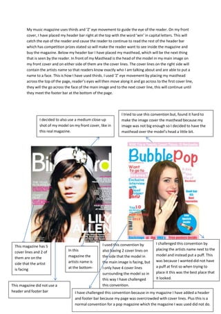
  • 1. My music magazine uses thirds and ‘Z’ eye movement to guide the eye of the reader. On my front cover, I have placed my header bar right at the top with the word ‘win’ in capital letters. This will catch the eye of the reader and cause the reader to continue to read the rest of the header bar which has competition prizes stated so will make the reader want to see inside the magazine and buy the magazine. Below my header bar I have placed my masthead, which will be the next thing that is seen by the reader. In front of my Masthead is the head of the model in my main image on my front cover and on either side of them are the cover lines. The cover lines on the right side will contain the artists name so that readers know exactly who I am talking about and are able to put a name to a face. This is how I have used thirds. I used ‘Z’ eye movement by placing my masthead across the top of the page, reader’s eyes will then move along it and go across to the first cover line, they will the go across the face of the main image and to the next cover line, this will continue until they meet the footer bar at the bottom of the page. I tried to use this convention but, found it hard to make the image cover the masthead because my image was not big enough so I decided to have the masthead over the model’s head a little bit. I decided to also use a medium close-up shot of my model on my front cover, like in this real magazine. In this magazine the artists name is at the bottom- right of the page. I challenged this convention by placing the artists name next to the model and instead put a puff. This was because I wanted did not have a puff at first so when trying to place it this was the best place that it looked. This magazine has 5 cover lines and 2 of them are on the side that the artist is facing I used this convention by also having 2 cover lines on the side that the model in the main image is facing, but I only have 4 cover lines surrounding the model so in this way I have challenged this convention. I have challenged this convention because in my magazine I have added a header and footer bar because my page was overcrowded with cover lines. Plus this is a normal convention for a pop magazine which the magazine I was used did not do. This magazine did not use a header and footer bar
  • 2. After Before I added a footer bar onto my front cover so that I could put more things on the page because it was becoming too crowded at the top. I have changed my main image from being behind the masthead to being in front of the main image as much as I can. This is because this is something that established Pop magazines do, such as Billboard magazine, so I have decided to uphold this convention, also because it looks better. I have moved my cover lines further down the page so that it could look clearer because it looked too clustered. I also changed the font to Serif and Sans Serif fonts because these are the fonts that are usually used in established magazines, so this is another convention I have upheld. I have added a puff to my front page because the page looked plain and I needed something to draw the attention of my audience. I have also used it because it is another convention of magazines especially Pop magazines, such as Top of the Pops.
  • 3. In my Contents page I have used ‘Z’ Eye movement in the sense that I have places aspect of my content page in certain places. What I did was that I placed the title at the top so that it is seen first, but I also placed my contents, by placing my editor’s note right below it so that it is seen right after the title because it is what is most likely to not be read on my contents page so I put it somewhere that it would be seen before other things. Below that is the ‘Features’ subheading which I have placed here so that it is seen after the editor’s note. I have placed the image of the front cover and the ‘News’subheading on the right side of the page so that they are seen after the contents. Lastly I have placed the three images for competitions at the bottom to ensure that they are seen last so that readers remember them. From looking at other magazines, I decided to use three images in boxes, in a row, on my contents page because this is something that magazines such as, We Love This and Billboard do. I decided to put an editor’s note on my contents page because from looking at other Pop magazines such as, we love Pop; this is something that they have done. In We Love Pop they have also placed it in the With my contents I have split them into categories such as Features and News. This is because from looking at established Pop magazines, I can see that this is something that they have done because it makes things easier for readers to find what they are looking for specifically.
  • 4. AfterBefore I have changed the position of my editor’s notefrom below the front over image to the top left side of the page so that it is seen more due to the ‘Z’ eye movement technique. I have moved the position of the contents on the page and removed the ‘Quizzes & Competitions’ subheading. This is so that I could put my editor’s note in the top left side of the page. Also because after looking closely at established magazines, I realised that they don’t have a lot of contents listed on their contents page, t they don’t have a lot of competitions in their magazines and in their magazines there are not a lot of articles due to the amount of advertisement in their magazines, meaning that their magazines are not actually that long or full, so all the articles and competitions on my contents page were not needed. I have added shapes with page numbers on the image of my front cover which is on my contents page. This was so that I would not have to put them on the Features or News subheadings due to the fact that there was too much on them. I have also added a Facebook and Twitter address so that readers can follow my magazine on these sites for publicity. As well as having ‘Bubble Pop’ at the top of my contents page, I have also put the word ‘contents’ at the top but below the masthead. This is so that people know which page it is but can also still see the masthead.
  • 5. For my Double-page spread I have also used thirds to arrange my page and make it look clear, neat and easy to read. On the left page my article is split into three sections, each section is headed with a question which is in a different colour font than the rest of the text on my page. This is so that readers can look at each section and decide which one they want to read first, this gives the readers freedom because there is not specific order to read the article. I also have also used the ‘Z’ eye movement technique again. I used it by placing the header quote at the top left corner of the page in large text and in a different font. I have then placed my questions right beneath the quote. On the right page I have placed the tour dates at the edge of the page so that it is seen after the article is read as to not distract from the article. I have then placed a footer bar at the bottom of the page with information on how to get tickets to the tour so that it is seen after the tour dates are seen. I have then placed the website for the magazine at the bottom right corner of the page so that it is the last thing that is seen. I have used pull quotes on my double page because this is something that is used by most magazines because it makes things easier for the reader to read the article and makes it look more interesting. I have also placed them in a bubble shape to coincide with the name of the magazine I have used this colour scheme because these are colours that go with my genre of pop. I have used the pinkish-red colour, taken from the colour of the model’s lipstick, to highlight things such as the questions, and I have used it for the quotation marks on the pull quotes to highlight the pull quotes because it is a bright colours so stands out against other colours well. I have used the light blue colour for most of the text on the page because it is a basic colour so does not really stand out. Lastly I have used the light pink colour for the backgrounds of things like the footer bar and the tour dates because it made a good base colour
  • 6. In my magazine females are represented,on my front cover I have an image of a female and in the image the model is wearing make-up which represents teenage girls because a stereotype for teenage girls is that they care a lot about make -up and the way they looks, shaving the model wear make-up upholds this stereotype. My model also has a fun and flirtatious face on which would draw the attention of males due to the male gaze. On my contents page I have another image of a female wearing headphones, in this image the model is wearing less make-up so looks more natural, this challenges the stereotype of females in media, which says that to be attractive they have to wear make-up to draw in the male gaze. The model is also fully covered in clothing which also challenges the stereotype of females because there is no part of her body that is exposed apart from her neck.On my double-page spread I have an image of a female smiling and having fun, this model is the same model used on my front cover so she is wearing the same clothes and make- up. The type of media institution that would distribute my music magazine would be an independent institution. Because my magazine is new and I am an independent magazine, I would not have a lot of money to pay a conglomerate institution to distribute it for me. This is where digital distribution comes in handy because as an independent magazine with not a lot of money, an easy and cheap way for me to distribute my magazine would be through the internet. If I were to put my magazine on the internet for distribution it would cost less if nothing to do, which is convenient for more as an independent magazine with a low amount of money because I would not have to pay for it. It would also allow my magazine to reach global heights because the internet is all over the world, people in different countries can also have access to my magazine. The Internet has things like social media sites, which could come in handy for me as I could distribute my magazine on them for free, and reach a wide audience. Social media is also useful for me because my target audience is young people such as teenagers, and teenagers are always on social media and make up the vast majority of social media users. I could also use the social media sites for advertisement and set up a website for my magazine where readers could subscribe to my magazine, which would make money for me. The audience for my music magazine is a mass audience because Pop is a mainstream genre and which is why it is called ‘Pop’ which is short for ‘popular’. My audience would also be young people between the ages of 10-20 this is because this is the average age range of people that listen to pop music. Other audience members would be fans of pop artists, people who like entering competitions and people who enjoy going to concerts. Before the production of my magazine I researched my genre and put out a questionnaire to my audience on what they would like to see in my magazine. I asked 15 people and the results of my questionnaire were: 1. Which title do you prefer? All Pop 13% My Pop 20% Bubble Pop 67% 2. Which colour scheme do you prefer? Bright colours 53% Dark colours 20%
  • 7. Light colours 27% 3. Where would you prefer barcode to be? Top left 14% Top right 14% Bottom left 36% Bottom right 36% 4. On the contents page, where would you prefer the contents Right 43% Left 50% Centre 7% 5. Where would you prefer the main image on the Double-page spread? Centre 76% Left side 12% Right side 12% 6. What would you prefer the double-page to be like? An interview of a ‘fake’, new band 53% An interview of a ‘fake’ existing band 47% This information helped to plan for my images as well as plan how to set out my magazine. The results made things easier for me in production, because they are my target audience; I had an idea of what they would like and what would be good for my magazine and make it look like an actual pop magazine. In my header bar I used the word ‘win’ to attract my audience. This is because the word ‘win’ suggests that there is a prize involved and would make readers want to read on to find out what prizes are on offer to win. In my music magazine I also made it seem like the artists were talking to the readers by using quotes that were addressed to the interviewer. I also used a rhetorical question in one of my cover lines because it addresses the reader directly. To attract male readers I used a female model due to the male gaze theory. I made the model wear make- up and a made her have a flirtatious look on her face so it looks like she is flirting with them. I have also used prizes such as boy band merchandise and freebies such as posters and make-up to attract the female audience. This is because of the stereotypes surrounding females, especially teenage girls, to do with boy bands and make up. On my contents page I have used 3 images of prizes to be won to attract the audience so that they can see what they can win. On my front cover I have also used words such as ‘Backstage’ and ‘Exclusive’ to attract my audience because the word ‘exclusive’ gives the meaning that it is just for this magazines so they have to buy it to know, otherwise they will not find out anywhere else. The word ‘Backstage’ gives the meaning that the reader can go behind where they are normally allowed which gives a sense that they are getting to do something they are not usually allowed to do and that it is a once in a lifetime opportunity. On my double-page spread I have used a main quote
  • 8. to attract my audience; the main quote is used to allow the reader to know what the article is mainly about. The main quote used in my magazine is, “My solo career bombed, so a band seemed right.” This will draw in the attention of the reader to the article, because they would want to know the story around the quote which they would find out in the article. On my double- page spread I have also used pull quotes in bubbles to attract the audience to the article, the pull quotes are used to highlight important and interesting things that are said in the article, the reader will see them before they read the article and want to know why the person has said this. In one of my pull quotes I have used the quote, “It was flattering but awkward at the same time.” I use this as a pull quote because the reader would want to know what was ‘awkward’ and ‘flattering’, because they will read my magazine for surveillance, and inter-personal relationships so will read the article so that they can be ‘in the know’ and be able to discuss it with other people. Once I started producing my music magazine, I was using Photoshop but found it difficult to use because if I had made mistakes or wanted to change something or move an object , i found that I was only allowed to undo once otherwise I had to delete what I had done and start all over again. I then decided to use InDesign instead which I found easier to use at first because I could undo more times than once and also I found that it was easier to place images in but found that I could not edit my images in it so I still had to use Photoshop to edit my images. I then began to find InDesign annoying and difficult to use so I moved back to Photoshop. When editing my images I had to use the Magic eraser to delete the green screen. This meant that I had to zoom into the image as to not delete any part of the image because some green parts were very close to the image. When From my preliminary task to my full production I have learnt to edit my images in Photoshop, which is something I did not do for my preliminary task. This is because in my preliminary task I did not have a green screen, I used my phone camera to take my images and they were not planned, and I also edited my images in preview. Whilst in the full product I actually had a green screen, I used a better and more professional camera, I planned my images so was able to have props and make-up and I was also able to edit my images in Photoshop. I have also learnt how to use audience theory, uses and gratifications and forms and conventions effectively in my product because in my preliminary task I did not really use them the only thing I used was the ‘z’ eye movement technique.
  • 9. Throughout the production of my music magazine I changed many of things. These include: Making the text on my header bar larger Integrating the text on my double page with my image Making the columns on my double page spread smaller- make the page look clearer Changing the fonts on my front page to sans and sans serif fonts Adding a by line on my double-page Adding a web address underneath my masthead Changing the image on my front cover- did not coincide with my double-page Changing the side that the three images on my content page where- from the right side to the bottom Changing the image on my double page- so that I could put it in the centre and have the pull quotes in her hand I also had to retake some photos