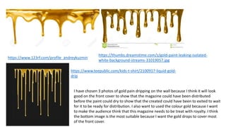
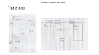
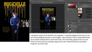
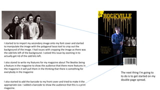
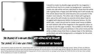
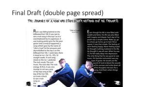
SlideShare a Scribd company logo
1 of 31
Ideas
• I want to make a double page spread with one side light and one side dark to show the light and darks sides of the rock genre and maybe the human mind.
• The masthead will be written in gold with gold oozing from the masthead to show it could of just been made amid not ready for distribution but it distributed
anyway.
• Target audience
• It will be for males and females.
• Its ideally or people 18+ as it will explore some mature and dark themes on the double page spread on with older teens and young adults can relate to.
• Due to the mature content and themes within the article, I will include contact details for supportive agencies to allow readers access to services to address any
issues arising from reading the content.
• Photography
• The front cover is going to make a photograph with me holding a guitar while looking down at the floor. I’m also going to have photographs of other instrument's
that will gradually get smaller and smaller as they in implemented onto the front cover. The dominant image will be a medium shot.
• For the double page spread I'm going to have 2 photos of me. Possible and the left side is going to be me holding a rose looking over to the left and on the right
side will be me with fake blood on my hand together with a guitar next to me looking to the right. The 2 dominant images will both be long shots and will be eye
level. The model of the 2 dominant image for the double page spread will be me sitting down on the floor. I want the sitting down poses because I want to let the
audience know that it’s the same person but he's in 2 different mind sets.
• Main Sell line
• The journey of a man who stated with nothing but his thoughts.(A Billboard Phenomenon)
Purpose
• The purpose of this magazine is to inform people that if your going
though a hard time, you can still achieve your goals no matter what
and the fact that you are much stronger then you think. I made an
example with the made up artist by showing the audience that he
was going through a very hard time with anxiety and depression and
because he stayed strong, he is now an icon in not just rock, but
music as a whole. The fact that he is a normal human being shows the
audience that they are not much different to him and that the fact
that he can do it, they can.
The Article 1 (draft)
• Rock was falling behind on the billboard hot 100. It was rare to see a
rock song in the top 5 as it has been overshadowed by it’s superiors.
It was looking pretty grim for the poor genre. Until a miracle
happened, a song that goes by the name “Life Is Cruel” hit the air
waves and skyrocketed to the top 5 on billboard. One week later it
stood there on the no.1 post. People have never seen anything like it
in years. A rock song. No hybrid. No pop or hip hop artists make an
appearance. A full rock song with the rock tunes. The rock vocals. The
rock lyrics. And the rock vibe. At first it felt a bit unusual as pop and
hip hop dominate the charts. And to see a thing like that is just a
mind blower.
In my article, I decided to give the 1st article a
flamboyant and uplifting tone to show the bright
side of this artists life and how he became a
phenomenon.
I wanted to write an article about rock peaking at no 1
on the billboard hot 100 because rock in the modern
day is overshadowed by there superior's. Pop and Hip
Hop.
Article 2 (draft)
• Even though life life is now filled with fame and wealth. His life was
filled with tragedy and despair. Each day of his youth was a simple
routine. Wake up, go to school, go home, and go to bed. Rinse repeat.
The feeling of never feeling happy, never feeling loved. Nothing
mattered in his life. He thought his life was over. When he was just 13
years old, he fell really deep into depression. The only thig he was
good at was music. He favorite instrument was any guitar he could
get his hands on. Acoustic, electric and even bass. It was escapism at
its peak for him as the sound swells his ears blocking everything
around him.
This article is going to be the complete opiate from the first article. This article is much
darker and more personal then the first one as this is going to be about his pat and how
he suffered from depression. Made this article because I want the to feel empathetic and
this could appeal to the audience as would like to know that even the most famous pepe
go through the same thing and that they are not alone.
• Purpose
• The purpose for this magazine is to inform the audience that this made up artist was going throw
a hard time as a teenager but came over it by letting his thoughts out via lyric's or rock tunes and
verses. It will also be a score entertainment as the audience can read about other artist in the
magazine and they could be interested in reading about the main artists story.
• Psychographic
• The psychographic for my magazine will be for strugglers as the the artist went through a hard
time before becoming famous and he used rock as an escape.
• I have decided that my magazine is going to be print because rock was at its peak back in the 60s-
90s and digital was not a main scarce of entertainment for music so I think it will be suitable for
my magazine to be print as a prefer more classic rock. Today, vinyl is starting to become more
popular in the medium and vinyl was one of the first physical distributions for music and print
magazines could become more popular because of that.
Legal and Ethical Issues
• When finding my secondary content, I need to make sure that I have
permeation to use that secondary content. If I cant get permeation to
use that secondary content, I can give them credit when
implementing them into my magazine. If I use the secondary content
and did not seek permeation or give the then creator credit, I will get
a copyright strike.
Primary images
I have taken some off my own photos for my primary images. I wanted the images to be a bit
blurry to show ambiguity to the audience. The artist is a very secretive man and he doesn't like
to be fully seen in public. It blurriness is also a metaphor for his depression as depression is
known to be very hard to deal with, its is also very confusing and hard to notice and that suits
the blurriness in the photo's. it will help to pull the audience in my making want to know why is
it so blurry and why can we not see them properly. I think the photo with him standing up will
be suitable for the front cover of my magazine because it will give them a teaser for what's to
come and with him not giving direct eye contact will make the audience feel uneasy as most
models on the photo usually look directly at the audience. It will also pull them in by wanting
to now why is he look at them.
I started to pick out what secondary images I want for my front cover for my magazine and figured out what images were
best suitable and why I thought they were suitable. Next time I will try in implement them into my final draft of my
magazine.
Secondary Images
• Don McCullin (1968) https://www.grammy.com/grammys/artists/beatles https://www.thebeatles.com
I have chosen 3 photos of The Beatles which I think will good as a secondary image for my front cover. I have chosen The
Beatles because it is a very old band and I want my magazine to be more old fashioned. I think that the photo in black
and white will be the most suitable because it looks very old and that will make stand out on the front cover as I want my
magazine to be old fashioned.
https://www.123rf.com/profile_andreykuzmin
https://thumbs.dreamstime.com/z/gold-paint-leaking-isolated-
white-background-streams-31019057.jpg
https://www.teepublic.com/kids-t-shirt/2100917-liquid-gold-
drip
I have chosen 3 photos of gold pain dripping on the wall because I think it will look
good on the front cover to show that the magazine could have been distributed
before the paint could dry to show that the created could have been to exited to wait
for it to be ready for distribution. I also want to used the colour gold because I want
to make the audience think that this magazine needs to be treat with royalty. I think
the bottom image is the most suitable because I want the gold drops to cover most
of the front cover.
Production log
Flat plans
Justify your ideas for your layout
Note (front cover and double page spread
drafts)
• Review your designs for your magazine (screen shots)
• Experiment with different designs, colour schemes, layouts, fonts etc.
and reflect are these designs aesthetically working, meeting your
audience needs and expectations, the genre of your magazine,
following/challenging codes and conventions etc.
I started to precise creating a magazine on
Photoshop to see what I'm good at going and
what thing I need to improve before created my
magazine. I also played with the colour schemes
to see how it will suit the fond and how it will
stand out to attract the audience as gold
resembles greatness and sophistication. The next
thing I'm going to do is I'm going to experiment
with other gold patterns to see what is best suited
for the front cover.
I started to experiment will the secondary images of gold paint dripping
from the the masthead. I think the one on the right but the more
suitable one to use because I think the one on the right look a bit
cartoonish ad I want the magazine to be more realistic.
I also stared to play around with the different font colours to witch one is
appropriate. I think the lighter font colour is suitable because it will be easer
to see for the audience. The next thing that I'm going to do is to start adding
my dominant image and the features for the magazine.
I started to create my fin draft for my magazine. I used the polygon lasso tool to crop
out all the background areas on the images. I also used the ruler to create bleed lines
to see where exactly where I want text to be. The next thing going to do is try and
finish my front cover by creating a plug and to start implementing my secondary
image for my front cover.
I started to create a plug to show the audience that the artist has created a new single and the fact that he
wants go let everyone to hear s the CD with the song on is in the magazine for free. I used the brush tool to
create a zig zag pattern to make it look informal because I want to show the audience that this magazine is not
look sophisticated like all the other traditional codes and convections of magazines. I made it look unfinished
and a bit rushed to show the the artist and the publishers were to exited to wait as they know this magazine is
going to be special. I had a play with the different style of fonts to see witch ones stand out. I've decided to use
the font on the right as the font makes it easier for the audience to see and it will help to pull the audience in.
the next thing I'm going to do is to stared implementing my secondary image and my features for my
magazines.
I started to to import my secondary image onto my font cover and started
to manipulate the image with the polygonal lasso tool to crop out the
background of the image. I had issues with cropping the image as there was
the odd bits left of the background. I solved this issue by zooming in to
actually get rid of the odd bits left.
I also stared to write my features for my magazine about The Beatles being
a feature in the magazine to show the audience that there more features in
the magazine's it will pull them in the thinking that there is something for
everybody in the magazine
I also started to add the barcode to my front cover and tried to make it the
appropriate size. I added a barcode to show the audience that this is a print
magazine.
The next thing I'm going to
to do is to get started on my
double page spread.
I stared to create my double page spread for my magazine. I
used the brush tool to to create my background. I wanted to
create one side white and one side black to show that the white
side is going have a happy and safe feeling and it will include my
first article about how the artist became very successful in the
modern rock industry. The other side in black will is going to
dark, sad as this will include my second article about how he
struggled with depression before he became famous. On the
white side, I used a brush tool to create small messy scribbles
on each bottom side of the magazine in the opposite colour so
its easer to see the page numbers. The scribble on the left also
show that there is still some darkness in the artist mind and the
white scribble shows that there is always hope in the darkness.
as the black and white background is a metaphor for the artist
mental state.
I also stared to create my article title. I played about with some font styles to see witch one best suites the double page spread. Bother of them are effective
because I wanted the font style to look scary and abnormal because the second article on the double page spread is going to be about the artists darker times
about feeling depressed and being depressed for long period's of time is abnormal for an average human being. But I think the font on the top is best suitable
for the audience as it it easier to understand.
I played about with the font colours and I had
issues trying to make sure that I can see the title
properly. I solved this issue by splitting the tile in 2
colours with one half of the title back when the
backroad is white and the other half white when
the background is black. The next thing I'm going
to do is to start implementing my dominant images
to my double page spread.
I stared to implement my dominant images for my
double page spread. I duplicated the layer of one
image and rotated the duplicated image to create
a mirror effect. I used the polygonal lasso tool to
get rid of the background on each image and
used a ruler to find center point of the double
page spread and place the images together to
look like one image is on the light side and the
other on the dark side if the magazine. I had an
issue trying to find the center point of the double
page due to the article title being in the way. I
resolved this issue by hiding the title until I found
the center point. The next thing I'm going to do is
I'm going to start writing my 2 articles for my
double page spread.
I started to write my first article for my magazine. I used the
ruler's to create the bleed lines so the article looks tidy and easy
to read. I made the font side bigger for the drop cap to show the
audience where the article starts and then made the rest of the
article smaller so that it fits on the double page spread.
When creating my pull quote, I used the bleed lines to create a
rectangle and them typed the pull quote inside it so that it fits
in the middle if both articles.
The next thing I'm going to do is I'm going to write my second
article for my double page spread.
I started to write my second article for my double page spread. Just like the first
article, used the ruler to create bleed lines to make sure that the the article is
tidy and that it is easy to read.
The 2 article's both cover both sides of the double page spread with the first
article is a lighthearted article about how he achieved his goals. And the second
article on the right talks about his early life and how he suffered from
depression. The article look and the inside of his mind in 2 different states.
The next thing I'm going to do is to some finishing touches
for my front cover.
I added some finishing touches to my front cover of my magazine by
adding a price tag for my magazine and a guide to where to find the article
bout the artist I have created.
Final draft (front cover)
Final Draft (double page spread)

More Related Content

What's hot (18)

Pitch
PitchPitch
Pitch
 
5
55
5
 
Unit G321 Mind Map Joe Dolan
Unit G321 Mind Map Joe DolanUnit G321 Mind Map Joe Dolan
Unit G321 Mind Map Joe Dolan
 
Formal proposal
Formal proposalFormal proposal
Formal proposal
 
Formal proposal
Formal proposalFormal proposal
Formal proposal
 
Updated Question 1
Updated Question 1 Updated Question 1
Updated Question 1
 
Drawn Analysis
Drawn Analysis Drawn Analysis
Drawn Analysis
 
Task 9 formal proposal (2)
Task 9 formal proposal (2)Task 9 formal proposal (2)
Task 9 formal proposal (2)
 
Task 9 formal proposal
Task 9 formal proposalTask 9 formal proposal
Task 9 formal proposal
 
Magazine evaluation
Magazine evaluation Magazine evaluation
Magazine evaluation
 
Textual Analysis
Textual AnalysisTextual Analysis
Textual Analysis
 
Drafting
DraftingDrafting
Drafting
 
Media studies music mag evaluation
Media studies music mag evaluationMedia studies music mag evaluation
Media studies music mag evaluation
 
Research pp
Research ppResearch pp
Research pp
 
Task 9 formal proposal (2)
Task 9 formal proposal (2)Task 9 formal proposal (2)
Task 9 formal proposal (2)
 
Stages of production & audience feedback
Stages of production & audience feedbackStages of production & audience feedback
Stages of production & audience feedback
 
Presentation1 music magazine (4)
Presentation1 music magazine (4)Presentation1 music magazine (4)
Presentation1 music magazine (4)
 
Presentation1 music magazine (4) (1)
Presentation1 music magazine (4) (1)Presentation1 music magazine (4) (1)
Presentation1 music magazine (4) (1)
 

Similar to Magazine ideas (20)

Evalutaion powerpont
Evalutaion powerpontEvalutaion powerpont
Evalutaion powerpont
 
Powerpoint, question 2
Powerpoint, question 2Powerpoint, question 2
Powerpoint, question 2
 
Formal Evaluation
Formal EvaluationFormal Evaluation
Formal Evaluation
 
Unit 14- LO1
Unit 14- LO1Unit 14- LO1
Unit 14- LO1
 
Unit 14 -Producing a print based Media product.
Unit 14 -Producing a print based Media product.Unit 14 -Producing a print based Media product.
Unit 14 -Producing a print based Media product.
 
Evaluation For Music Magazine
Evaluation For Music MagazineEvaluation For Music Magazine
Evaluation For Music Magazine
 
Music magazine proposal
Music magazine proposalMusic magazine proposal
Music magazine proposal
 
Evaluation
EvaluationEvaluation
Evaluation
 
Evaluation:
Evaluation:Evaluation:
Evaluation:
 
Drafting
DraftingDrafting
Drafting
 
Question 1
Question 1Question 1
Question 1
 
Evaluation 1
Evaluation 1Evaluation 1
Evaluation 1
 
Evaluation
EvaluationEvaluation
Evaluation
 
Powerpoint of factual on social media
Powerpoint of factual on social mediaPowerpoint of factual on social media
Powerpoint of factual on social media
 
Evaluation music magazine
Evaluation  music magazineEvaluation  music magazine
Evaluation music magazine
 
Numer1 presentation
Numer1 presentationNumer1 presentation
Numer1 presentation
 
In What Ways Does Your Media Product Use, Develop or Challenge Forms and Conv...
In What Ways Does Your Media Product Use, Develop or Challenge Forms and Conv...In What Ways Does Your Media Product Use, Develop or Challenge Forms and Conv...
In What Ways Does Your Media Product Use, Develop or Challenge Forms and Conv...
 
Evaluation 1
Evaluation 1Evaluation 1
Evaluation 1
 
Evaluation 1
Evaluation 1Evaluation 1
Evaluation 1
 
Evaluation
EvaluationEvaluation
Evaluation
 

More from JamesPotts21

More from JamesPotts21 (20)

Unit 2 learning aim a and b
Unit 2  learning aim a and bUnit 2  learning aim a and b
Unit 2 learning aim a and b
 
Unit 2 learning aim d
Unit 2 learning aim dUnit 2 learning aim d
Unit 2 learning aim d
 
CV
CVCV
CV
 
Unit 2 learning aim d
Unit 2 learning aim dUnit 2 learning aim d
Unit 2 learning aim d
 
CV
CVCV
CV
 
Scriptwriting evaluation
Scriptwriting evaluationScriptwriting evaluation
Scriptwriting evaluation
 
Script you and i 3
Script you and i 3Script you and i 3
Script you and i 3
 
Script you and i 2
Script you and i 2Script you and i 2
Script you and i 2
 
Unit 2 learning aim a and b
Unit 2  learning aim a and bUnit 2  learning aim a and b
Unit 2 learning aim a and b
 
Unit 19 screenwriting- learning aim a and b
Unit 19  screenwriting- learning aim a and bUnit 19  screenwriting- learning aim a and b
Unit 19 screenwriting- learning aim a and b
 
Advertising pitch and production log
Advertising pitch and production logAdvertising pitch and production log
Advertising pitch and production log
 
Script you and i
Script you and iScript you and i
Script you and i
 
Unit 19 screenwriting- learning aim a and b
Unit 19  screenwriting- learning aim a and bUnit 19  screenwriting- learning aim a and b
Unit 19 screenwriting- learning aim a and b
 
Single camera techniques learning aim a
Single camera techniques learning aim aSingle camera techniques learning aim a
Single camera techniques learning aim a
 
Advertising pitch and production log
Advertising pitch and production logAdvertising pitch and production log
Advertising pitch and production log
 
Y2 proposel
Y2 proposelY2 proposel
Y2 proposel
 
Single camera techniques learning aim a
Single camera techniques learning aim aSingle camera techniques learning aim a
Single camera techniques learning aim a
 
Unit 19 la a
Unit 19 la aUnit 19 la a
Unit 19 la a
 
Advertising assigment
Advertising assigmentAdvertising assigment
Advertising assigment
 
Unit 19 la a
Unit 19 la aUnit 19 la a
Unit 19 la a
 

Recently uploaded

Spellings Wk 4 and Wk 5 for Grade 4 at CAPS
Spellings Wk 4 and Wk 5 for Grade 4 at CAPSSpellings Wk 4 and Wk 5 for Grade 4 at CAPS
Spellings Wk 4 and Wk 5 for Grade 4 at CAPS
AnaAcapella
 

Recently uploaded (20)

80 ĐỀ THI THỬ TUYỂN SINH TIẾNG ANH VÀO 10 SỞ GD – ĐT THÀNH PHỐ HỒ CHÍ MINH NĂ...
80 ĐỀ THI THỬ TUYỂN SINH TIẾNG ANH VÀO 10 SỞ GD – ĐT THÀNH PHỐ HỒ CHÍ MINH NĂ...80 ĐỀ THI THỬ TUYỂN SINH TIẾNG ANH VÀO 10 SỞ GD – ĐT THÀNH PHỐ HỒ CHÍ MINH NĂ...
80 ĐỀ THI THỬ TUYỂN SINH TIẾNG ANH VÀO 10 SỞ GD – ĐT THÀNH PHỐ HỒ CHÍ MINH NĂ...
 
Accessible Digital Futures project (20/03/2024)
Accessible Digital Futures project (20/03/2024)Accessible Digital Futures project (20/03/2024)
Accessible Digital Futures project (20/03/2024)
 
Spellings Wk 4 and Wk 5 for Grade 4 at CAPS
Spellings Wk 4 and Wk 5 for Grade 4 at CAPSSpellings Wk 4 and Wk 5 for Grade 4 at CAPS
Spellings Wk 4 and Wk 5 for Grade 4 at CAPS
 
Graduate Outcomes Presentation Slides - English
Graduate Outcomes Presentation Slides - EnglishGraduate Outcomes Presentation Slides - English
Graduate Outcomes Presentation Slides - English
 
Sensory_Experience_and_Emotional_Resonance_in_Gabriel_Okaras_The_Piano_and_Th...
Sensory_Experience_and_Emotional_Resonance_in_Gabriel_Okaras_The_Piano_and_Th...Sensory_Experience_and_Emotional_Resonance_in_Gabriel_Okaras_The_Piano_and_Th...
Sensory_Experience_and_Emotional_Resonance_in_Gabriel_Okaras_The_Piano_and_Th...
 
How to Manage Call for Tendor in Odoo 17
How to Manage Call for Tendor in Odoo 17How to Manage Call for Tendor in Odoo 17
How to Manage Call for Tendor in Odoo 17
 
How to Add New Custom Addons Path in Odoo 17
How to Add New Custom Addons Path in Odoo 17How to Add New Custom Addons Path in Odoo 17
How to Add New Custom Addons Path in Odoo 17
 
Python Notes for mca i year students osmania university.docx
Python Notes for mca i year students osmania university.docxPython Notes for mca i year students osmania university.docx
Python Notes for mca i year students osmania university.docx
 
TỔNG ÔN TẬP THI VÀO LỚP 10 MÔN TIẾNG ANH NĂM HỌC 2023 - 2024 CÓ ĐÁP ÁN (NGỮ Â...
TỔNG ÔN TẬP THI VÀO LỚP 10 MÔN TIẾNG ANH NĂM HỌC 2023 - 2024 CÓ ĐÁP ÁN (NGỮ Â...TỔNG ÔN TẬP THI VÀO LỚP 10 MÔN TIẾNG ANH NĂM HỌC 2023 - 2024 CÓ ĐÁP ÁN (NGỮ Â...
TỔNG ÔN TẬP THI VÀO LỚP 10 MÔN TIẾNG ANH NĂM HỌC 2023 - 2024 CÓ ĐÁP ÁN (NGỮ Â...
 
Basic Intentional Injuries Health Education
Basic Intentional Injuries Health EducationBasic Intentional Injuries Health Education
Basic Intentional Injuries Health Education
 
OSCM Unit 2_Operations Processes & Systems
OSCM Unit 2_Operations Processes & SystemsOSCM Unit 2_Operations Processes & Systems
OSCM Unit 2_Operations Processes & Systems
 
This PowerPoint helps students to consider the concept of infinity.
This PowerPoint helps students to consider the concept of infinity.This PowerPoint helps students to consider the concept of infinity.
This PowerPoint helps students to consider the concept of infinity.
 
How to Add a Tool Tip to a Field in Odoo 17
How to Add a Tool Tip to a Field in Odoo 17How to Add a Tool Tip to a Field in Odoo 17
How to Add a Tool Tip to a Field in Odoo 17
 
Food safety_Challenges food safety laboratories_.pdf
Food safety_Challenges food safety laboratories_.pdfFood safety_Challenges food safety laboratories_.pdf
Food safety_Challenges food safety laboratories_.pdf
 
General Principles of Intellectual Property: Concepts of Intellectual Proper...
General Principles of Intellectual Property: Concepts of Intellectual  Proper...General Principles of Intellectual Property: Concepts of Intellectual  Proper...
General Principles of Intellectual Property: Concepts of Intellectual Proper...
 
How to Manage Global Discount in Odoo 17 POS
How to Manage Global Discount in Odoo 17 POSHow to Manage Global Discount in Odoo 17 POS
How to Manage Global Discount in Odoo 17 POS
 
Jamworks pilot and AI at Jisc (20/03/2024)
Jamworks pilot and AI at Jisc (20/03/2024)Jamworks pilot and AI at Jisc (20/03/2024)
Jamworks pilot and AI at Jisc (20/03/2024)
 
HMCS Vancouver Pre-Deployment Brief - May 2024 (Web Version).pptx
HMCS Vancouver Pre-Deployment Brief - May 2024 (Web Version).pptxHMCS Vancouver Pre-Deployment Brief - May 2024 (Web Version).pptx
HMCS Vancouver Pre-Deployment Brief - May 2024 (Web Version).pptx
 
Basic Civil Engineering first year Notes- Chapter 4 Building.pptx
Basic Civil Engineering first year Notes- Chapter 4 Building.pptxBasic Civil Engineering first year Notes- Chapter 4 Building.pptx
Basic Civil Engineering first year Notes- Chapter 4 Building.pptx
 
On_Translating_a_Tamil_Poem_by_A_K_Ramanujan.pptx
On_Translating_a_Tamil_Poem_by_A_K_Ramanujan.pptxOn_Translating_a_Tamil_Poem_by_A_K_Ramanujan.pptx
On_Translating_a_Tamil_Poem_by_A_K_Ramanujan.pptx
 

Magazine ideas

  • 1.
  • 2.
  • 3. Ideas • I want to make a double page spread with one side light and one side dark to show the light and darks sides of the rock genre and maybe the human mind. • The masthead will be written in gold with gold oozing from the masthead to show it could of just been made amid not ready for distribution but it distributed anyway. • Target audience • It will be for males and females. • Its ideally or people 18+ as it will explore some mature and dark themes on the double page spread on with older teens and young adults can relate to. • Due to the mature content and themes within the article, I will include contact details for supportive agencies to allow readers access to services to address any issues arising from reading the content. • Photography • The front cover is going to make a photograph with me holding a guitar while looking down at the floor. I’m also going to have photographs of other instrument's that will gradually get smaller and smaller as they in implemented onto the front cover. The dominant image will be a medium shot. • For the double page spread I'm going to have 2 photos of me. Possible and the left side is going to be me holding a rose looking over to the left and on the right side will be me with fake blood on my hand together with a guitar next to me looking to the right. The 2 dominant images will both be long shots and will be eye level. The model of the 2 dominant image for the double page spread will be me sitting down on the floor. I want the sitting down poses because I want to let the audience know that it’s the same person but he's in 2 different mind sets. • Main Sell line • The journey of a man who stated with nothing but his thoughts.(A Billboard Phenomenon)
  • 4. Purpose • The purpose of this magazine is to inform people that if your going though a hard time, you can still achieve your goals no matter what and the fact that you are much stronger then you think. I made an example with the made up artist by showing the audience that he was going through a very hard time with anxiety and depression and because he stayed strong, he is now an icon in not just rock, but music as a whole. The fact that he is a normal human being shows the audience that they are not much different to him and that the fact that he can do it, they can.
  • 5. The Article 1 (draft) • Rock was falling behind on the billboard hot 100. It was rare to see a rock song in the top 5 as it has been overshadowed by it’s superiors. It was looking pretty grim for the poor genre. Until a miracle happened, a song that goes by the name “Life Is Cruel” hit the air waves and skyrocketed to the top 5 on billboard. One week later it stood there on the no.1 post. People have never seen anything like it in years. A rock song. No hybrid. No pop or hip hop artists make an appearance. A full rock song with the rock tunes. The rock vocals. The rock lyrics. And the rock vibe. At first it felt a bit unusual as pop and hip hop dominate the charts. And to see a thing like that is just a mind blower.
  • 6. In my article, I decided to give the 1st article a flamboyant and uplifting tone to show the bright side of this artists life and how he became a phenomenon. I wanted to write an article about rock peaking at no 1 on the billboard hot 100 because rock in the modern day is overshadowed by there superior's. Pop and Hip Hop.
  • 7. Article 2 (draft) • Even though life life is now filled with fame and wealth. His life was filled with tragedy and despair. Each day of his youth was a simple routine. Wake up, go to school, go home, and go to bed. Rinse repeat. The feeling of never feeling happy, never feeling loved. Nothing mattered in his life. He thought his life was over. When he was just 13 years old, he fell really deep into depression. The only thig he was good at was music. He favorite instrument was any guitar he could get his hands on. Acoustic, electric and even bass. It was escapism at its peak for him as the sound swells his ears blocking everything around him.
  • 8. This article is going to be the complete opiate from the first article. This article is much darker and more personal then the first one as this is going to be about his pat and how he suffered from depression. Made this article because I want the to feel empathetic and this could appeal to the audience as would like to know that even the most famous pepe go through the same thing and that they are not alone.
  • 9. • Purpose • The purpose for this magazine is to inform the audience that this made up artist was going throw a hard time as a teenager but came over it by letting his thoughts out via lyric's or rock tunes and verses. It will also be a score entertainment as the audience can read about other artist in the magazine and they could be interested in reading about the main artists story. • Psychographic • The psychographic for my magazine will be for strugglers as the the artist went through a hard time before becoming famous and he used rock as an escape. • I have decided that my magazine is going to be print because rock was at its peak back in the 60s- 90s and digital was not a main scarce of entertainment for music so I think it will be suitable for my magazine to be print as a prefer more classic rock. Today, vinyl is starting to become more popular in the medium and vinyl was one of the first physical distributions for music and print magazines could become more popular because of that.
  • 10. Legal and Ethical Issues • When finding my secondary content, I need to make sure that I have permeation to use that secondary content. If I cant get permeation to use that secondary content, I can give them credit when implementing them into my magazine. If I use the secondary content and did not seek permeation or give the then creator credit, I will get a copyright strike.
  • 11. Primary images I have taken some off my own photos for my primary images. I wanted the images to be a bit blurry to show ambiguity to the audience. The artist is a very secretive man and he doesn't like to be fully seen in public. It blurriness is also a metaphor for his depression as depression is known to be very hard to deal with, its is also very confusing and hard to notice and that suits the blurriness in the photo's. it will help to pull the audience in my making want to know why is it so blurry and why can we not see them properly. I think the photo with him standing up will be suitable for the front cover of my magazine because it will give them a teaser for what's to come and with him not giving direct eye contact will make the audience feel uneasy as most models on the photo usually look directly at the audience. It will also pull them in by wanting to now why is he look at them.
  • 12. I started to pick out what secondary images I want for my front cover for my magazine and figured out what images were best suitable and why I thought they were suitable. Next time I will try in implement them into my final draft of my magazine.
  • 13. Secondary Images • Don McCullin (1968) https://www.grammy.com/grammys/artists/beatles https://www.thebeatles.com I have chosen 3 photos of The Beatles which I think will good as a secondary image for my front cover. I have chosen The Beatles because it is a very old band and I want my magazine to be more old fashioned. I think that the photo in black and white will be the most suitable because it looks very old and that will make stand out on the front cover as I want my magazine to be old fashioned.
  • 14. https://www.123rf.com/profile_andreykuzmin https://thumbs.dreamstime.com/z/gold-paint-leaking-isolated- white-background-streams-31019057.jpg https://www.teepublic.com/kids-t-shirt/2100917-liquid-gold- drip I have chosen 3 photos of gold pain dripping on the wall because I think it will look good on the front cover to show that the magazine could have been distributed before the paint could dry to show that the created could have been to exited to wait for it to be ready for distribution. I also want to used the colour gold because I want to make the audience think that this magazine needs to be treat with royalty. I think the bottom image is the most suitable because I want the gold drops to cover most of the front cover.
  • 16. Flat plans Justify your ideas for your layout
  • 17. Note (front cover and double page spread drafts) • Review your designs for your magazine (screen shots) • Experiment with different designs, colour schemes, layouts, fonts etc. and reflect are these designs aesthetically working, meeting your audience needs and expectations, the genre of your magazine, following/challenging codes and conventions etc.
  • 18. I started to precise creating a magazine on Photoshop to see what I'm good at going and what thing I need to improve before created my magazine. I also played with the colour schemes to see how it will suit the fond and how it will stand out to attract the audience as gold resembles greatness and sophistication. The next thing I'm going to do is I'm going to experiment with other gold patterns to see what is best suited for the front cover.
  • 19. I started to experiment will the secondary images of gold paint dripping from the the masthead. I think the one on the right but the more suitable one to use because I think the one on the right look a bit cartoonish ad I want the magazine to be more realistic. I also stared to play around with the different font colours to witch one is appropriate. I think the lighter font colour is suitable because it will be easer to see for the audience. The next thing that I'm going to do is to start adding my dominant image and the features for the magazine.
  • 20. I started to create my fin draft for my magazine. I used the polygon lasso tool to crop out all the background areas on the images. I also used the ruler to create bleed lines to see where exactly where I want text to be. The next thing going to do is try and finish my front cover by creating a plug and to start implementing my secondary image for my front cover.
  • 21. I started to create a plug to show the audience that the artist has created a new single and the fact that he wants go let everyone to hear s the CD with the song on is in the magazine for free. I used the brush tool to create a zig zag pattern to make it look informal because I want to show the audience that this magazine is not look sophisticated like all the other traditional codes and convections of magazines. I made it look unfinished and a bit rushed to show the the artist and the publishers were to exited to wait as they know this magazine is going to be special. I had a play with the different style of fonts to see witch ones stand out. I've decided to use the font on the right as the font makes it easier for the audience to see and it will help to pull the audience in. the next thing I'm going to do is to stared implementing my secondary image and my features for my magazines.
  • 22. I started to to import my secondary image onto my font cover and started to manipulate the image with the polygonal lasso tool to crop out the background of the image. I had issues with cropping the image as there was the odd bits left of the background. I solved this issue by zooming in to actually get rid of the odd bits left. I also stared to write my features for my magazine about The Beatles being a feature in the magazine to show the audience that there more features in the magazine's it will pull them in the thinking that there is something for everybody in the magazine I also started to add the barcode to my front cover and tried to make it the appropriate size. I added a barcode to show the audience that this is a print magazine. The next thing I'm going to to do is to get started on my double page spread.
  • 23. I stared to create my double page spread for my magazine. I used the brush tool to to create my background. I wanted to create one side white and one side black to show that the white side is going have a happy and safe feeling and it will include my first article about how the artist became very successful in the modern rock industry. The other side in black will is going to dark, sad as this will include my second article about how he struggled with depression before he became famous. On the white side, I used a brush tool to create small messy scribbles on each bottom side of the magazine in the opposite colour so its easer to see the page numbers. The scribble on the left also show that there is still some darkness in the artist mind and the white scribble shows that there is always hope in the darkness. as the black and white background is a metaphor for the artist mental state. I also stared to create my article title. I played about with some font styles to see witch one best suites the double page spread. Bother of them are effective because I wanted the font style to look scary and abnormal because the second article on the double page spread is going to be about the artists darker times about feeling depressed and being depressed for long period's of time is abnormal for an average human being. But I think the font on the top is best suitable for the audience as it it easier to understand.
  • 24. I played about with the font colours and I had issues trying to make sure that I can see the title properly. I solved this issue by splitting the tile in 2 colours with one half of the title back when the backroad is white and the other half white when the background is black. The next thing I'm going to do is to start implementing my dominant images to my double page spread.
  • 25. I stared to implement my dominant images for my double page spread. I duplicated the layer of one image and rotated the duplicated image to create a mirror effect. I used the polygonal lasso tool to get rid of the background on each image and used a ruler to find center point of the double page spread and place the images together to look like one image is on the light side and the other on the dark side if the magazine. I had an issue trying to find the center point of the double page due to the article title being in the way. I resolved this issue by hiding the title until I found the center point. The next thing I'm going to do is I'm going to start writing my 2 articles for my double page spread.
  • 26. I started to write my first article for my magazine. I used the ruler's to create the bleed lines so the article looks tidy and easy to read. I made the font side bigger for the drop cap to show the audience where the article starts and then made the rest of the article smaller so that it fits on the double page spread. When creating my pull quote, I used the bleed lines to create a rectangle and them typed the pull quote inside it so that it fits in the middle if both articles. The next thing I'm going to do is I'm going to write my second article for my double page spread.
  • 27. I started to write my second article for my double page spread. Just like the first article, used the ruler to create bleed lines to make sure that the the article is tidy and that it is easy to read. The 2 article's both cover both sides of the double page spread with the first article is a lighthearted article about how he achieved his goals. And the second article on the right talks about his early life and how he suffered from depression. The article look and the inside of his mind in 2 different states.
  • 28. The next thing I'm going to do is to some finishing touches for my front cover.
  • 29. I added some finishing touches to my front cover of my magazine by adding a price tag for my magazine and a guide to where to find the article bout the artist I have created.
  • 31. Final Draft (double page spread)