
Recommended
More Related Content
What's hot
What's hot (20)
Similar to Draft double page spread process
Similar to Draft double page spread process (20)
More from Ceri Lewis
More from Ceri Lewis (20)
Recently uploaded
Recently uploaded (20)
Draft double page spread process
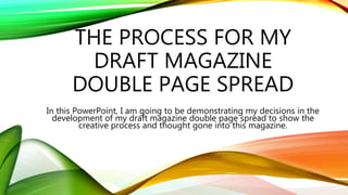
- 1. THE PROCESS FOR MY DRAFT MAGAZINE DOUBLE PAGE SPREAD In this PowerPoint, I am going to be demonstrating my decisions in the development of my draft magazine double page spread to show the creative process and thought gone into this magazine.
- 2. SETTING UP MY DOUBLE PAGE SPREAD I set up my double page spread having the width double my front cover which means in the production of creating my magazine, it will perfectly be fitted into the spine. I continues have the background as white to show continuality in my magazine and white is the conventional colour of music magazines as the background so the text is clear and easily readable. The margins are the same as my cover page and contents page (0.5cm) as I feel this an appropaite sized gap as it will allow me to put the page number
- 3. ORIGINAL AND EDITED IMAGES I didn’t edit my images too much for my double page spread as I liked the layout of the image so I only cropped them slightly, made the images brighter and adjusted the contrast. This made the images stand out more on the page. I am unsure whether I am going to cut my image on the right out for my double page spread as this is the image that will be featured on one page. I will see later on whether the image works being cut out or if it will look fake and unnatural.
- 4. FIRESIDE TITLE I decided to do the layout of my first page before putting the images in as I want to include an image in the text and I will need to look at the layout of my article before I put this image in. I did my Fireside heading in the Telegrafico font which I found on www.dafont.com and I screenshotted it and then adjusted the text to a suitable size appropriate to the double page spread. I chose this font as I felt it was a very clear, bold and defined font that would attract the attention of my audience. I fitted my heading to my margins as I feel the artist name needs to be one of the most recognizable things on the double page spread along side the main image which will encourage the audience to read the article.
- 5. LAYOUT OF MY ARTICLE I decided to do three columns for my article which is traditionally used a lot for double page spreads as it will include more information but it will not be off putting for the reading appearing that it is a long article. I decided the page into three and had 0.5cm margins on each side so there is a 1cm gap between each article so the text is spread out. I chose to do three columns as it allowed me to fit all of my text that I had written in my draft on the article whilst arranging the columns so they were equal having each line going as far to the margins as possible. This means when I remove the margins there will be clear and defined columns overall demonstrating a professional approach.
- 6. LAYOUT OF MY IMAGE I chose to include an image in my article as I feel it breaks the text up and gives the page more originality and character. I feel the image chosen highlights the artist’s sense of outgoing and individual attitude as it captures how close they are even though they have only known each other for a short period of time. I put the image in the margins matching the article in the middle column and in line with the text in the top line. This makes the page look professional and carefully thought about in order to make the page seem as eye catching and effective as possible.
- 7. PULL QUOTE I chose to include a pull quote in my article to intrigue the audience as they are skimming through the magazine. I feel this particular quote will attract my target audience as Scenesters (from the Leading Edge tribe) as they are describes as “moving onto what's ‘next’ before it has a chance to become ‘now’” which means the idea of a new, interesting artist will be appealing to my target audience as they want to know about them before everyone else does.
- 8. MAIN IMAGE AND LINES I looked at how my image looked with the original background and having the image cut out but I felt the image cut out looked too harsh and unrealistic whereas the grey background worked well with the colour scheme for my magazine. With the images, I decided to use the convention of having straight lines to separate my columns, pull quote and images as this is a typical approach in a simplistic magazine style as it fills in blank space without making the page look crowded.
- 9. TAGLINE AND PAGE NUMBERS I feel that the tagline for my magazine is appropriate as it works with my article and will intrigue my reader making them question what the opportunity is. This will encourage my audience to read my article. For the page numbers, I adopted the style of Q magazine having a black box with the number written in white I decided this would be an appropriate style for my magazine as it works with my overall approach. The style works with the bold text and defined Fireside title ensuring every aspect of my magazine stands out and captures the readers’ attention.
- 10. OVERALL PRODUCT Overall, I am happy with the creation of my double page spread as I believe it looks good, eye catching and will appeal to my target audience. I feel it works with the overall styling I want for my magazine whilst still conforming to typical conventions of magazines (eg pull quote and website). I feel that the article I have constructed will be interesting and intriguing for the reader encouraging them to read the rest of my magazine of subscribe to it.