3. CONTENTS PAGE
Mis-en- scene of images:
The mis-en-scene of my images follow the key conventions of existing indie magazines such as Clash
and Wire, which I find show the images to be natural and have limited photographic editing. I
wanted mine to feel true and unedited, showing the audience the artist/subject how it really is,
connoting honesty and truth. I took a large influence from Clash Magazines contents page with there
layout of text and images, which I found worked well overall .
I have achieved this, as all these images have been captured as they are and edited in no
photographic way apart from giving the corners rounded edges. I have then changed the overall
design by introducing these transparent shapes, only to enhance the images collectively for the
audiences eyes.
The images that are featured are of male artist, with two other artistic landscape photos specifically
captured and created as a representation of the content they are tagged with. All of the images are
simple, with the models staged in a non-distracting background putting all focus upon them. Along
with there clothing which connotes youthfulness, maturity and an identity.
I wanted there to be a diversity with the look and content of the images, however I realise now
unintentionally they contain male artists. This wasn’t something I intended, my intentions were to
capture real images of artist shown performing or having them posed in a way that represented
them. If I were to change this I would add two more images featuring female artists.
4. TEXT AND FEATURES OF CONTENTS PAGE
Here is what I would call my magazines banner, and something that I am very happy
with, which I had created for the contents page. First it tells the reader what the
page is, the “Contents Page” and then your reshowing the magazines name, Pine
again as a rebranding element. Along with that I introduced an interactive element
for the audience to engage with, which is the QR code.
Which would take them to the magazines website hypothetically if scanned, a
feature which I find works well for the magazine. As this would allow Pine to expand
themselves in an online format, and I think the way I've advertised it here. In this
sleek design with a tagline allows there to be a direct connection for the audience to
be involved with. Which for them I think they would find safe to engage with, and
connotes a strong independence for the magazine.
5. In the magazines I looked at, the information
was presented in the format of having the page
number, with a title and small sub-feature
about that content. They would be written
formally and with limited words that were
straight to the point, with the intention of
engaging the reader, to read more.
I kept to these conventions with features that I
found necessary to include a sub-feature,
however if I found the titles worked well
enough by themselves, then I left it be.
I kept the format and mode of address simple,
with easy to read text, written formally. With
the use of colour, alternating design to allow
there to be a clear distinction between title and
feature information. To add with this distinction
images were used as a formal representation of
content, identified with page number
coinciding with that feature.
USE OFTEXT ON CONTENTS PAGE
6. At the time of creating this feature, it is a true and
known charity that was publicising itself during worlds
aids day of last year. I personally knew and heard of the
charity previously, but found that not many within my
social circle did, and therefore found it to be a feature
that should be added to my magazine.
The reason for this is that I wanted the magazine to
seem realistic and I thought if I added this into the
contents page, it would do that. Having a real world
issue displayed within a magazine too allow them to
raise awareness to there readers, is a feature found in
many music magazines. Therefore I wanted to challenge
myself to do the same thing and therefore created this
awareness feature.
I hoped that it would connote a positive element to the
magazine showing that they are aware of real world
issues. That my magazine is self-aware and doesn’t just
want to feature various content on music and artists,
which are conventionally whitewashed in existing
magazine. However I chose to be honest and diverse by
having features like these exist, to challenge the forms
and conventions of real media products.
DRIVETO CHANGE FEATURE
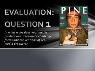
8. IMAGE
When it comes to the generic conventions of a double page spread, they would feature
one singular image usually spread upon both pages. With the images focal point being on
the left page and article being on the right page.
The content of the image is not specified however conventionally they are staged within a
studio and heavily edited to enhance the image. A natural or composited background may
be placed or just a blank canvas with a specific colour, usually white.
For mine I wanted it to be original, natural and showing the artist for who they were and
not have them heavily edit or enhance. For this image the only thing I did was change it
too black and white, as I find it gives the image a distinct and sharp look. It also generic
for the genre of indie to use black and white photo’s for there artists.
I chose to keep this as the convention for me magazine, of leaving the background in not
asking to wear specific clothing. With the direction of telling them to be themselves,
honest and true with I think connotes a positive authenticity and originality of both the
artist and reader.
9. I tried to keep the overall layout
simple in order to give the reader an
easy article read, that was not
overcrowded with unnecessary
features as seen in generic
conventions of magazines.
I featured only what I deemed was
needed for a DPS, such as the
image, headline, sub-headline,
article and page numbers. I wanted
to have the name “Deputy Dan” in a
huge bold font spreading along
both pages, as when you either
reader or see the picture you know
whom this person is.
LAYOUT
It is a striking design and layout that I purposely done, I find the colours, text and image infiltrate the page
well and work together successfully. I think the reader would be able to identify this as a DPS as it follows
the conventions, with a familiar layout they can engage with easily.
This is so by having the text brought through from the image, by having an overlay box to enhance the
visual readability of the text. I have also included a drop cap that is a generic convention of a DPS. I am very
happy with my DPS the one thing that I would change is the way I bordered it, I would keep the white
border at the bottom where the page numbers are. However I would take the image up and over the border
at the top and sides to fulfil the overall page.
10. The conventions of my double page spread
are true to how existing media products
represent there's. I have a limited range of
colours that follow throughout the page,
specifically white and black for text, and
then transparent reds, greens and white
which are colours themed throughout my
magazine creating a colour continuity.
For font the page numbers are the same as
the magazines masthead, “MoolBran”
keeping an obvious design continuity and
iconography for Pine Magazine.The text
used for the article is “Basic Title Font” from
DaFont. It was a font that I find worked well
to connote a character and identity for my
artist. As many music artist conventionally
have there name written in a specific font
that can be identified with them. I choose
this one for both overall design and creating
that conceptual ideology for my artist.
HOUSE STYLE