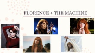
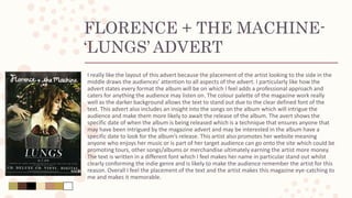
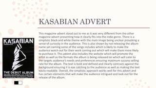
MAGAZINE
ADVERT
ANALYSIS
Through my research I analyzed magazine adverts to
gain an insight into the different variety of adverts
which I can use for inspiration in my final product.
ARCTIC MONKEYS
ARCTIC MONKEYS- ‘THE
JEWELLER’S HANDS’ ADVERT
I really like the layout of this magazine advert as the bold artist name clearly catches our
attention and the colour of the font contrasts against the background making it stand out to
the audience. The advert connotes a symmetrical effect making it appear more professional
and ensures the audiences’ attention is drawn to all areas of the advert. The advert includes a
song that will be featured on the album which I feel is a nice effect as it intrigues the audience
as we are learning more about the album meaning we will be more likely to be exited for the
release. I also like the added effect of the star rating from the magazines including NME and Q
which are both highly respected music magazines and are likely to be known by Arctic
Monkey’s target audience. The image intrigues the audience as the added colour in
comparison to the black and white theme of the rest of the advert makes the image stands
out. The colour palette demonstrates how well all of the colours work together contrasting
against each other allowing certain text to stand out. I like how the image has a border around
it and although I most likely won’t adapt the same layout of this advert having a smaller image
in the middle, I feel using a border would be an effective approach. Overall I feel the layout of
the magazine advert works really well and stands out to the target audience especially due to
the interesting and not as conventional placement of the image.
FLORENCE + THE MACHINE
FLORENCE + THE MACHINE-
‘LUNGS’ ADVERT
I really like the layout of this advert because the placement of the artist looking to the side in the
middle draws the audiences’ attention to all aspects of the advert. I particularly like how the
advert states every format the album will be on which I feel adds a professional approach and
caters for anything the audience may listen on. The colour palette of the magazine work really
well as the darker background allows the text to stand out due to the clear defined font of the
text. This advert also includes an insight into the songs on the album which will intrigue the
audience and make them more likely to await the release of the album. The avert shows the
specific date of when the album is being released which is a technique that ensures anyone that
may have been intrigued by the magazine advert and may be interested in the album have a
specific date to look for the album’s release. This artist also promotes her website meaning
anyone who enjoys her music or is part of her target audience can go onto the site which could be
promoting tours, other songs/albums or merchandise ultimately earning the artist more money.
The text is written in a different font which I feel makes her name in particular stand out whilst
clearly conforming the indie genre and is likely to make the audience remember the artist for this
reason. Overall I feel the placement of the text and the artist makes this magazine eye-catching to
me and makes it memorable.
KASABIAN
KASABIAN ADVERT
This magazine advert stood out to me as it was very different from the other
magazine advert presenting how it clearly fits into the indie genre. There is a
simplistic black and white theme with the main image being unclear provoking a
sense of curiosity in the audience. This is also shown by not releasing the album
name yet naming some of the songs includes which is likely to make the
audience watch out for their work coming out which will make them more likely
to purchase it. This advert also includes the website which will promote the
artist as well as the formats the album is being released on which will cater to
the targets audience’s needs and preferences ensuring maximum success selling
rate for the album. The text is bold and defined and clearly contrasts against the
background ensuring it is eye catching to the audience as well as making the text
easily readable. Overall, the simplistic approach works well for this advert and
has certain elements that will make the audience intrigued and look out for the
release of the album.

Magazine Advert Analysis

  • 1.
    MAGAZINE ADVERT ANALYSIS Through my researchI analyzed magazine adverts to gain an insight into the different variety of adverts which I can use for inspiration in my final product.
  • 2.
  • 3.
    ARCTIC MONKEYS- ‘THE JEWELLER’SHANDS’ ADVERT I really like the layout of this magazine advert as the bold artist name clearly catches our attention and the colour of the font contrasts against the background making it stand out to the audience. The advert connotes a symmetrical effect making it appear more professional and ensures the audiences’ attention is drawn to all areas of the advert. The advert includes a song that will be featured on the album which I feel is a nice effect as it intrigues the audience as we are learning more about the album meaning we will be more likely to be exited for the release. I also like the added effect of the star rating from the magazines including NME and Q which are both highly respected music magazines and are likely to be known by Arctic Monkey’s target audience. The image intrigues the audience as the added colour in comparison to the black and white theme of the rest of the advert makes the image stands out. The colour palette demonstrates how well all of the colours work together contrasting against each other allowing certain text to stand out. I like how the image has a border around it and although I most likely won’t adapt the same layout of this advert having a smaller image in the middle, I feel using a border would be an effective approach. Overall I feel the layout of the magazine advert works really well and stands out to the target audience especially due to the interesting and not as conventional placement of the image.
  • 4.
  • 5.
    FLORENCE + THEMACHINE- ‘LUNGS’ ADVERT I really like the layout of this advert because the placement of the artist looking to the side in the middle draws the audiences’ attention to all aspects of the advert. I particularly like how the advert states every format the album will be on which I feel adds a professional approach and caters for anything the audience may listen on. The colour palette of the magazine work really well as the darker background allows the text to stand out due to the clear defined font of the text. This advert also includes an insight into the songs on the album which will intrigue the audience and make them more likely to await the release of the album. The avert shows the specific date of when the album is being released which is a technique that ensures anyone that may have been intrigued by the magazine advert and may be interested in the album have a specific date to look for the album’s release. This artist also promotes her website meaning anyone who enjoys her music or is part of her target audience can go onto the site which could be promoting tours, other songs/albums or merchandise ultimately earning the artist more money. The text is written in a different font which I feel makes her name in particular stand out whilst clearly conforming the indie genre and is likely to make the audience remember the artist for this reason. Overall I feel the placement of the text and the artist makes this magazine eye-catching to me and makes it memorable.
  • 6.
  • 7.
    KASABIAN ADVERT This magazineadvert stood out to me as it was very different from the other magazine advert presenting how it clearly fits into the indie genre. There is a simplistic black and white theme with the main image being unclear provoking a sense of curiosity in the audience. This is also shown by not releasing the album name yet naming some of the songs includes which is likely to make the audience watch out for their work coming out which will make them more likely to purchase it. This advert also includes the website which will promote the artist as well as the formats the album is being released on which will cater to the targets audience’s needs and preferences ensuring maximum success selling rate for the album. The text is bold and defined and clearly contrasts against the background ensuring it is eye catching to the audience as well as making the text easily readable. Overall, the simplistic approach works well for this advert and has certain elements that will make the audience intrigued and look out for the release of the album.